


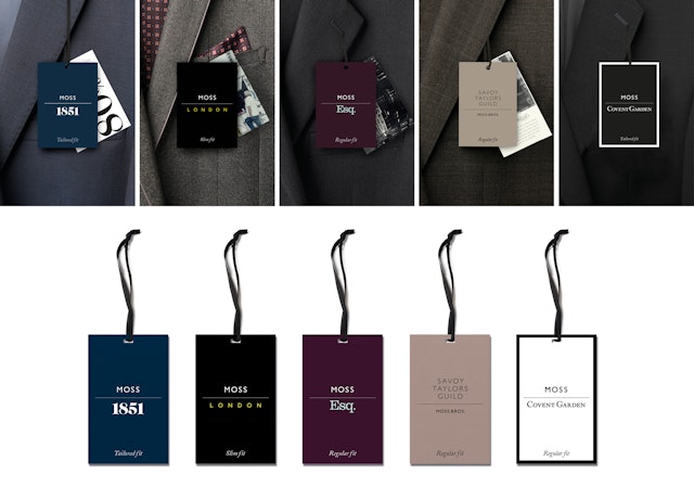


Consistency between the master brand, retail brands, and own brand labels is achieved through use of the master colour scheme and a horizontal line in all logotypes, which serves as the company’s visual hallmark.





Moss Bros. is a formal menswear company that has been ‘suiting the nation’ since 1851. Pentagram has paid homage to this by creating a new visual identity, tone of voice and interior strategy for its 150 stores.
Pentagram emphasised the company’s heritage by returning to the name ‘Moss Bros.’, moving away from the briefly adopted ‘Moss’. To reflect its British pedigree, Gill Sans is used in the logotype with Caslon elsewhere. The brand colour is a mix of classic suit colours that is supported by a subsidiary chalk tone inspired by tailoring patches.
As well as strengthening the Moss Bros. brand, its internal hierarchy is clarified and reinforced. Consistency between the master brand, retail brands, and own brand labels is achieved through use of the master colour scheme and a horizontal line in all logotypes, which serves as the company’s visual hallmark.
Individual colour schemes are used in tandem with the master colour scheme to give each sub-brand a distinct character. For example, Savoy Taylors Guild’s colours are based on the façade of their original store on the Strand. These details help to draw up visual personalities that are further developed through unique photography styles for each sub-brand.
Pentagram created a new tone of voice for the brand, reintroducing pride, expertise and charm into how the organisation communicates. This tone is extended to the shop floor, where customers are greeted by ‘suit experts’ instead of ‘sales assistants’, creating a more proud and knowledegable persona.
To make the stores cohere with the new identity and rebrand, Pentagram was tasked with creating a design that would be suitable for a number of different store sizes, formats and locations, from standalone stores in London to shopping malls in the Midlands.
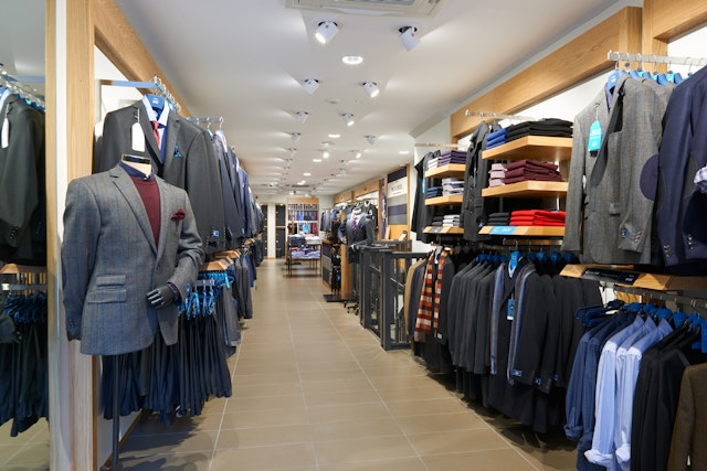
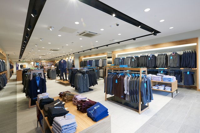
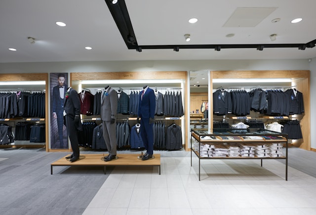
The interiors brief from the client was for a refresh, building on and evolving the existing environment. Pentagram used European oak, creating a light and warm interior that contrasts with the typically dark colours of suits. The colours of the brand identity have been incorporated into the material palette which has been simplified and clarified, helping to reinforce the quality and heritage of the brand.
The perimeter merchandise display is broken up into smaller bays, producing a rational journey through the store. Key pieces are highlighted using large graphic panels, which use the unique photography styles developed for each sub-brand during the rebrand. Technology has been integrated as small moments within the stores to allow cross-platform shopping for the customer.
The concept is currently being rolled out across the company’s store portfolio, implementing Pentagram’s multi-disciplinary creative work with Moss Bros.
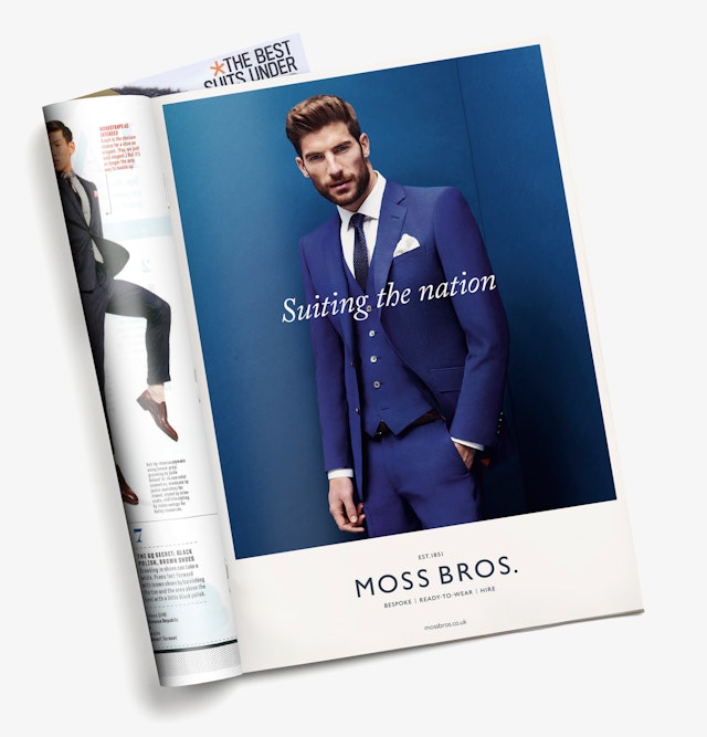
The brand regeneration is completed with an organisational manifesto that ends with the line ‘suiting the nation’, expressing Moss Bros.’ range, country-wide reach and ability to suit every man and every wallet in the country.
Office
- London
Partners
- Harry Pearce
- Naresh Ramchandani
- William Russell
