

The ‘W’ symbol suggests a movable placard or folding display system, an apt metaphor as the virtual museum moves toward hosting exhibitions in physical spaces.


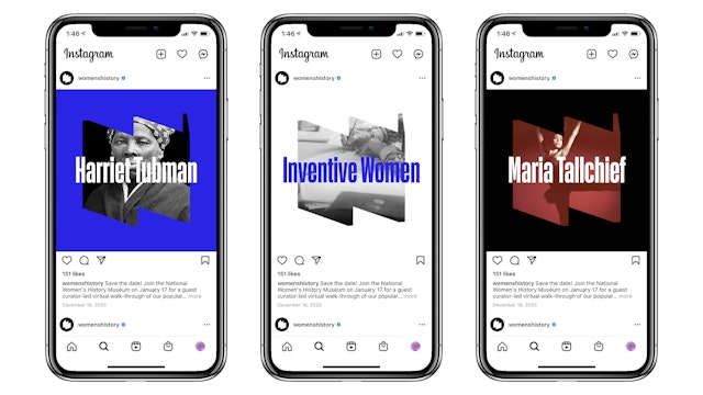
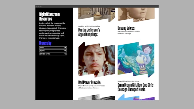
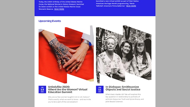
The symbol can appear in flat color, or act as a frame or window for photos and images about women and history.






The National Women’s History Museum is dedicated to telling the stories of the women who transformed the US, displaying the collective history of American women, and offering a more complete view of US history that will educate, inspire and empower. Founded in 1996, the institution does this through a growing, state-of-the-art online presence as it looks forward to a future physical museum.
Paula Scher and her team at Pentagram have designed a dynamic new visual identity for the Museum that can evolve with the institution. The bold and contemporary identity centers on a folded “W” symbol that evokes a movable placard or display system, an apt metaphor as the virtual museum moves toward hosting exhibitions in physical spaces—and eventually finds a permanent home of its own.
Scher worked closely on the project with the Museum’s leadership, including President and CEO Holly Hotchner. The new look coincides with the institution’s 25th anniversary and launches as the Museum is about to introduce its first physical presence in exhibitions and programs in Washington, DC in 2022.
For the past 20 years, NWHM has been leading the effort to build a permanent museum on or near the National Mall in Washington, DC. In 2014, Congress voted to create a congressional commission to study the creation of a National Women’s History Museum, which would be the first museum in any national capital solely dedicated to the history of its women. It currently curates online exhibitions and programming and provides educational materials for schools.
“The goal for the new identity was to make a strong statement that we are a contemporary history museum—that we are here to record and interpret and create a platform for history in the making, to draw connections from the past and give inspiration for the future,” says Hotchner. “The new identity succeeds through the boldness of our ‘W,’ which alludes to our community and can be interpreted in different ways.”
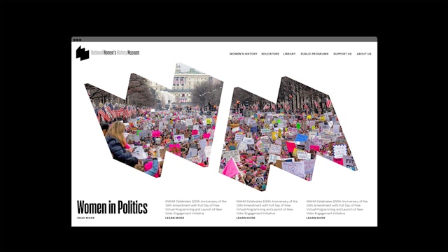
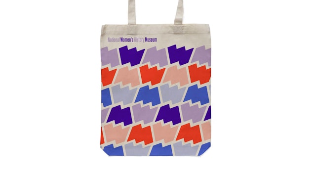
The new logo has endless flexibility; the “W” can be rotated to appear as an “M,” for “Museum,” or seen in perspective from various angles. The symbol can appear in flat color, or act as a frame or window for photos and images about women and history. The “W” can carry a single, carefully cropped image, as seen on the homepage of the redesigned website. Paired in combination, the “W” and “M” can be used to creatively tell stories—with a portrait of the woman pictured in the “W,” and her accomplishments represented in the “M.” The symbol can also be used to form graphic patterns.
The “W” logo can appear on its own or paired with a wordmark. The logotype and primary typography are set in Action Condensed Bold (from Commercial Type), a strong, straight-sided condensed sans with a friendly personality and quirky shapes.
The identity provides the basis for a cohesive brand architecture that ties together the Museum’s various initiatives, programs and groups, such as Council XIX and the 1920 Society. Each is given its own “W” distinguished by a different color and angle of perspective, establishing it as a sub-brand while still being immediately recognizable as part of the Museum. The vibrant brand colors include a purple inspired by the U.S. suffrage movement, along with a secondary palette of bright, modern colors.
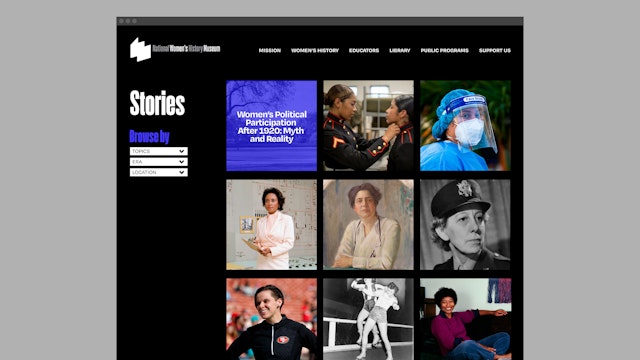
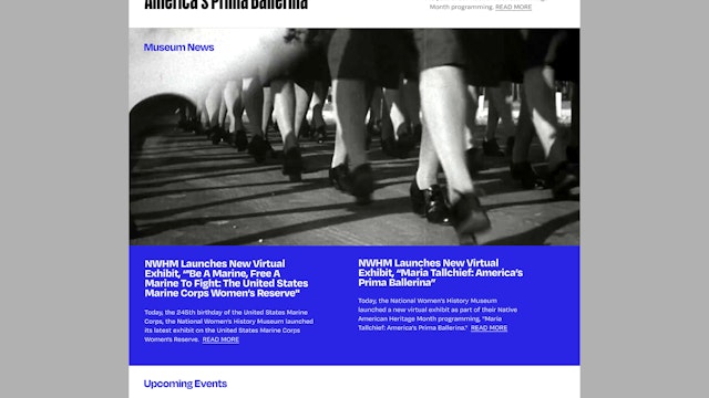
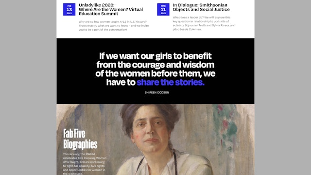
As part of the new identity, the Pentagram team also redesigned the NWHM website, as well as the Museum’s quarterly magazine, formerly called A Different Point of View, which now features a larger, oversized format.
Sector
- Arts & Culture
Discipline
- Brand Identity
- Digital Experiences
