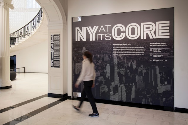

The graphics use typography—specifically, the versatile typeface Titling Gothic—to establish a cohesive look and feel for the exhibition.
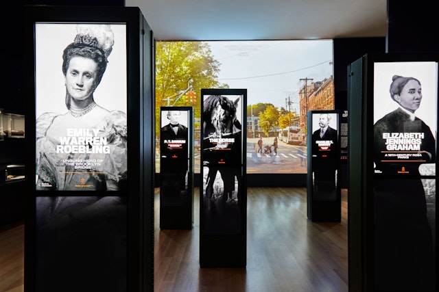
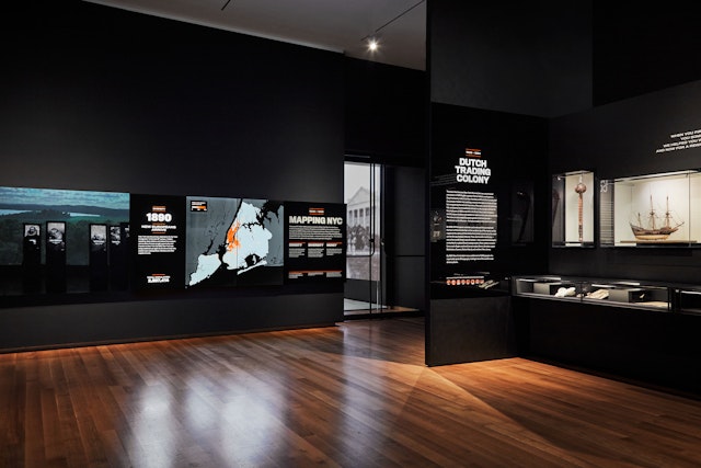

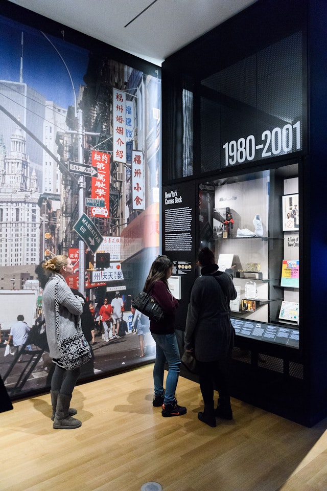
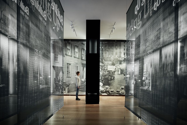

The typography is used in combination with a custom color palette and display methods to make each section feel unique.
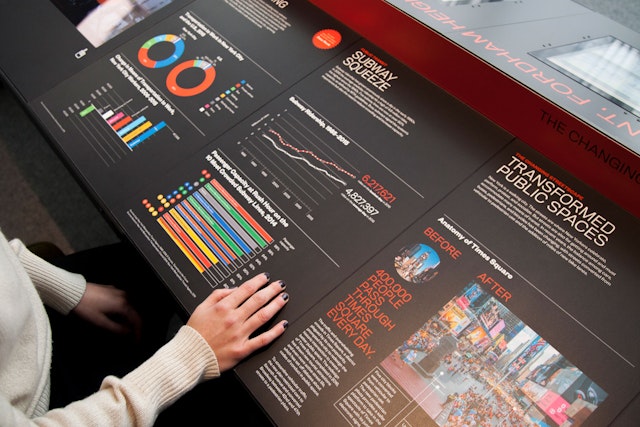


Developed in collaboration with a multi-disciplinary team, the display strategies interpret a variety of artifact types and information from a diversity of perspectives.

New York at Its Core is the first-ever permanent exhibition at the Museum of the City of New York. Exploring what makes New York New York, the show tells the city’s 400-year story through more than 450 historic objects and images, many drawn from the museum’s permanent collection. Pentagram designed the graphics for the award-winning exhibition, including the brand identity, and collaborated on the display strategies as part of a multi-disciplinary team that included architecture by Studio Joseph and interactive media by Local Projects.
The 8,000 sf show encompasses the entire first floor of the museum and incorporates an enormous range of content as it presents its narrative. The exhibition is chronologically divided into three parts: two galleries break the history into distinct eras, while one looks at where the city is now and where it may be headed in the future. The graphics needed to support the curatorial approach and provide a visual framework that helps organize the material. The team also had to develop display strategies that would accommodate a variety of artifact types and information from a diversity of perspectives.
The graphics use typography—specifically, the versatile typeface Titling Gothic—to establish a cohesive look and feel for the exhibition. Different weights and typographic treatments are used to differentiate the three sections of the show, essentially creating graphic sub-brands that suggest the focus of the content in each gallery. The typeface is also used for the exhibition identity, which places an inline in the letters of the title as a play on the word “Core,” itself a play on New York as “The Big Apple.”
The typography is utilized in combination with a custom color palette and display methods to make each gallery feel unique. A wide, heavy weight of centered type resembling the wood type of historic playbills is used for the first section, “Port City,” spanning almost three centuries from 1609-1898, with accents of orange inspired by the period’s brick architecture. Condensed type and vertically stacked titles reference the skyscraper-building era of the second gallery, “World City,” covering 1898-2012, with spots of taxi-cab yellow. The graphics are incorporated in layered projections on scrims, giving the gallery a dynamic sense of depth.
The exhibition concludes with the hands-on Future City Lab, an innovative gallery that offers a series of interactive zones, designed with Studio Joseph and Local Projects, where visitors can use technology to investigate issues facing contemporary and future New Yorkers, including housing, transportation and the environment. The installations include a massive, curved map table built of screens displaying data visualizations and a “What if?” table where visitors can ask questions on postcards and experts will answer.
Throughout the exhibition, special printing techniques were explored to create different experiential effects, including printing on mirror-finish acrylic surfaces, printing on woven, vinyl scrim, back-printed acrylic panels, and rear-illuminated photography. Other signage appears on rear-illuminated cases and edge-lit acrylic sheets.
New York at Its Core was recognized with the prestigious Overall Award in the 30th Annual American Alliance of Museums (AAM) Excellence in Exhibition competition (2018) and received an Honor award in the 2017 AIA New York Design Awards, a Built Environment Award in the 2017 Core77 Design Awards, and was a Finalist in the 2017 SEGD Global Design Awards.
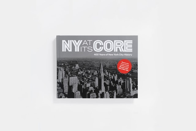
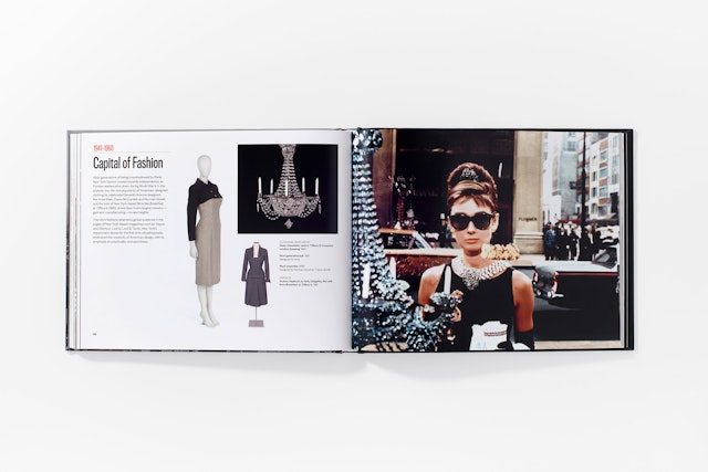
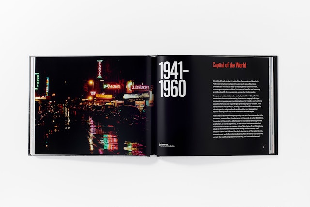
The Pentagram team also designed the accompanying catalogue, NY at Its Core: 400 Years of New York City History. Organized like a timeline, the richly illustrated book features almost 400 of the exhibition’s historic objects and images, as well as profiles of notable New Yorkers.
