
From the outset, Pentagram was challenged with naming and branding the first-of-its-kind enterprise, keeping in mind that if successful, the concept could expand to other landlocked destinations around the country.


NLand Surf Park opened in Austin in 2015, bringing surfing to the heart of Texas—far from any ocean. The surf park is the brainchild and passion of Doug Coors, an engineer and member of the famous Coors Beer family, who somehow managed to become an avid surfer while growing up in the mountains of landlocked Golden, Colorado. When Coors came to town, he called on Pentagram to help name the park and to develop its brand identity.
When NLand opened its gates, the park became the first inland surfing destination of its kind in North America. The park’s Texas-sized lagoon, a 14-acre body of water the size of nine football fields, is 100-percent self-sustaining and uses more than 11 million gallons of rainwater collected from the property situated next door to a cattle ranch.
Coors partnered with Wavegarden, a Spanish engineering outfit that invented NLand’s innovative wave-maker: a giant snowplow-like apparatus that runs down the length of a long pier that divides the manmade lagoon in half. The machine generates consistent waves for surfers of all levels: from head-high, open face waves with a 35-second ride for experts, challenging open face waves for passionate travel surfers and gentle white water waves for kids and beginners.
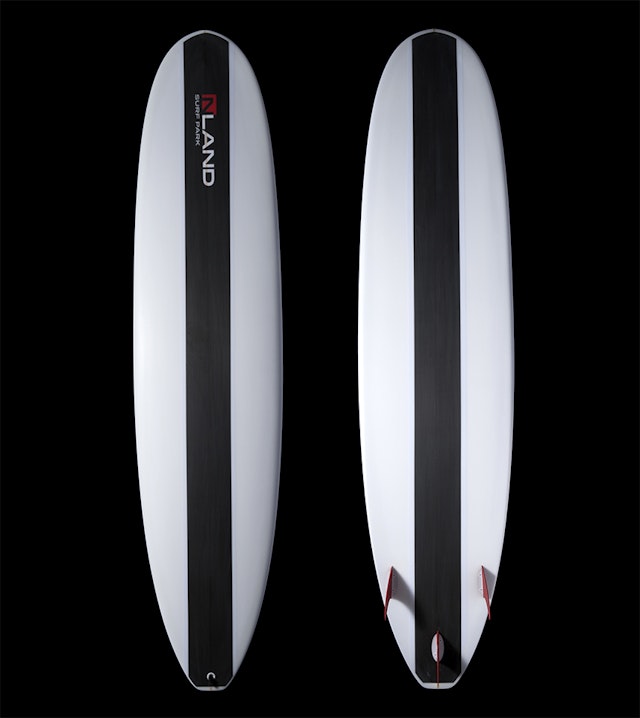
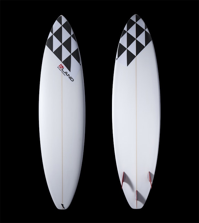
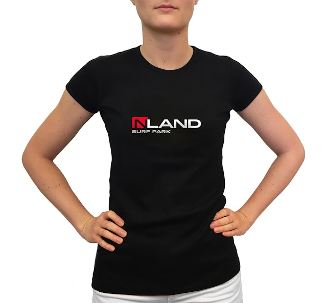
Just in case a few of NLand’s Texas patrons aren’t confident with their surfing abilities, the park maintains a state-of-the-art training center with a full staff of instructors from around the world. The park features a fully stocked surf shop carrying high-end gear, custom NLand apparel and surfboards, and even their own brand of surf wax called Giddy Up—a one-of-a-kind souvenir for surf enthusiasts. A locally sourced scratch kitchen called Blue Prairie, also branded by the Pentagram team, and a stand-alone juice bar provide healthy food and beverage choices for surfers and visitors to the park.
“NLand has been a dream of mine for the past 20 years,” says Coors. “My family has a rich history of water conservation and environmental stewardship. I am proud to continue that tradition of innovation and sustainability. I look forward to sharing our waves with the world.”
From the outset, Pentagram was challenged with naming and branding the first-of-its-kind enterprise, keeping in mind that if successful, the concept could expand to other landlocked destinations around the country. The surf park’s founders understood that they weren’t just building a single inland surf destination in Austin, Texas, they were creating a whole new sport category the way that Burton Snowboards helped to launch a different category of skiing. NLand’s ambitious vision is to become the U.S. leader in inland surfing including parks, events, competitions, and licensed products. With this in mind, the Pentagram team landed on the NLand moniker, a straightforward name that clearly communicates the new sport experience in a branded, own-able shorthand form.
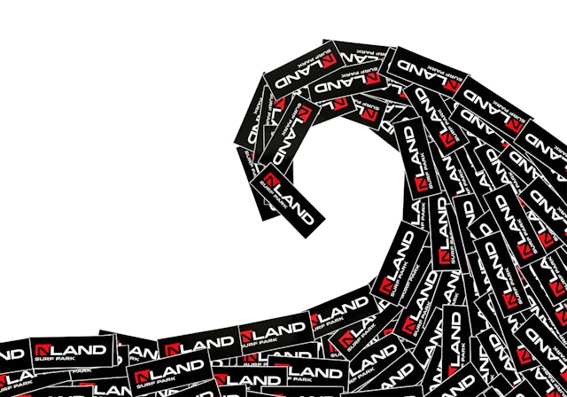
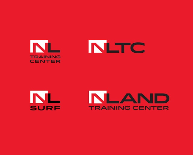
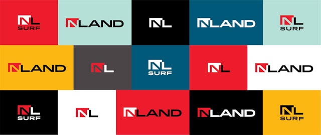
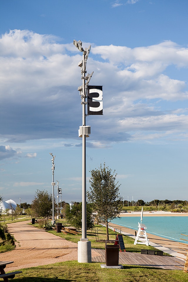
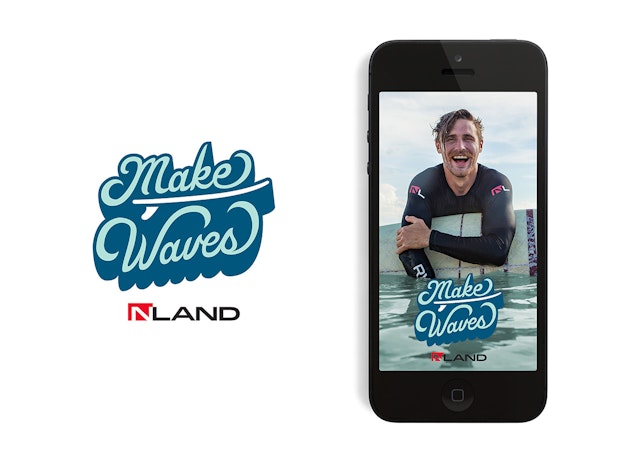
This “new sports category” ethos guided the look and feel of the identity and other branded elements in the park including Pentagram’s designs for NLand’s primary logo and other identity elements, signage, flags, custom icons, lane indicators, uniforms, hats, name tags, water bottles, stickers, restaurant identity and menus, instruction displays, videos, vehicle graphics and custom apparel and surf gear for the surf shop.
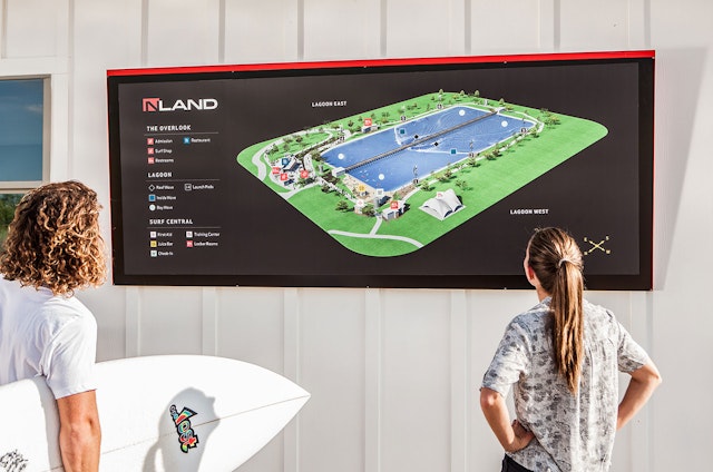
The Pentagram team also developed the signage and way-finding program to reflect NLand’s identity with a modern, confident design language and weighed-in on the over all architectural scheme of the simple, Texas-appropriate buildings in the park.
In addition, the Pentagram team designed the park’s website, which includes infographics, videos and an extensive commerce interface for making reservations and purchasing tickets. A unique feature on the website is a daily weather update on the homepage that lets surfers know up-to-the-minute surfing conditions. But with consistent, manmade waves and mostly warm weather in central Texas year round, the surf’s always up at NLand!
Client
NLand Surf ParkSector
- Entertainment
Discipline
- Brand Identity
- Signage & Environmental Graphics
- Digital Experiences
- Brand Strategy
