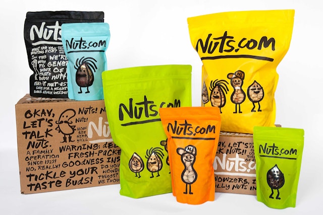


The redesign incorporates this irreverent and chatty tone of voice into the packaging with friendly hand-drawn typography and illustrations.


Nuts.com is exactly what it sounds like: an online retailer of every kind of nut, from peanuts, pistachios, pecans and pine nuts, to cashews, almonds and filberts, in salted, unsalted and organic varieties. Founded by “Poppy” Sol Braverman in 1929 as the Newark Nut Company, the family-owned business has grown from a stand in Newark’s Mulberry Street market into a thriving site that sells over 2,000 items and has annual sales of over $20 million. The company has been named one of the "Top Tastes of New Jersey" and featured on “Rachel Ray," and with the slogan "We're more than just nuts," also offers dried fruit, snacks, chocolate, coffee and tea.
The company first launched its site in 1999 with the slightly confusing name/URL NutsOnline.com––a second choice after it found the URL Nuts.com was already taken. This year the company finally secured the Nuts.com address and made the move to the new name. With the change, the company asked Pentagram to create a new identity and packaging that would help establish Nuts.com as a distinctive brand. The new graphics create an unmistakable look and feel that is fun, personal, and well, a little nutty.
A family business, Nuts.com prides itself on a personal approach and has always used a friendly, personable, slightly zany tone of voice in its marketing. This can be seen on its website, where the four members of the Braverman family who run the company––Kenny (son of “Poppy” Sol), his son Jeffrey (recently profiled in The New York Times), Uncle Sandy and Cousin David––are represented as cartoon nuts and describe the company and its story in their own words.
The redesign incorporates this irreverent and chatty tone of voice into the packaging with friendly hand-drawn typography and illustrations. Bags and shipping boxes are covered in commentary: “This way to your taste buds!,” “Isn’t it nut-astic?,” etc. The typeface was hand-drawn and converted into a font by Jeremy Mickel, who provided a lot of alternate characters. The illustrator Christoph Niemann redrew the cartoon nuts to complement the typeface; the mascots appear on the bags of nuts, where they are reversed out to show the product inside. A bright, appealing color palette completes the cheerful look.
Office
- New York
