Pentagram and OPPO collaborated closely on every aspect of the visual identity framework, beginning with an understanding of developed and emerging markets, through to production and sustainability needs.



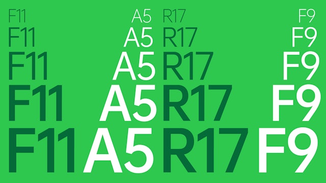
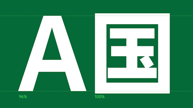
The development of OPPO Sans is a significant undertaking that shows OPPO’s care for quality, craftsmanship and uniqueness in every detail.


The branding framework makes the counterform ellipse of the logo an iconic, instantly recognizable shape that OPPO can own as part of its visual language.
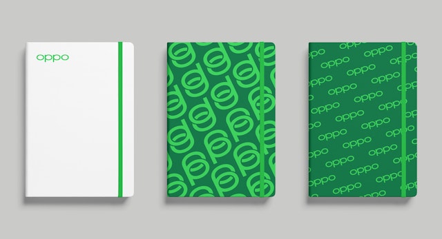
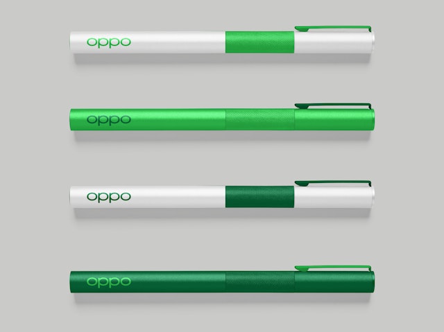
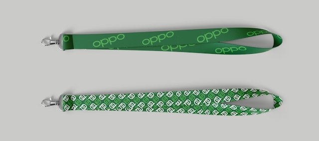
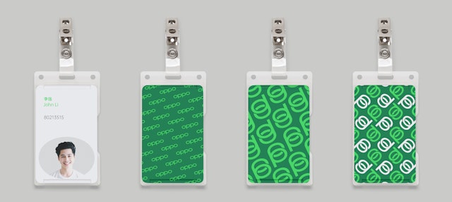

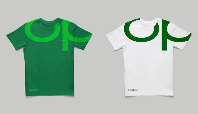
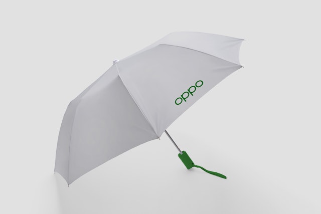

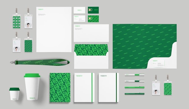
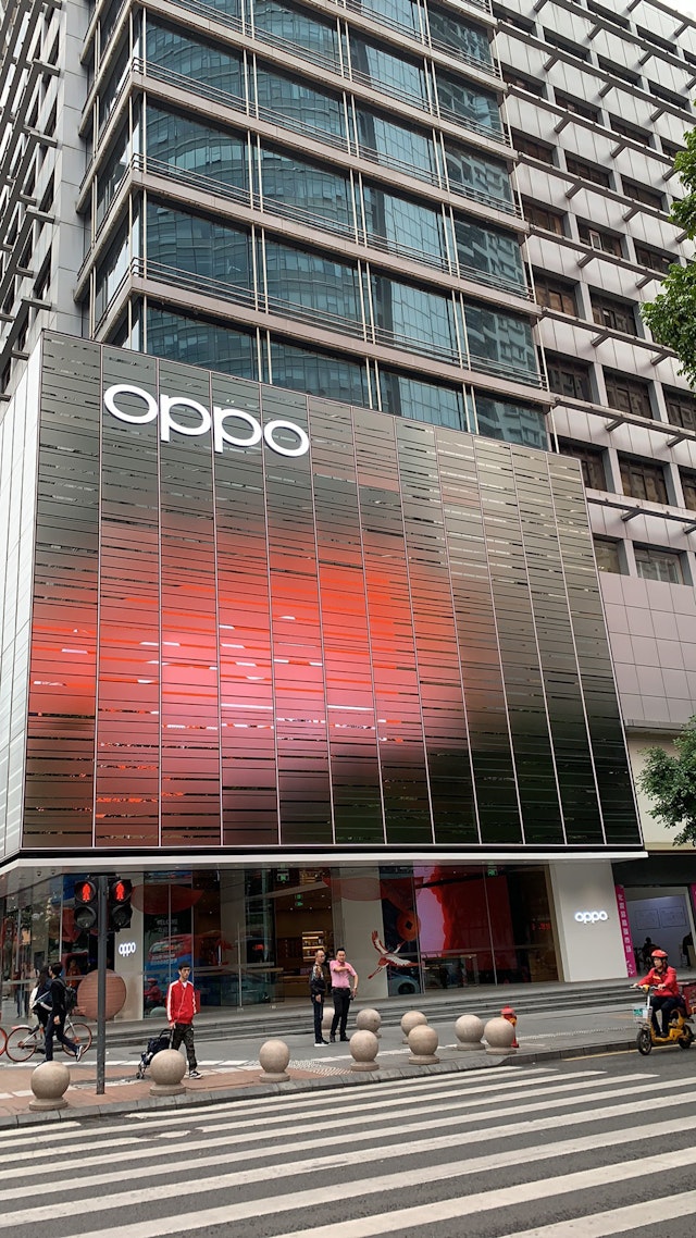
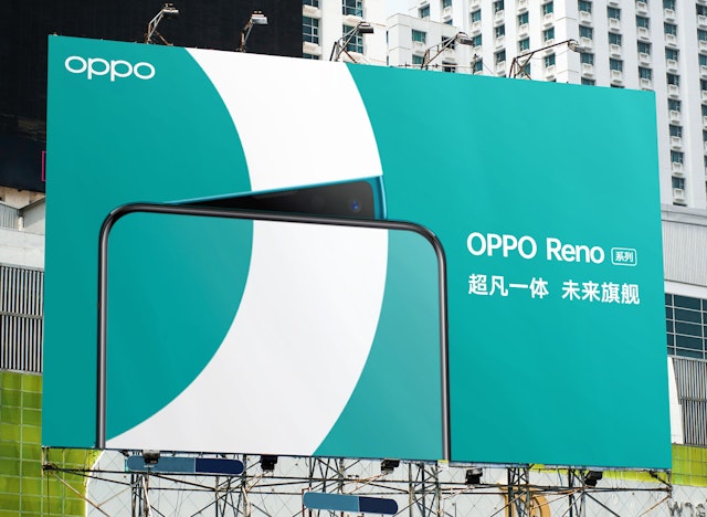
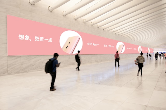
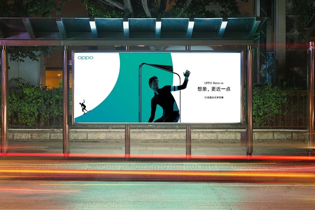

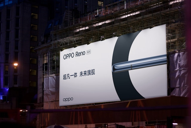


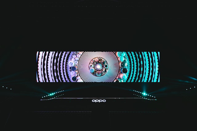
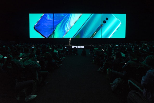
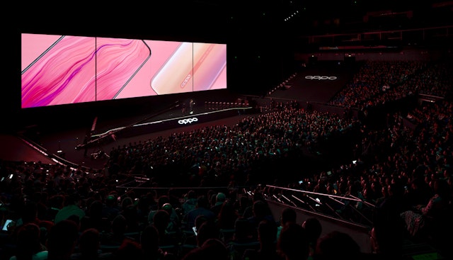
OPPO is one of the world’s leading smartphone brands, specializing in high-quality camera phones and advanced mobile photography technology that are used by over 200 million people around the globe. Pentagram has designed a new brand identity framework for OPPO that introduces a refreshed logotype and monogram and helps the brand evolve as it broadens its reach in new and existing markets. The program includes an expanded color system and visual layout system, as well as the debut of a custom typeface, OPPO Sans, rendered in Chinese, Cyrillic and Latin alphabets. The visual updates range from dynamic changes to subtle optimizations, and coincide with the launch of OPPO’s new Reno series.
Founded in 2004 and based in China, OPPO was the first brand to offer smartphones with 5MP (mega-pixel) and 16MP front cameras, along with other innovations in the category, and continues to appeal to a target audience of young consumers with popular, high-quality camera phones like the powerful F11 Pro and the picture-perfect F1 Selfie Expert. In 2018, OPPO was ranked the fifth largest smartphone brand globally, leading the Chinese domestic market and with a growing presence in India, Southeast Asia, Africa, Australia and Europe.
The Pentagram team worked closely with OPPO leadership on the new branding framework, which marks a strategic shift for the brand. Over the past decade, OPPO has been focusing on breakthroughs in mobile photography and wanted the new brand positioning to highlight the beauty of its technology and product design. At the same time, the company needed a simple, more cohesive brand that would set its products apart in a visually crowded category, including at OPPO’s own 200,000 retail outlets across China.
The rebranding process lasted nearly two years, beginning with an understanding of developed and emerging markets, through to production and sustainability needs. The team conducted extensive research in major cities in China and India, where they experienced firsthand the way westernized design was not necessarily optimized for exposure in the marketplaces of Shenzhen and New Delhi, which require a more dynamic, flexible approach.
OPPO’s redrawn logotype balances out the humanist form of the previous wordmark with a new custom-drawn sans serif typeface, OPPO Sans. The new logotype shows the brand’s heritage through its extended letterforms and is optimized to meet mass manufacturing needs. It also establishes a clear and contemporary presence allowing it to complement OPPO’s vast and ongoing products range.
A plethora of different marks were tested during the development process, including a version that tilted the oval “O” at a positive angle. The final logo retains the tailored curved form of the previous logo’s “O,” but simplifies it with a more straightforward, universal character. The wordmark also maintains the balance and symmetry that is important to the brand. (This love for symmetry carries through to OPPO’s tradition of setting the clocks on its product interface displays at 01:10.) The team also developed a custom monogram that layers the “O” and “P” together into a distinctive symbol that works well in graphic patterns.
The branding makes the counterform ellipse of the logo an iconic, instantly recognizable shape that OPPO can own as part of its visual language. The oval can be used for background patterns or to frame images like a camera lens, reinforcing the brand’s focus on photography.
Like the logo, the OPPO Sans typeface is designed for maximum clarity of expression and simplicity of form. The development of the typeface, designed by Pentagram in collaboration with Chester Jenkins, was a significant undertaking that demonstrates OPPO’s care for quality, craftsmanship and uniqueness in every detail. The oval of the logotype has been extended to the shape of counters in other letters in the Latin and Cyrillic alphabets, and the Chinese letterforms are carefully drawn with the same optical proportions and weight.
The identity is accompanied by a vibrant color system that refines the brand’s signature green, enhances it for digital contexts and introduces new colors for various product lines. The core color system has been expanded to include light green, dark green and a platinum that evokes the product materials. An extended palette of adaptive colors will be used to indicate individual phones, like teal for the new Reno.
The new identity launched with “Oppolence,” a short film created by Studio Lernert & Sander that transforms the logo into a 3D sculptural installation. In the film, the action takes place in the oval of each letter, exploring different aspects of the new identity and conveying the idea that lives take place inside the spaces of OPPO devices.
Office
- New York
Partner
Project team
- Ken Deegan
- Pedro Mendes
- Paul Yoon
- Xinle Huang
- Xingwei Huang
