Since the pandemic many have decided to reinvent how they live and work. The proposition of co-living and co-working in remote places has become very attractive and relevant in our times.
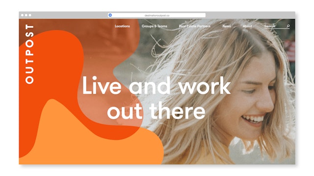
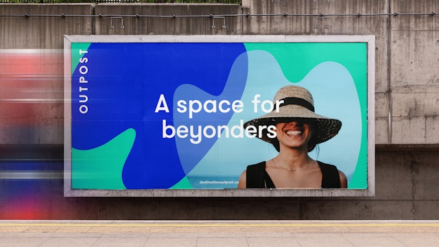
The brand position developed by Pentagram is summarised in the strapline ‘Live and work out there’, expressing the business aim to engage audiences who are pioneers at work but also explorers who want to see the world.


The design approach is inspired by tropical modernism with its utopian values, vibrant colours and sense of optimism.
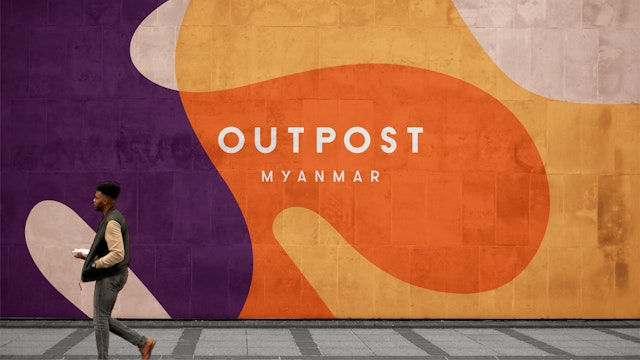
Outpost is a unique community built around beautiful design-led co-working and co-living spaces based in idyllic remote locations such as Bali, Sri Lanka and Cambodia. Since the pandemic many have decided to reinvent how they live and work. The proposition of co-living and co-working in remote places has become very attractive and relevant in our times.
The concept is founded with a single purpose: to empower remote workers, creatives and entrepreneurs to live and work from anywhere. Centred around the idea of community, Outpost enables internationally-minded individuals to connect to others in culturally rich locations. The retreats are tailor-made for those working remotely for days, weeks or months and as well as welcoming individuals, Outpost also organises bespoke team retreats for both office-based companies looking to strengthen their teams, and for remote teams who want to come together in an inspiring environment.
Outpost’s two founders established the business in 2012. Both longstanding digital nomads, their then-radical vision of working anywhere in the world has now become the mainstream. With a strong emphasis on sustainability, Outpost is active in its local communities, and partners with local organisations and businesses to provide positive experiences for both them and its members.
Pentagram was asked to create a clear brand strategy and brand identity to reflect Outpost’s bold vision and to define a framework for growth as many co-living spaces are opening across the globe.
The brand position developed by Pentagram is summarised in the strapline 'Live and work out there’, expressing the business aim to engage audiences that are pioneers at work but also are explorers who want to see the world and go further.
The graphic language is inspired by aesthetics from tropical modernism with its utopian values, vibrant colours and sense of optimism, found in countries like Brazil, where architecture fully embraces nature. Patterns are inspired especially by landscape designers such as Roberto Burle Marx.
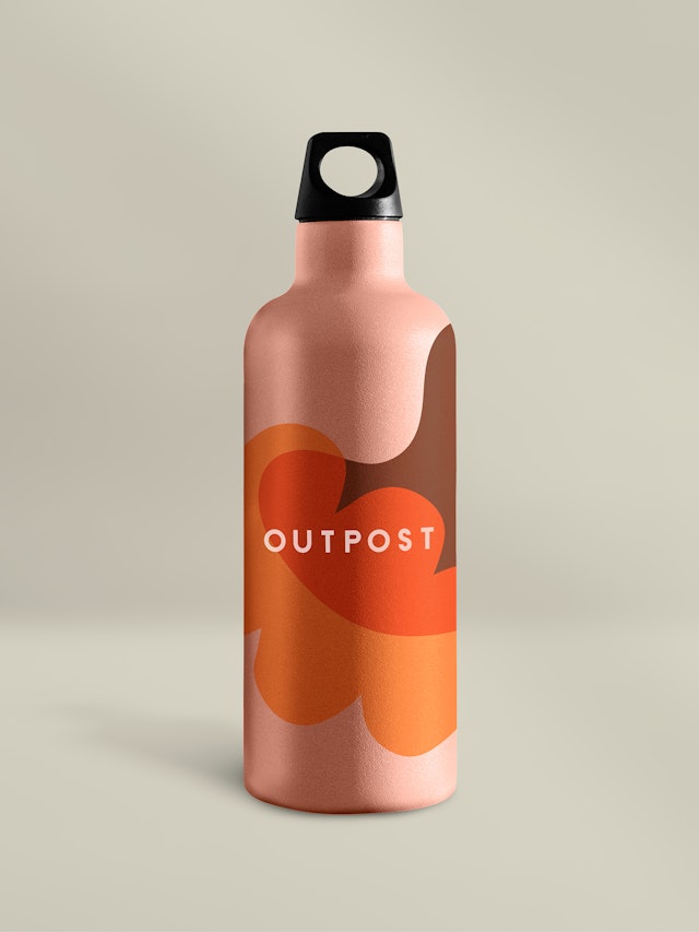
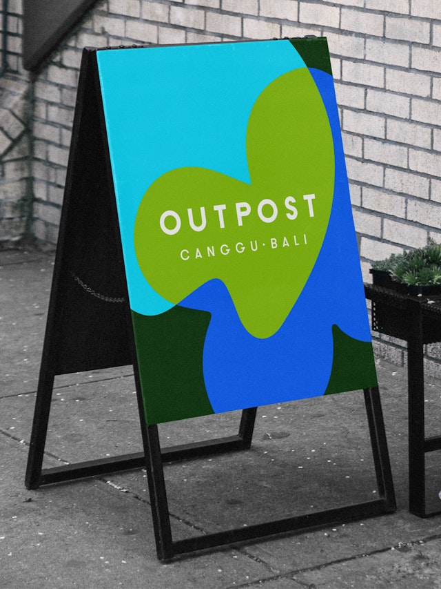
Colour is a key element of Outpost’s new identity. The design team created a vibrant colour palette that exudes positivity and evokes the warmth of the beautiful locations of the co-working spaces. The graphic language features a series of interconnected organic shapes with overlaid colours—these are used throughout the identity and appear on the website and social media, as well as in the interiors and exteriors of the outpost live and workspaces.
The typographic logo is set in Outpost’s primary typeface, Grilli Type’s GT Walsheim. Used throughout the identity it offers a friendly vibe that perfectly matches Outpost’s welcoming culture. Aspirational but realistic photography also plays a key part in the new brand identity, with friendly and chilled-out images of people used alongside shots of the attractively designed Outpost spaces, as well as glimpses of its exotic locations.
The new identity is designed to work seamlessly across on and offline applications including the website, social media, printed collateral, facade signage and digital advertising. The team also created the tools for the Outpost staff to implement the identity with their local agencies.
Pentagram has created a vibrant identity that perfectly brings the Outpost brand to life in all of the spaces it inhabits, embodying all of the fun, connection and adventure that happens when you become part of Outpost’s global community of digital nomads.
Office
- London
Partner
Project team
- Rita Desport
- Marta Gaspar
- Stuart Gough
- Kate Blewett
- Ian Osborne
Collaborators
- John Grant (strategy)
