The system encompasses a new bespoke brand typeface, PayPal Pro, a streamlined color palette, and a motion language based on everyday payment behaviors like tapping, flipping and swiping.

PayPal Pro is a customized version of LL Supreme, a contemporary redrawing of Futura by Lineto Type Foundry.

The new PayPal wordmark is the foundational element of the identity, set in a new custom typeface, PayPal Pro, that embodies the brand attributes of boldness, confidence and clarity.
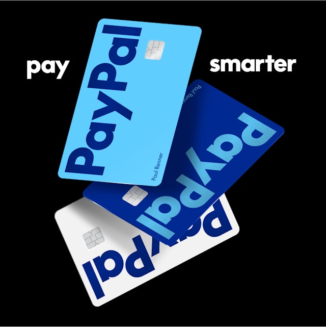
The new identity launches with the new PayPal Debit Card, with more brand expressions to follow as part of an extended design system––everywhere, and for everyone.

For the past two decades, PayPal has been innovating sophisticated technology making our financial lives easier. Pentagram refreshed its brand identity to reflect and bolden this simplicity.
PayPal has been revolutionizing commerce globally for more than 25 years with innovative experiences that make moving money, selling and shopping simple, seamless, personalized and secure. The digital payment platform is now ushering in a new era for customers that makes it easier and more rewarding to shop and pay with PayPal anywhere, anytime.
As part of this evolution, Andrea Trabucco-Campos and his team at Pentagram have developed an identity refresh that unifies the PayPal brand and conveys its mission to revolutionize commerce on a global scale. The system encompasses a new bespoke brand typeface, PayPal Pro, a streamlined color palette, and a motion language based on everyday payment behaviors like tapping, flipping and swiping.
The Pentagram team collaborated closely on the rebrand with Diego Scotti, Executive Vice President and General Manager of PayPal’s Consumer Group and Global Marketing & Communications, and Geoff Seeley, Chief Marketing Officer at PayPal, along with the company’s internal communications, marketing and advertising teams. Pentagram worked with PayPal to oversee all aspects of the implementation of the new system, including an advertising campaign by BBH Global featuring Will Ferrell.
Creative strategy
Pentagram first helped PayPal clarify a visual strategic foundation for the brand identity that would enable and amplify the transformation of the business into a more universal offering. These principles include simplicity, optimism and trust, with the goal of making PayPal more accessible for “Everyone, everywhere.”
The brand identity finds its power in a visual language that is bold, open and direct, with a flexibility that welcomes new brand partnerships and collaborations.
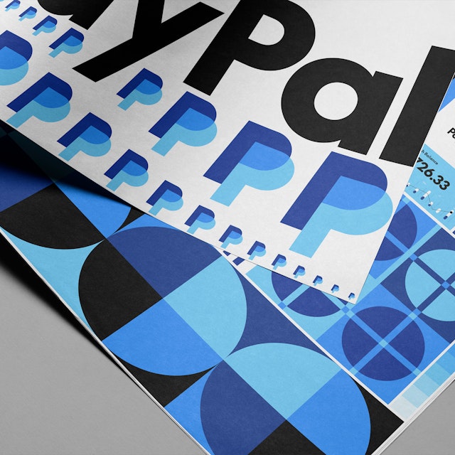
The iconic PayPal monogram has been redrawn to be sharper and modern: in the updated mark, the angle of the layered letters stays the same, but curves at the corners of the letterforms have been de-rounded for a sharper appearance. The colors have been calibrated for continuous contrast, to create a sense of depth and dimension in the layers of the logo that were not previously there. Bright blue and deep blue overlap to reveal Venmo blue, a nod to the growing mobile app owned by PayPal.
While the structure of the monogram has not dramatically changed, its relationship with the accompanying logotype has. To elevate the look of the identity and make it more flexible, the symbol is no longer locked up with the wordmark. The two elements now function independently from each other bringing more possibility through simplicity of elements.
A new logo and typographic voice
The new PayPal wordmark is the foundational element of the identity, set in a new custom typeface, PayPal Pro, that embodies the brand attributes of boldness, confidence and clarity. PayPal Pro is a customized version of LL Supreme, a contemporary redrawing of Futura by Lineto Type Foundry. Originally designed by Paul Renner in 1927, Futura is a geometric sans serif inspired by the proportions of lettering over 2,000 years old. With its timeless universal forms, the typeface allows the focus to stay on the message. PayPal Pro similarly aims to be constructed purely out of straight lines and circular curves. Pentagram is working closely with Lineto and PayPal to develop a secondary typeface, PayPal Pro Text, that is optimized to perform at small sizes for legibility and utility.
Color distilled
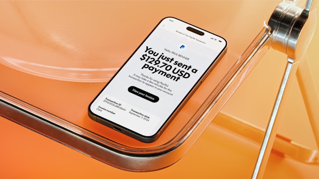
The timeless type is matched by a neutral black and white palette that elevates the new logo and sets it apart from the blue that has become synonymous with fintech. Instead, blues are used as accents and energy for the brand. The system also eliminates the yellow from the previous palette, which duplicated other retail brands. This change extends to the UI, where the outdated yellow payment buttons are now black.
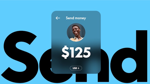
The streamlined palette allows PayPal to dial up its brand personality in color-saturated imagery. The new photo direction highlights the accessibility of the platform in moments that feel real, spontaneous and authentic.
Everyday behaviors baked into a motion identity
Emphasizing PayPal’s ease of use, the motion language of the identity draws on the everyday transactional gestures and behaviors of making payments, both digital and physical. Brand animations activate the wordmark and typography with taps, clicks, flips and swipes, bringing the movement of the product experience into the identity itself.
The new identity launched with a new PayPal Debit Card* value prop, with more brand expressions to follow as part of an extended design system––everywhere, and for everyone.
* The PayPal Debit Mastercard® is issued by The Bancorp Bank, N.A. (“Bancorp”) pursuant to a license by Mastercard International Incorporated and may be used everywhere Mastercard is accepted. Mastercard and the circles design are registered trademarks of Mastercard International Incorporated. Bancorp is issuer of the Card only and not responsible for the associated accounts or other products, services, or offers from PayPal.
PayPal is a financial technology company, not a bank. The Card is linked to your PayPal Balance Account. See PayPal Balance Terms and Conditions.
Office
- New York
Partner
Project team
- Lauren Rush
- JJ Jung
- Mònica Losada
- Cyrus Cumming
- Camila Pérez
Collaborators
- PayPal Brand Team
- BBH Global
