
The brief was to create a strong brand identity for the business that reflected its position as a standalone commercial enterprise while demonstrating its relationship to TfL. The brand identity needed to be highly accessible and inclusive, and work alongside the brands of TfL, the Mayor of London and other partners.

The new brand and visual identity represent the physical spaces and gaps in which the business operates, its two-dimensional representation of a three-dimensional space provides flexibility, as well as a consistent and highly ownable visual style.


Throughout the project, Pentagram and Places for London worked side-by-side to ensure the wider internal and stakeholder teams were brought along on the journey.


Places for London is the new name for Transport for London’s property company. TfL is one of London’s largest landowners and is responsible for a huge portfolio (5,500+ acres) stretching across almost every borough. Working closely with both TfL, The Mayor of London and many other commercial partners, Places for London will be providing homes, workspaces, retail and cultural spaces for Londoners, as well as working to improve the existing infrastructure within its wide-ranging portfolio.
Previously known as Transport Trading Limited Properties Ltd. (TTLP), after internal restructuring to give the business more autonomy and a more commercial focus, Pentagram was commissioned to help create a new name, brand strategy and visual identity.
The brief was to create a strong brand identity for the business that reflected its position as a standalone commercial enterprise while maintaining and demonstrating its relationship to TfL. The brand identity needed to be highly accessible and inclusive, and work alongside the brands of TfL, the Mayor of London and many other partners.
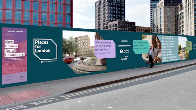
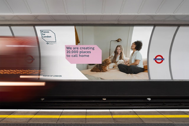
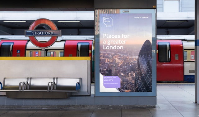
The target audience is primarily B2B partners and stakeholders within the property sector, local government, and councils within the London metropolitan area, however the brand will also be seen at times by members of the public on more public-facing applications and partnerships.
Research for the project involved multiple levels of stakeholder engagement alongside detailed competitive analysis and site visits. A long-term vision was needed, because, as well as being both sustainably conscious and inclusive to all, the brand also needed to balance the lines between quality and trust, transparency and responsibility, commercial and public-spirited, and heritage and future-facing.
The public nature of the business meant consensus-building with a large number of stakeholders as well as public engagement and explaining and demonstrating the strategic and creative decisions from both a creative and commercial perspective. Lots of consideration was given to the relationship between Places for London and Transport of London and how this works at various scales and applications. Similarly, due to the highly collaborative nature of the business, careful consideration was given to the partnership with others.
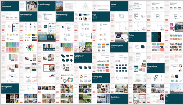
The new brand identity impacts all aspects of the business, from the underlying strategy and brand value to the public-facing and visible logo, graphic system, colour palette and copywriting.
Playing on TfL’s iconic London Underground announcement, the core strategic idea behind Places for London is ‘Minding London’s Gaps’. The new brand and visual identity represent the physical spaces and gaps in which the business operates, its two-dimensional representation of a three-dimensional space provides flexibility, as well as a consistent and highly ownable visual style.
The logo is formed by a 3-dimensional frame which represents the physical places at the heart of the brand. The type is set in Johnston, the corporate font of Transport for London and synonymous with the London Underground. The 45° angle of the cubic frame is also reflected in the Johnston typeface, a subtle graphic link to the parent brand.
As part of the brand identity development, the team developed a graphic system inspired directly by the logo, this allows text and imagery to be placed into a flexible and highly legible framework across all communications and formats.
This graphic system has been used to inform other elements of the brand such as a comprehensive custom iconography suite, information graphics, and signage. It creates a distinct visual connection across all touchpoints and applications but still stands out visually in the often safe and restrictive world of public and governmental brand identities.
Drawing on TfL’s heritage, Places for London was created with the mission of becoming one of the most impactful property companies by collaborating with commercial partners and local communities from every corner of London. Throughout the project, Pentagram and Places for London worked side-by-side to ensure the wider internal and stakeholder teams were brought along on the journey. The result is a brand identity that provides flexibility, has a consistent and highly ownable visual style and will serve the business for years to come.
Office
- London
Partner
Project team
- Mariona Alegre
- Karolina Alvekrans
- Jack Brown
- John Grant
- Ruth Jamieson
- Ashley Johnson
- Anterleena Maiti
- Eoghan McMahon
- Ishaan Pamnani
- Daniela Perez
- Kimaya Sarin
- Charlotte Selby
- Alex Wright
