

The branding introduces a logo and custom typography that play off the unique name and evoke the visual language of cinema.


Each letter in the name ‘Quad’ has been assigned to an individual theater in the four-screen cinema, where it appears as large-scale LED lighting in the ceiling.


New York’s renowned Quad Cinema reopened following a major renovation that revitalizes the theater with a sleek modern design and state-of-the-art technology. Pentagram has developed the brand identity for the new Quad, as well as the look and feel of the theater, including signage, environmental graphics and digital installations for the interiors. The branding introduces a logo and custom typography that play off the unique name and evoke the visual language of cinema.
The Quad originally opened in 1972 and holds an important place in Manhattan moviegoing history: it was the first theater in the city to have multiple screens under one roof—four to be exact, hence the name. The new renovation and technical upgrade allows it to continue its mission of bringing a diverse slate of independent, classic and first-run films to New Yorkers, in a one-of-a-kind setting.
The designers worked closely on the project with the Quad’s new owner, Charles S. Cohen, and his company Cohen Media Group, which produces and distributes independent films, including this year’s Oscar winner for Best Foreign Film, “The Salesman.”
The Quad logotype is inspired by the cinema’s distinctive name. The designers created a custom typeface that echoes the name in square letterforms with rounded corners, suggesting the shape of screens and film sprockets. The frame-like shape of the letters also complements the branding for Cohen Media Group, previously designed by Pentagram.
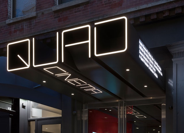
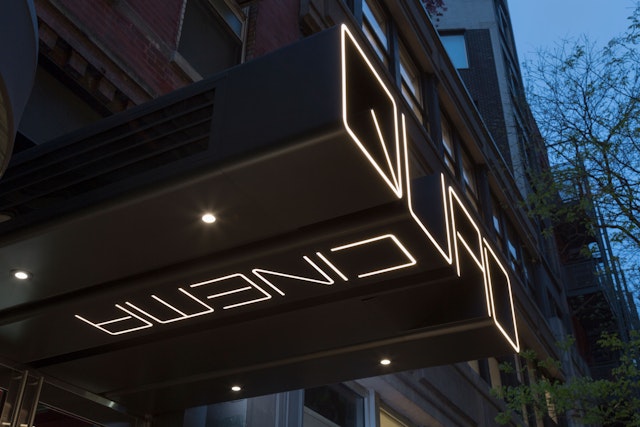
The identity and environmental graphics have been seamlessly integrated with the architecture. The new marquee is a dimensional version of the logo that projects from the building’s facade to create a striking presence on West 13 Street. The sculptural form instantly makes the Quad a landmark that looks unlike any other movie theater. Screening times appear on the sides of the marquee, and the word “Cinema” runs along the underside of the “U,” guiding visitors inside. Fabricated of aluminum, the monumental form of the marquee also extends back into the theater, through the ceiling of the foyer and into the lobby, where the name repeats on the reverse.
The designers helped guide the look and feel of the cinema interiors. The lobby greets moviegoers with a dynamic digital display wall, where sequences from classics in the Cohen Film Collection are intercut with information on showtimes and theater amenities. The 12- by 6-foot video wall is comprised of 32 flat screens, with clips simultaneously playing across different sections of the installation. The lobby also features a 50-foot concession stand and the new Quad Bar, adjacent to the cinema.
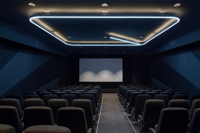
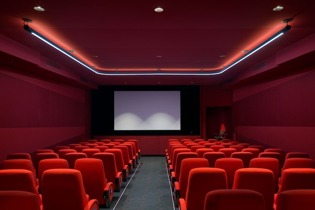
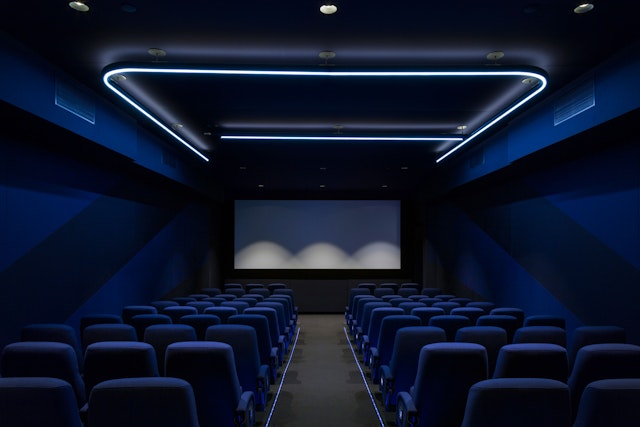
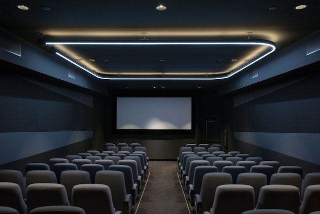
The viewing experience is enhanced in jewel-like screening rooms that are intimate and luxurious. Each letter in the name “Quad” has been assigned to an individual theater in the four-screen cinema, where it appears as large-scale LED lighting in the ceiling. Each auditorium also has its own color scheme from the brand palette of red, blue, black and grey, which appears on walls and seating.
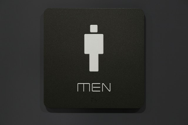
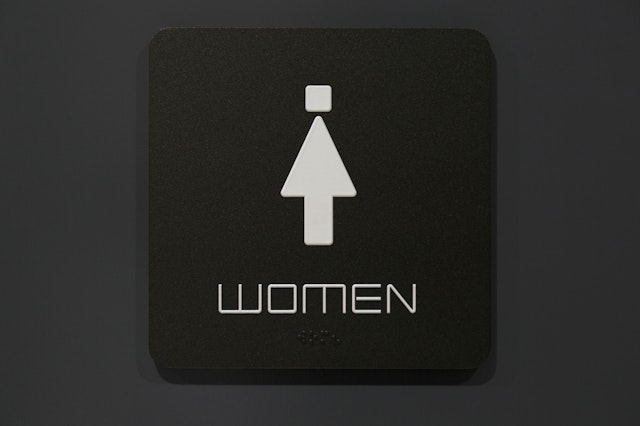
The Quad logo was extended into a modular signage system based on squares and illuminated typography. The team developed custom icons constructed of simple shapes for applications like restroom signage, and the identity is inlaid in tile on the Quad Bar floor. Secondary type in print promotions and the Quad website is set in the geometric sans serif GT Walsheim.
