The new identity is designed to strengthen the connection of the brand and its products with students, educators and administrators.

The visual language is bold, friendly and accessible, and reinforces the idea that each student is unique and on their own personal path.


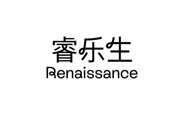
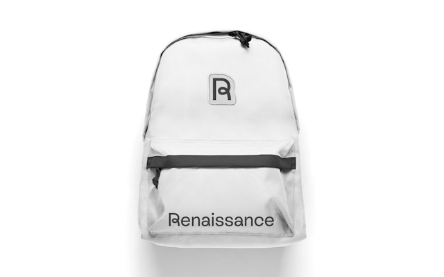
The looping letterforms give the brand a visual signature and convey that the software is intuitive and effortless, rather than complex and technical.


Renaissance is a global leader in pre-K–12 educational technology, providing teachers and administrators with assessment, reading and math solutions that help all students build a strong foundation for success. Established in 1986, the company is one of the most recognized and trusted brands in K-12 education, with products that reach more than 40% of US schools and more than a half million students in over 100 countries around the world. The company’s analytics-driven, integrated ecosystem enables schools and districts to benchmark student progress, and teach, plan, and respond to students’ needs in real-time with personalized instruction.
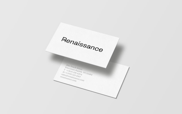
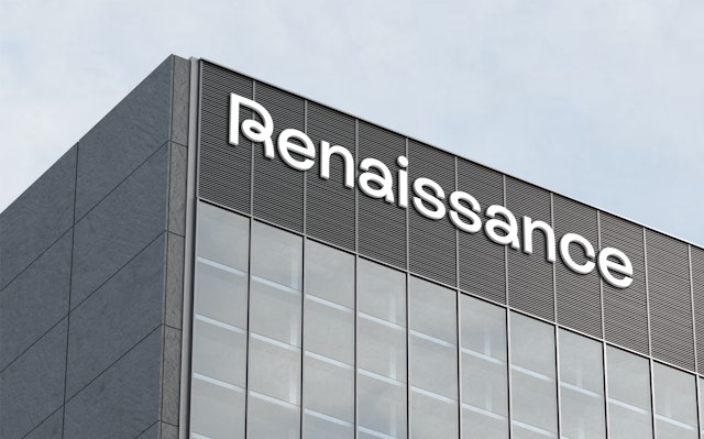
Pentagram has designed a new visual identity for Renaissance that helps strengthen the connection of the brand and its products with students, educators and administrators. The logo features a distinctive looping “R” that nods to the educational experience and the streamlined ease of the software. The friendly upper- and lowercase wordmark is set in a bespoke typeface, Renaissance Rebound, which extends the loops of the logo to other letterforms. The identity also establishes a cohesive brand architecture that helps tie together all of the company’s software solutions as part of Renaissance, and gives each its own updated symbol.
Pentagram worked closely with Renaissance leadership, the Blackstone Brand Transformation team, and strategists at Goodby Silverstein & Partners (GS&P) to refresh the identity and communications. The new identity marks a shift in the company from specific education products to full-service, integrated solutions that champion a teacher-centered ecosystem supporting the whole student.
Given the reach of Renaissance, the identity has a broad range of audiences that encompasses teachers, administrators, and local and state governments, as well as students from preschool all the way up through the 12th grade. One of the core ideas of the Renaissance platform is that educators––through the use of its interconnected tools for assessment, instruction and insight––are now able to clearly “See Every Student,” the theme of the rebrand launch campaign.
Nationwide, schools and districts are facing unprecedented challenges from teacher burnout, teaching vacancies and the pressure to deliver results. These were exacerbated by the Covid-19 pandemic, which saw most education temporarily moved online to digital platforms. To address these issues, solutions that cater to the unique needs of each student are essential.
“Our business has changed dramatically over the past few years,” said Sarah DiFrancesco, chief marketing officer at Renaissance. “The rebranding marks a new Renaissance, demonstrating how we help every student succeed by providing teachers and administrators with the digital tools they need to unlock personalized teaching.”
The new identity is bold, friendly and accessible, and reinforces the idea that each student is unique and on their own personal path. The simple gesture of the looping letterforms gives the brand a visual signature and conveys that the software is intuitive and effortless, rather than complex and technical.
The wordmark is intentionally straightforward, changed from the all caps of the previous logo to a more open and approachable mixed case with a single stroke weight. The proprietary typeface Renaissance Rebound Medium was customized from the assertive and dynamic sans serif Rebond Grotesque (from Extraset), the brand’s lead typeface. Secondary type is set in Tiempos Text, a contemporary editorial font from Klim Type Foundry.
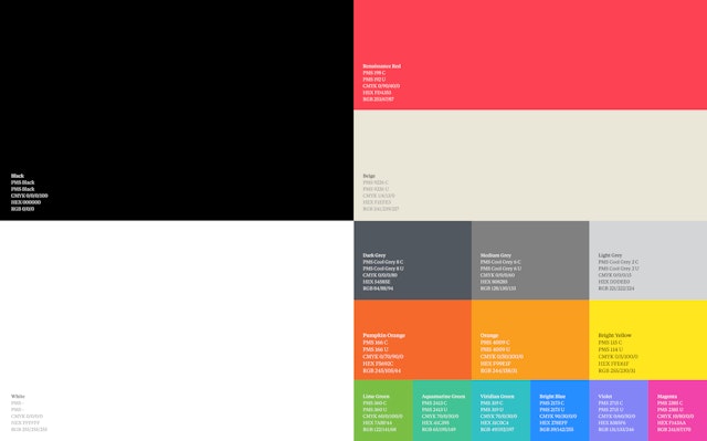
The primary brand color is a warm red that sets Renaissance apart in the category. The bold hue is balanced by a palette of black, white and warm grays––a clear and neutral background that serves as a foil for the powerful imagery and infographics.
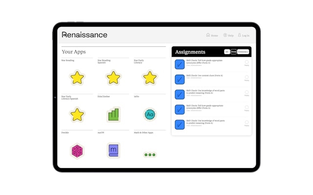
The logo provides the basis for a brand architecture that helps visually unify the company’s holistic portfolio of solutions, including Star Assessments, myIGDIs, myON, Accelerated Reader and Freckle, Lalilo and Nearpod. These products each already had their own brand equity, and the framework recasts their existing logos in the bright style of the new identity, making them look like part of the family.
In support of the “See Every Student” concept, Pentagram introduced a new photo direction centered around expressive, head-on black-and-white portraits. These bold, high-contrast images specifically focus on the faces of engaged students and their teachers, purposely highlighting the individual against a neutral background. A secondary photographic language depicts students in the context of their lives beyond screens, desks and classrooms, with images taken in light-filled spaces and often with non-traditional points of view.
The updated identity was introduced as part of the “See Every Student” campaign, along with a newly designed website, social media, advertising, trade show and conference activities.
Office
- New York
Partner
Project team
- Shigeto Akiyama
- Antonio Nogueira
- Rob Hewitt
- Gracia Lee
- Anna LaGrone
- Avery George
