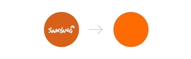

Samyang’s new brand strategy is centred around the idea of juxtaposition and contradiction—the past and the future, art and science, consumption and sustainability—and overall helps reposition the business as a much more future-facing and visionary group.


Samyang is South Korea’s earliest instant noodle manufacturing company. In 1963, it was the first company to introduce instant noodles to the Korean market, a staple food that has become one of the country’s favourite snacks.
As well as noodles, Samyang also manufactures a wide range of other food products such as dairy-based products, snacks, and sauces. Since 1972 it has owned Daegwanryeong, South Korea’s largest farm and Asia’s largest green pasture. Although one of Korea’s most recognisable instant noodle brands, Samyang wanted to increase awareness internationally and move towards becoming a global leader in food technology and sustainability.
To facilitate this, Pentagram was asked by Samyang to create a new visual identity that would communicate the company’s ambitious plans and vision for the future as it enters its next phase.
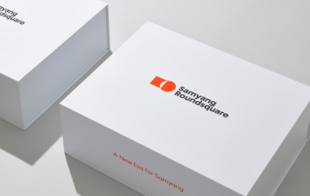
With the increased competition, changes in technology, and market challenges that Samyang was facing, a new strategic approach was needed. Samyang’s new strategy was centred around the concept of contradiction, and influenced the new corporate name ‘Samyang Roundsquare Group’, which was designed to unify and consolidate the different business areas that Samyang was now operating in. The strategy is centred around the idea of juxtaposition and contradiction—the past and the future, art and science, consumption and sustainability—and overall helps reposition the business as a much more future-facing and visionary group.
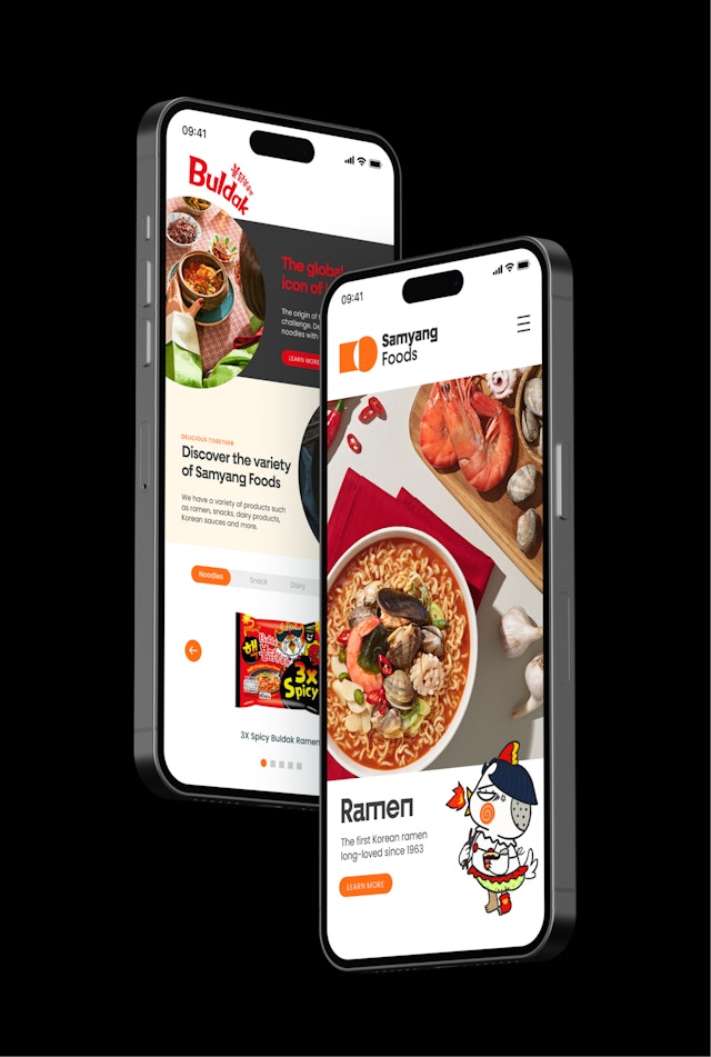
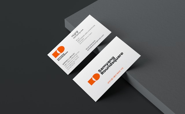
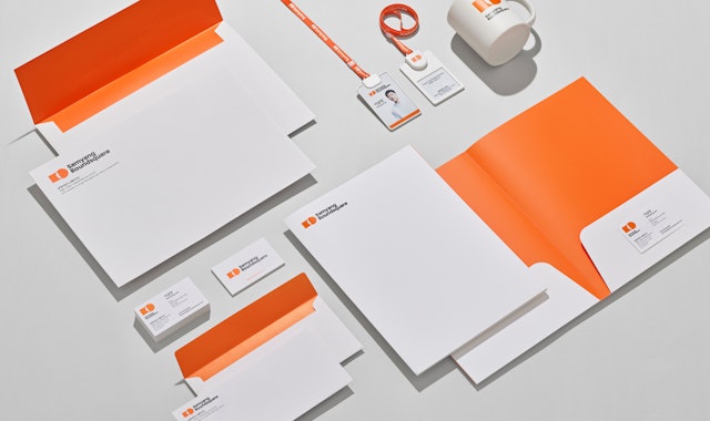
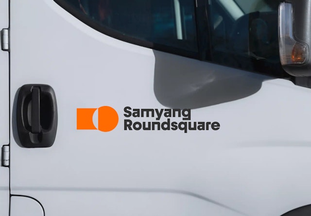
The brand identity focussed on the corporate symbol and wordmark, typography and colour palette. This was then developed into a visual style in collaboration with Cheil, who also helped develop the Korean (Hangul) applications of the brand. The project also included the creation of brand guidelines, packaging design templates for key products, and application templates such as presentations, documents and business cards.
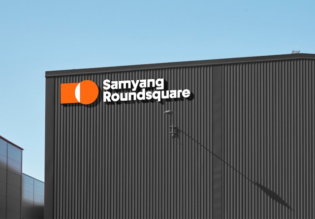
The design approach, and in particular the symbol, is a direct representation of the brand strategy and the inherent contradiction of the pure geometry of a square and a circle, reflecting the new name. The proportions of the symbol are born from the fundamental human geometry as seen in Da Vinci's Vitruvian Man drawing and provide visual balance, harmony and the connection between the square and the circle.
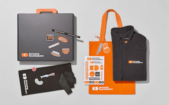
The team also designed a series of icons inspired by the round and square elements of the logo. A mix between curved and sharp elements gives the icons a distinct and characterful look, while still remaining highly legible at all sizes.
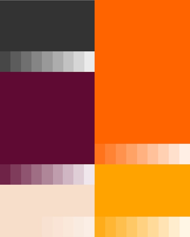
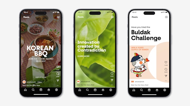
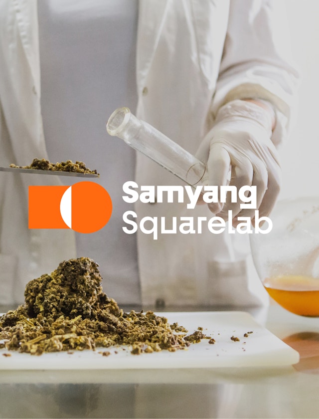
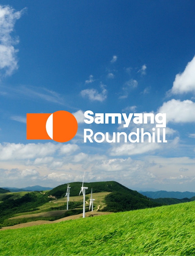
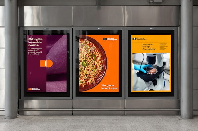
The core colour palette consists of charcoal and bright orange, with an extended palette of fresh orange and burgundy. Photography reflects the human side of the business, and the images aim to show the joy of both consuming and producing Samyang products.
The identity features a geometric sans called Fractul, which has two versions, a more traditional face, and an accompanying version with squarer characteristics which are used together to suggest the visual contradiction ‘Roundsquare’. The new identity has captured the idea of contradiction in a simple, ownable way which provides enough rigour and robustness to carry the brand forward for years to come.
Pentagram has helped to align the visual identity of the group and its affiliates across multiple sectors and markets, helping Samyang look to the future with a clear and distinctive voice, and stand out in a large and crowded global marketplace.
Office
- London
Partner
Project team
- Mariona Alegre
- Karolina Alvekrans
- Jack Brown
- Eoghan McMahon
- Daniela Perez
- Charlotte Selby
- Alex Wright