The new identity needed to capture the colorful spirit and rich heritage of San Antonio, a historically important Texas city 80 miles southwest of the State Capitol in Austin.



The distinct geometry of the library’s architecture also influenced the typographic direction of the new wordmark.


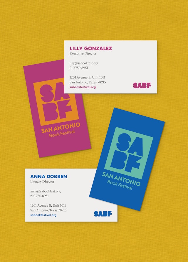


The new identity tools include a set of colorful, checkered and step-and-repeat patterns and a framing device where photographs and other imagery of the Book festival can be placed within the geometric SABF letterforms.


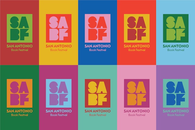
The identity system provides a spectrum of bold color combinations inspired by Mexican culture that add a bright festive quality to merch, promotions and publicity materials.


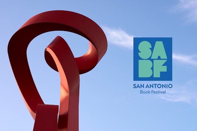

Pentagram has designed a new identity for the San Antonio Book Festival (SABF), an annual all-day event that features over 110 national, regional, local and emerging authors and welcomes more than 20,000 visitors annually. The distinct new logotype was unveiled in August 2023 and the full new identity system will make its official debut at the San Antonio Book Festival on April 13th, 2024.
Pentagram has a long, rich history with book festivals in the state of Texas. The Austin office redesigned the Texas Book Festival logo and brand identity system in 2017 and has been involved with the statewide, non-profit organization since its inception in 1995.
When DJ Stout, partner and principal of Pentagram Austin, was Art Director of Texas Monthly magazine, he got a call from Laura Bush (First Lady of Texas at the time) who invited him to be involved with the new literary festival she was starting. Stout served as a panelist for that first festival, held on the Texas State Capitol grounds in Austin, and is now an Advisory Board member and financial supporter of the annual event. In addition to creating the Texas Book Festival’s brand identity, the Austin office has designed most of the festival’s commemorative posters and print collateral, and is instrumental in the selection of the annual, honorary Texas Book Festival poster artist.
The San Antonio Book Festival was founded in 2013 as a program of the San Antonio Public Library Foundation and a sister organization of the Texas Book Festival. In 2019, the San Antonio Book Festival separated from the Library Foundation, and in 2022, the festival’s Executive Director Lilly Gonzalez reached out to Pentagram Austin to develop a new identity for the festival to mark its tenth anniversary. The new identity needed to capture the colorful spirit and rich heritage of San Antonio, a historically important Texas city 80 miles southwest of the State Capitol in Austin.
At the kickoff meeting in San Antonio, Gonzalez and her team made it clear they didn’t want the new identity to reference the Alamo, a much-revered Texas icon but a symbol that has been overused in the “Alamo City.” They also didn’t want the new identity to be an evolution of their previous one, a mark in the shape of the equally iconic “Rose Window,” a beautiful architectural detail at the historic Mission San José. Gonzalez also asked the design team to stay clear of clichés like the colorful “papel picado” banners found in Mexican restaurants and the landmark Tower of the Americas.
The design team began by researching the identities of book festivals all over the country. The majority of peer group logos feature graphic interpretations of book spines lined up on a shelf, stacked volumes and fluttering pages, but many of the identities fail to capture the unique personalities of the cities where the festivals reside. San Antonio is one of the most colorful, culturally rich places in the American southwest, with a deep Spanish and Mexican heritage. The Pentagram team wanted to capture the city’s unique personality and communicate the literary focus of the book festival at the same time.
Early on, the designers decided that a type-based logotype would be the perfect way to avoid cliché symbolism and help the San Antonio Book Festival identity to stand out among its peers. The design team also liked that the SABF acronym for the festival was four letters. When stacked on two lines in a symmetrical configuration, the letters resemble a bookplate or a publisher’s colophon on the spine of a book.
Another source of inspiration was the San Antonio Central Library where the book festival is held. The iconic building was designed by renowned Mexican architect Ricardo Legorreta in 1995. True to Legorreta’s signature style, the Central Library uses light, geometry, humor and vibrant colors to create a unique building that’s a bold departure from traditional library design. The playful use of geometric shapes, including three-dimensional spheres, triangles, sharp angles and particularly rectangles and squares, inspired the configuration of the new identity, and the main color of the library, lovingly referred to as “enchilada red” by the locals, inspired the color palette.
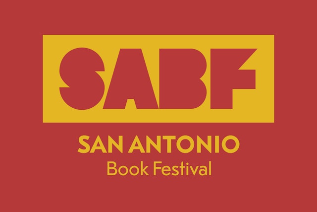
The distinct geometry of the library’s architecture also influenced the typographic direction of the new wordmark. While researching the history of Mexican art and typography, the Pentagram team discovered a hand-crafted, geometric font used on posters and books in the 30s. In addition to representing San Antonio’s significant cultural influence from its neighbor south of the border, the designers liked how the geometric typeface felt as if it was drawn by Legorreta himself.
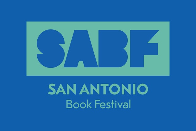
The final, primary wordmark features the acronym SABF set in the 30s-era geometric font and contained in a square. Horizontal, one-line versions of the logotype are available as well. The main colors of the new mark are a rusty red (“enchilada red”) and a bright yellow, two prominent colors found on the facade of the Central Library. The identity system provides a spectrum of bold color combinations inspired by Mexican culture that add a bright festive quality to merch, promotions and publicity materials.
Additionally, the new identity tools include a set of colorful, checkered and step-and-repeat patterns and a framing device where photographs and other imagery of the Book festival can be placed within the geometric SABF letterforms.
Office
- Austin
Partner
Project team
- Michelle Maudet
- Sierra Walton
- Evan Eastep
Collaborators
- Zach Lyons, photography
