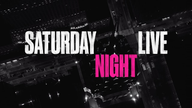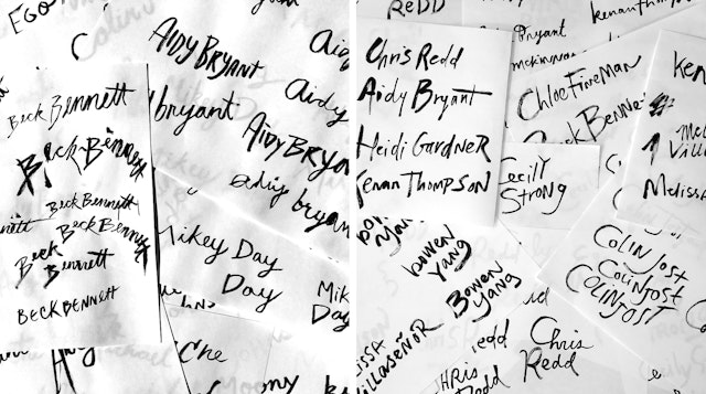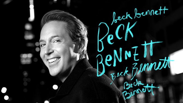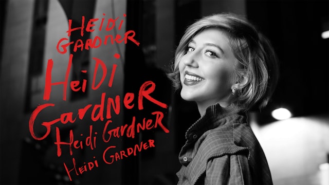

The titles incorporate hand-drawn typography for the first time and have a more intimate, personal feel that reflects the current moment.


The titles combine still images with short bursts of movement, creating a stop motion-like effect that feels hand-crafted.
Saturday Night Live launched its 46th season in October 2020 with its first shows to bring the cast back to Studio 8H at 30 Rock since the Covid-19 pandemic halted production in spring. Pentagram created a new opening title sequence for the season in collaboration with iconic SNL photographer Mary Ellen Matthews and SNL film unit director Paul Briganti. The legendary sketch comedy show is built around the camaraderie of its cast and is returning to audiences who have experienced months of social distancing, separation and anxiety and are looking to reconnect. To capture this idea, the titles incorporate hand-drawn typography for the first time and have a more intimate, personal feel that reflects the current moment.
Pentagram has worked with SNL on multiple opening sequences over the years, most recently in 2018 for the show’s 44/45th seasons. The title sequence traditionally depicts the cast in various locations around New York and makes the city feel like a party, helping to set a joyful tone for viewers as the show begins.
SNL is a cultural touchstone and its return has relevance as the world tries to reset. With the new opening, SNL wanted to recognize the extraordinary circumstances of the pandemic and show that NYC––which is practically a cast member itself––is still alive and ready to get through this.
Season 45 wrapped up with three episodes of “SNL at Home,” in which individual cast members taped their own skits remotely in quarantine. This season returns SNL to its true home at 30 Rock and the sequence depicts the cast coming back to “reopen” the show, reunite and be together again. The team wanted to create something that felt focused and yet dream-like, like the city as it comes back to life.
Each of the cast members appears in a different location in and around 30 Rock as they return, traveling via foot, taxi, subway and bike (with masks!) The cast and city are shot in black and white, with only one moment of color––when Kate McKinnon points up to the NBC Studios marquee and it lights up. The titles combine still images with short bursts of movement, creating a stop motion-like effect that feels hand-crafted.
The logo is hand painted and the cast names are rendered in colorful and expressive hand-drawn type that fills space around their portrait––all of which is designed to give the open a personal and intimate feel at a time in all our lives we could use some human connection. The designers sketched studies of the various names to develop the different tableaus.
The lo-fi technique was partially inspired by the show’s opening titles in the 1970s, when the city was also weathering hard times and everyone pulled together. Those titles featured hand-painted montages by Edie Baskin that combined slow dissolves of stills with classic portraits of the cast. The new sequence reinvents the approach with imperfect handwriting in vibrant, punk rock colors layered on top.
The process of creating a new opening title sequence is usually as fast-paced and spontaneous as SNL’s infamous weeklong production schedule. By necessity this year was different: Covid-19 safety protocols were crucial and every aspect of the project required detailed planning. Precautions included masks, social distancing and daily tests for the shoots. Safety first!
Office
- New York
Partner
Project team
- Emily Oberman, director
- Laura Berglund
- Jase Hueser
- Matt Varner
- Zoe Chrissos
- Daniel Zender
Collaborators
- Mary Ellen Matthews, director
- Paul Briganti, director
- Sarra Idris, editor
- Dave Eber, assistant animator
