
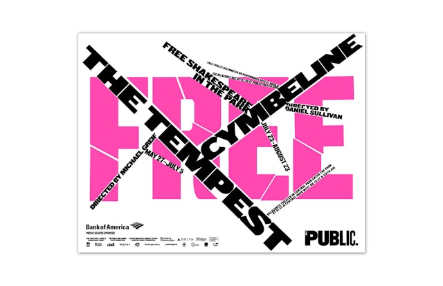

Playing off the word ‘free,’ this year’s design is handmade and exists as lines of sliced typography that are cut through photography or large-scale words.

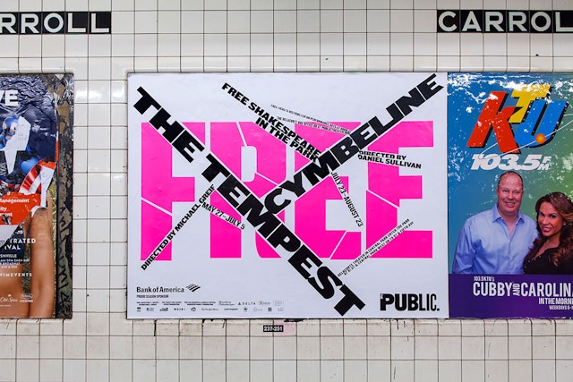
Pentagram's iconic Public Theater identity goes to pieces in the campaign for the 2015 season of Shakespeare in the Park, the annual free performances presented by The Public Theater at the Delacorte Theater in Central Park. The summer program pairs "The Tempest", Shakespeare’s stormy classic about the magic of storytelling, with the fairy-tale romance "Cymbeline".
The campaign for the summer performances previews the look of the graphics for the Public’s 2015-2016 season. The Shakespeare in the Park poster campaigns used to exist apart from the fall season campaigns, but over the past few years the graphics for the Public’s most famous program have helped establish the seasonal look for all aspects of the institution.
Playing off the word “free,” this year’s design is handmade and exists as lines of sliced typography that are cut through photography or large-scale words. The tempest of type creates a mini-identity that both dramatically updates and functions within the familiar Public Theater brand.
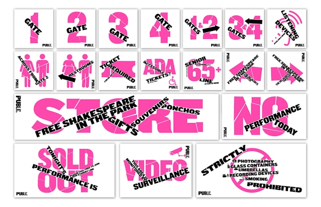
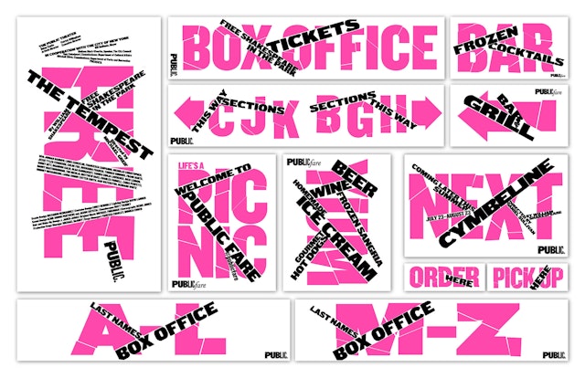
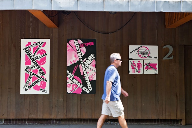
The Shakespeare posters are designed by Pentagram, and then extended and elaborated into a full system of season graphics by Kirstin Huber, the Public’s art director, and her in-house team of designers, Tammy Shell (graphic designer and photographer) and Kameron Neal (junior graphic designer). Working with Pentagram's oversight, Huber skillfully rolls out each season with remarkable invention, building a full visual personality in graphics that appear on posters, the season brochure, print advertisements, the redesigned website, and banners for the restored façade, as well as promotional materials for Joe’s Pub.
In our two decades-plus designing for The Public, this flexible approach to the graphics has helped pioneer the development of dynamic identity systems that can adapt to potentially hundreds of applications. Cultural institutions that have robust programming need both strong institutional identities and the ability to differentiate their various programs, events, initiatives and seasons. With countless expressions in print and digital media, as well as environmental installations like sniped posters on the street, identity is “always on” and meets audiences wherever they are. An institutional identity must look as good in an ad in a Google search as it does in signage on a front of a building.
At the Public this means each play or event has its own poster image within a seasonal look that enables a myriad of digital and print communications to hang together. Each year’s season design changes in color and in the use and spirit of Knockout, the font of the Public identity. For instance, last year's Shakespeare in the Park posters juxtaposed the play titles in slanted typography, which was expanded into a full season of skewed type for the 2014-2015 campaign. A similar approach was used in 2013, when the overprinting effect of the Shakespeare posters led to a season of red, blue and yellow graphics.
Client
The Public TheaterSector
- Entertainment
- Arts & Culture
Discipline
- Signage & Environmental Graphics
- Campaigns
