


The goal of the redesign was maintaining the image of a modern global brand while also reflecting the heritage of a company that has been in business for almost 300 years.


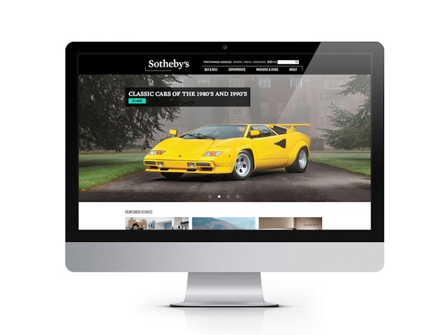
Dramatically cropped, the oversized photographs suggest both a macro and micro view of the art world and provide a compelling entry point to content about the auction house and its activities.


Established in 1744, Sotheby's is one of the world’s oldest and largest auction houses, and the oldest company listed on the New York Stock Exchange (ticker symbol: BID). From its roots as a book dealership, the auction house has grown over the past three centuries into a global company that ranks alongside the great art museums in the breadth of its influence and expertise. Pentagram has been collaborating with Sotheby’s over a two-year period to bring stronger coherence to the full spectrum of the company’s identity and communications, including its website, catalogues, and magazine. Pentagram worked closely with Sotheby’s leadership, collections specialists, and design and technology teams in New York and London to develop the comprehensive program.
The project was initiated in 2011 as a redesign of the Sotheby’s website, but the team quickly realized a broader review of all communications materials was needed. Sotheby’s has a truly global outreach: Founded in London and currently headquartered in New York, the company also has salesrooms in Paris, Zurich, Milan, Geneva, Beijing, Hong Kong and Doha, along with a network of offices and consultants around the world. Sotheby’s was the first international fine art auction house in Russia and China, and the first to hold online auctions.
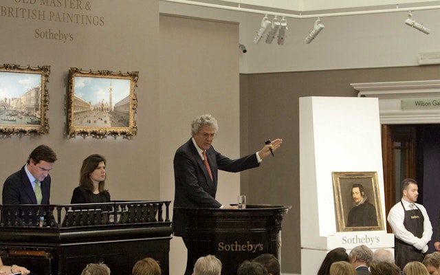
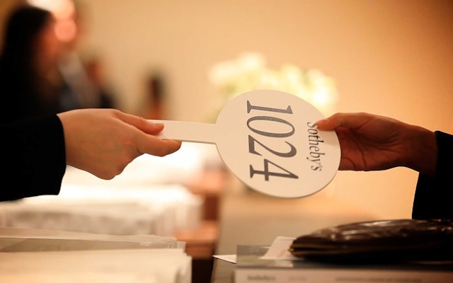
The new system establishes a cohesive look and feel across the company’s diverse locations and programs. The goal of the redesign was maintaining the image of a modern global brand while also reflecting the heritage of a company that has been in business for almost 300 years. The designers developed a new wordmark (shifting from the previous Gill Sans-based sans serif to Mercury) and new design standards for stationery and related print collateral, auction catalogues, Sotheby’s magazine, the Sotheby’s website and app, advertising and promotions, signage and environmental graphics, and auction ephemera like aprons and bid paddles.
A suite of typefaces ties the system together across various channels. Mercury is the primary typeface, with Benton Sans as the secondary font. Freight is a tertiary typeface employed for display and headlines. Miller commissioned the acclaimed type designer Akira Kobayashi of Monotype to draw custom Chinese characters for Sotheby's Hong Kong wordmark that would pair gracefully with the Mercury.
The identity is supported by a refocused editorial approach that showcases immersive, contextual imagery and the role of artists. Editorial content for the website and publications is shaped to create stories that contextualize the auction house and its objects within a larger historical narrative about art, collecting, and living with art. The new editorial direction is evident in the reinvigorated approach to imagery created for the website and the magazine, as well as in the production of new video segments. Art, artists, specialists, and collectors are portrayed in environments like studios, galleries, and the homes of collectors to tell a larger story about living with art.
The identity was first implemented on the Sotheby's gateway website, which has been updated with a dynamic and engaging design that immediately immerses users in the world of art. The splash page features a slideshow of large-format images in a cinematic “widescreen” presentation. Dramatically cropped, the oversized photographs suggest both a macro and micro view of the art world and provide a compelling entry point to content about the auction house and its activities.
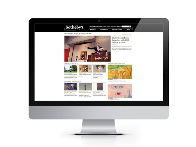
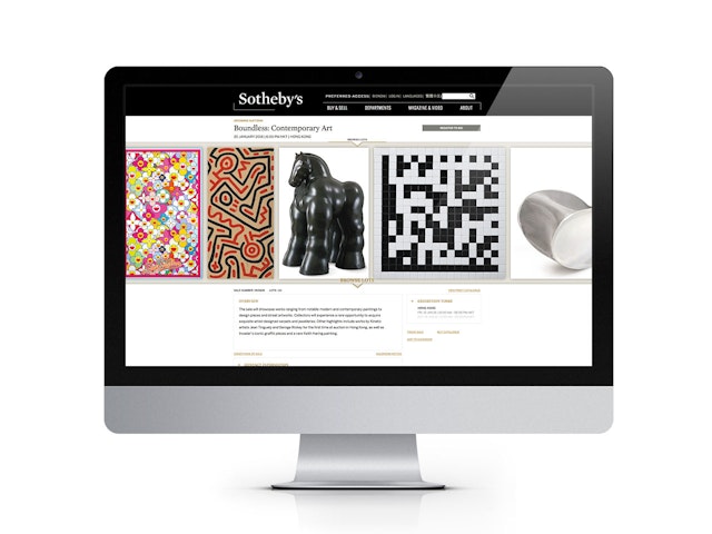
The new design introduces a more intuitive navigation that is elegant and easy to use. Various departments and functions have been reorganized into simplified channels of information—“mega menus” that also accommodate fine-grain navigation. The layout uses a modular format that surfaces featured stories alongside auction announcements and incorporates images and video throughout. A list of the many departments functions as a kind of site map, allowing collectors to quickly find their field of interest. Each department page displays an overview of activities, with a highlighted auction or exhibition followed by news of featured lots, results from recent sales, and a selection of specialists in the area. Artworks can be viewed in clearly defined lists or slideshows, and users can track the objects and add them to their own personal catalogues to download or print.
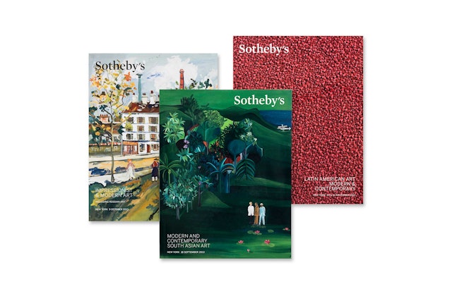
Print has always been a primary expression of Sotheby’s identity; the company publishes hundreds of auction catalogues annually—a book for almost every day of the year. The new identity includes a complete redesign of the publishing program; as with the other elements, the goal was to establish a consistent look and feel that would support Sotheby’s position as the leader in its category. While the catalogues are important selling tools, they also function as a comprehensive archive of the company’s auctions and other activities, as well as a historic record of the art world.
The designers developed a uniform format for the catalogues that utilizes the new logo as an insignia in one corner of the covers. Interior layouts are clean and minimal, with vibrant images silhouetted against white. Characteristic details are shown in double-page spreads with full-bleed images. The font Benton is used for titles, headlines and text. The format has also been implemented in the Sotheby’s catalogue app for the iPad, a digital version that instantly puts the publications at the fingertips of collectors.
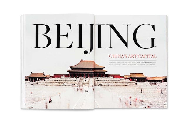
The team also created a new format for Sotheby's magazine, a monthly review of the company’s activities and the international art scene. The magazine presents a lively mix of articles about artists, exhibitions and collectors, along with announcements of Sotheby’s auctions and news of other events. Conceived as a kind of hybrid between an art journal and an exhibition catalogue, the redesigned publication feels more substantial, with a unique size and quality papers, including a matte finish cover. The redesigned layout features a flexible, modern grid that opens up the pages to let text and images breathe. The graphic device of a black bar is used to organize layouts and set off headlines. The magazine employs the full range of typefaces, with Mercury, Benton and Freight all used as display fonts and Mercury and Benton used for text and captions.
Office
- New York


