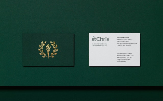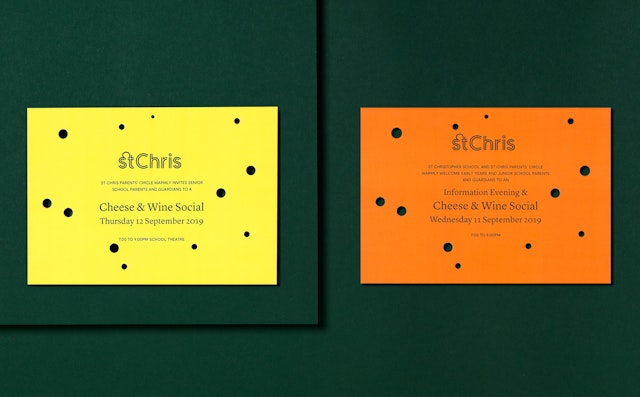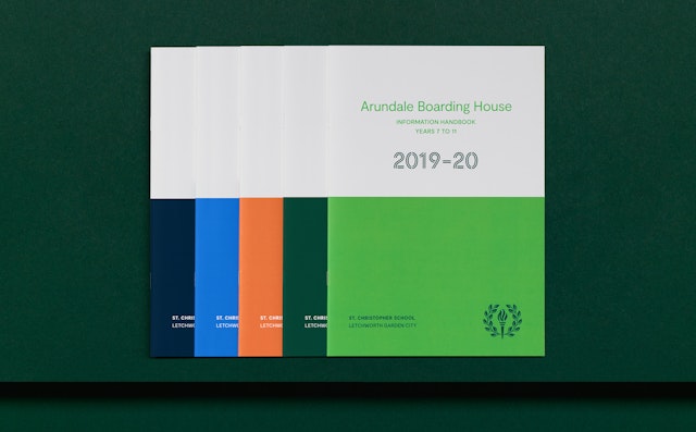


With a subtle Arts and Crafts influence, the St Chris crest was redrawn to make it work much more effectively across a variety of media.


Pentagram also created a new brand narrative for the school, which includes a playful pair of taglines that reflect the school’s ethos of linking enjoyment to achievement.


Now comprising of different shades of green, the simplified colour palette references St Chris’ roots in the history of Letchworth Garden City.


Based in Letchworth Garden City, St Chris is an independent school for boys and girls aged 3-18 that takes a progressive approach to education. Pentagram worked with the principal, governors, teachers and students to refresh the school’s brand.
Set on a leafy 25-acre campus in the heart of the UK’s first-ever garden city, the school believes that developing students into truly fulfilled individuals is the best way of achieving excellent exam results. St Chris is more informal than most other schools: students do not wear uniforms, address teachers by their first name and are encouraged to have a voice in how the school is run. It is also unusual in that it provides only vegetarian meals for its students and staff.
Pentagram’s challenge was to modernise the brand and highlight its alternative ethos while acknowledging the school’s 100-year history, along with the ideas and opinions of its staff and students.
Key to the new brand identity is the change of name. While the school’s formal name is St Christopher School Letchworth Garden City, the name ‘St Chris’ is burned into the collective consciousness of everyone at the school and in the local area. Pentagram suggested adopting the shorter version as the school’s official brand name – in a way formalising the more informal brand identity which already existed.
Pentagram’s design team then created a St Chris logotype from scratch, giving the school a bold new identity that enables it to stand out in the education market. St Chris was founded shortly after Letchworth Garden City was built and embodies many of the same utopian principals. As a nod to St Chris’ notable heritage, Pentagram retained the school crest as part of the overall visual identity. With a subtle Arts and Crafts influence, it was redrawn to make it work much more effectively across a variety of media.
Pentagram also decided to simplify the existing colour palette. Now comprising of different shades of green, it references St Chris’ roots in the history of Letchworth Garden City. The crest is now gold, giving the new identity a more established feel.
A bespoke inline typeface that echoes the more graphic qualities of the redrawn crest was created, this adds a modern feel to the identity and contrasts with the crest's more formal look. The St Chris wordmark has a distinctive ligature which complements the new, more informal approach.
Pentagram also created a new brand narrative for the school, which includes a playful pair of taglines that reflect the school’s ethos of linking enjoyment to achievement. This messaging was used in the press release announcing the new brand and quoted extensively in subsequent newspaper articles.
When the new St Chris brand was revealed during morning assembly, staff and students gave it their loud and passionate approval.
