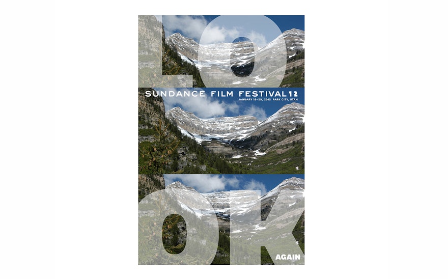
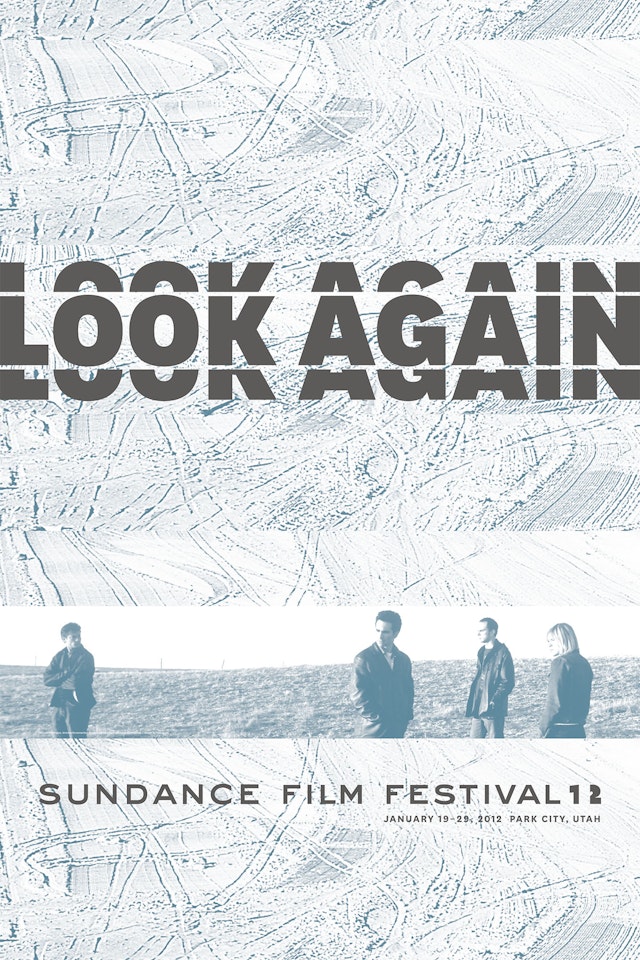
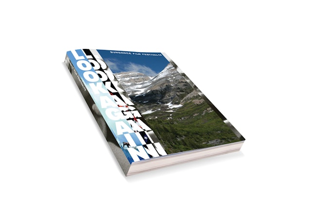
For the identity, the designers created a fragmented treatment of the ‘Look Again’ tagline that suggests a shifting of perception or one’s scope of vision, and frames of film slipping through a projector.

Established in 1978, the Sundance Film Festival is produced by the non-profit Sundance Institute, founded by the actor and director Robert Redford to discover and support independent film and artists. Noteworthy recent films like “Marcy Martha May Marlene,” “Like Crazy,” “Being Elmo” and “Another Earth” were all honored with awards at the 2011 festival, and Sundance has been instrumental in launching the careers of directors like Steven Soderbergh, Darren Aronofsky and Quentin Tarantino.
Pentagram created the bold graphic identity for this year’s festival, organized around the theme “Look Again.” Each year Sundance invites filmmakers to alter perceptions with their films, and Redford and the marketing team at Sundance developed the "Look Again" tagline after being inspired by a quote by Henry Miller: “One’s destination is never a place, but rather a new way of seeing things.” The theme captures the mission of Sundance and the spirit of independent film.
“We wanted to say something simple about the power of film, and invite people to approach the Festival—and film in general—as a rich and wonderful opportunity to see things a little bit differently,” says Jessica Buzzard, Director of Marketing at Sundance. “We really responded to the idea of seeking out experiences that can change perspectives or ideas, and we happen to believe that seeing a film can be one of those experiences.”
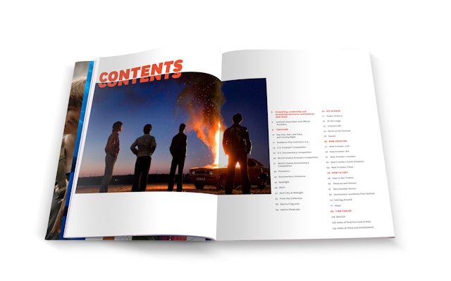
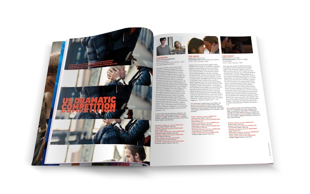
For the identity, the designers created a fragmented treatment of the “Look Again” tagline that suggests a shifting of perception or one’s scope of vision, and frames of film slipping through a projector. In the campaign, this typography is paired with images of the stunning landscape surrounding Park City and stills from Sundance films, capturing both the remarkable environment of the Festival and the cutting-edge quality of the films.
The designers experimented with varying degrees of “splicing” of the display type and image to properly create the fragmented effect. The overlapping strips are carefully spaced to create a consistency of color and texture and ensure that the type is legible. The font National is used throughout the campaign, and the “Look Again” tagline may appear in horizontal or vertical orientations. Graphics appear in a bright color palette of black, orange and yellow, with secondary colors of blue and green. The designers also developed a version of the Festival logo with a special “12” that complements the spliced type of the tagline.
The graphics will have a starring role at Sundance. “Our environmental graphics program really does take over Park City for the Festival, so people will be encouraged to ‘Look Again’ many, many times,” says Buzzard. The designers created graphic standards that the Festival could use to cohesively implement the identity across various applications. In addition to banners, the graphics will be applied to merchandise, bumpers shown before the featured films and the Sundance website. As part of a Sundance tradition, the team created an official poster for the Festival and limited edition art print that are available for purchase.
Office
- New York
