
The look and feel of the redesign takes its inspiration from newspapers and temple newsletters traditionally so important to the community.

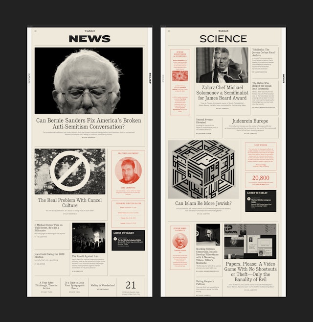
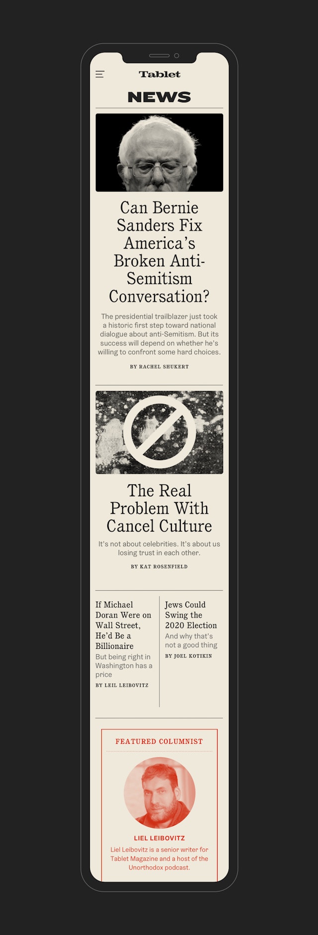
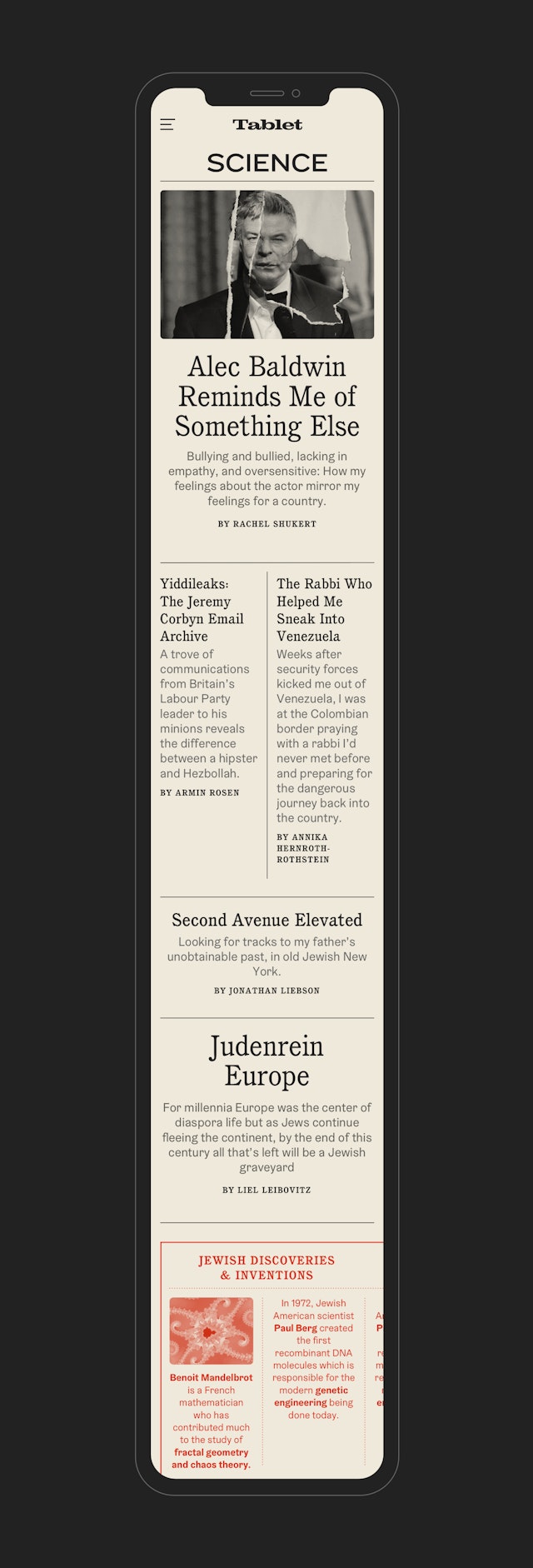
Navigating via the ‘Scroll’ gives readers the opportunity to browse the section fronts before diving deeper, similar to a multi-sectioned Sunday paper.

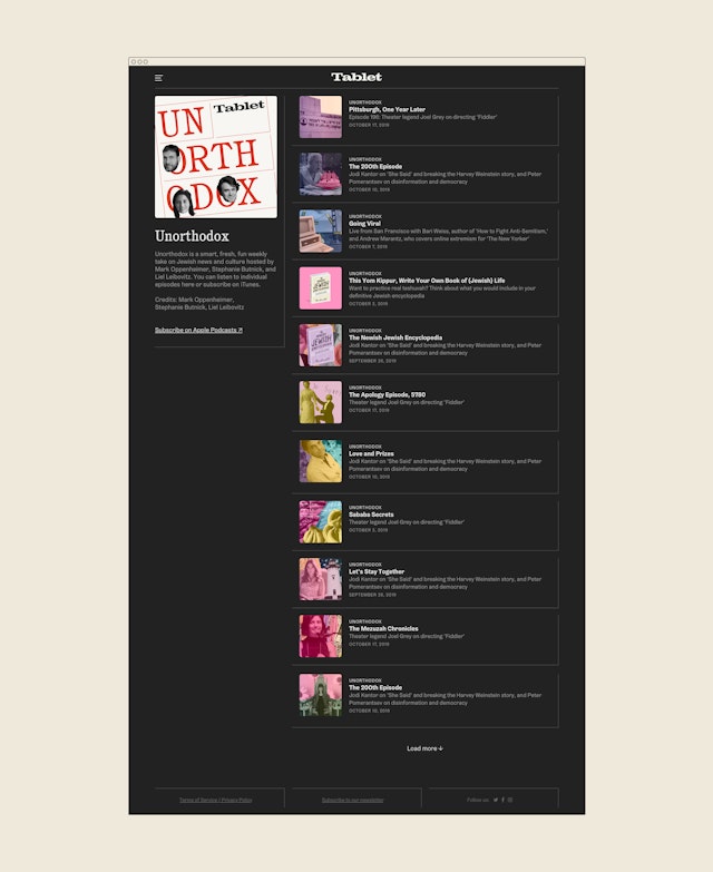
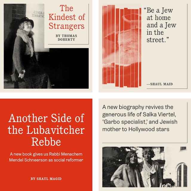
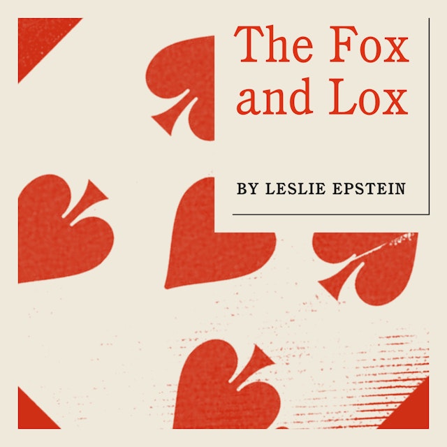

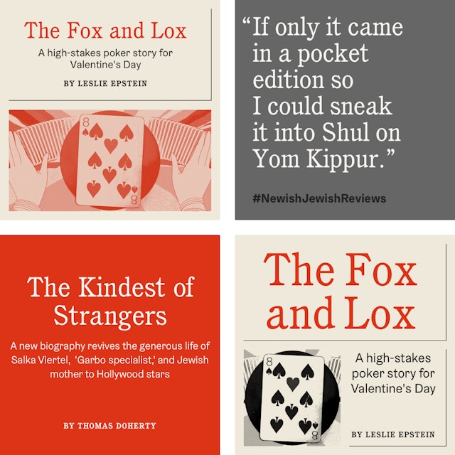
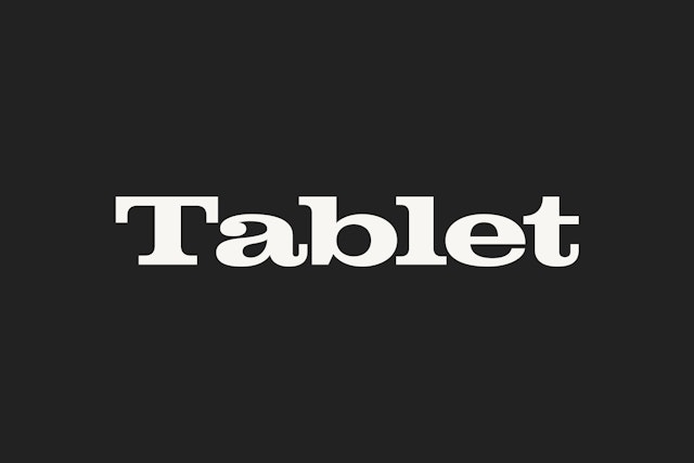
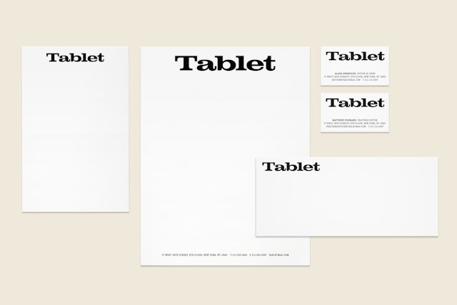
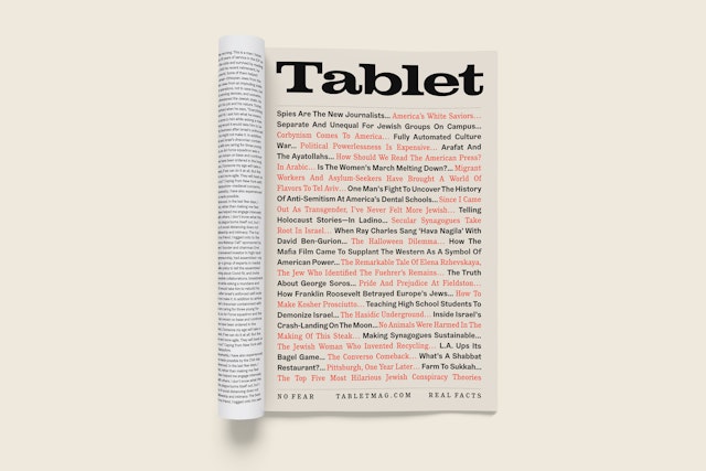
The custom-drawn logo shows more swagger with muscular letterforms that have a brash New York City character and soft warmth.
Tablet is an award-winning online publication that explores Jewish life and culture in all its diversity. Pentagram has collaborated with Tablet on a comprehensive redesign of its website, including an update to its brand identity. The new design helps the platform better display its expansive coverage, creating departments and a richer experience for readers. It also serves to surface some of the publication‘s deep 10-year archive, much of which is evergreen content. The look and feel of the redesign takes its inspiration from newspapers and temple newsletters that have traditionally been so important to the community.
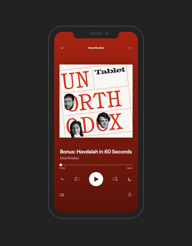
Pentagram worked closely with Tablet editor-in-chief Alana Newhouse and her team on the strategy and creative direction for the relaunch. In the decade-plus since it first debuted in 2009, Tablet has grown from an niche online journal with a focus on religion, politics, arts and culture into a wide-ranging platform with an output that includes books and podcasts like “Unorthodox,” the world’s leading Jewish podcast. (The Pentagram team previously designed a Tablet print magazine published by the site.)
Tablet is known for its long-form essays and thought pieces, but over the years found itself wanting to appeal to a broader audience and highlight more everyday topics like food and sports, all with the smart, opinionated attitude its readers have come to expect. The site wanted to offer a place where people could connect with Judaism on a regular basis and build a sense of community, in a role more like a newspaper.
The creative team envisioned the site as a useful guide to the incredibly varied experience of modern Jewish life. The approach is in line with The Newish Jewish Encyclopedia: From Abraham to Zabar’s and Everything in Between, “a guide to all things Jewish (and Jew-ish)” published by Tablet in 2019, as well as its latest publication, The Passover Haggadah.
The authoritative voice starts with the redesigned Tablet nameplate, which shows more swagger in a custom-drawn logo based on the slab serif typeface Clarendon. The muscular letterforms have a brash New York City character but with soft warmth.
This engaging personality carries through to the website design. For inspiration, the team looked to the vernacular of historical American Jewish publications, including the original Yiddish Jewish Daily Forward, as well as Lower East Side theater posters. A secondary navigation—the “Scroll”—provides an opportunity for readers to browse the section fronts before diving deeper, similar to a multi-sectioned Sunday paper.
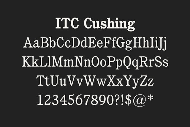
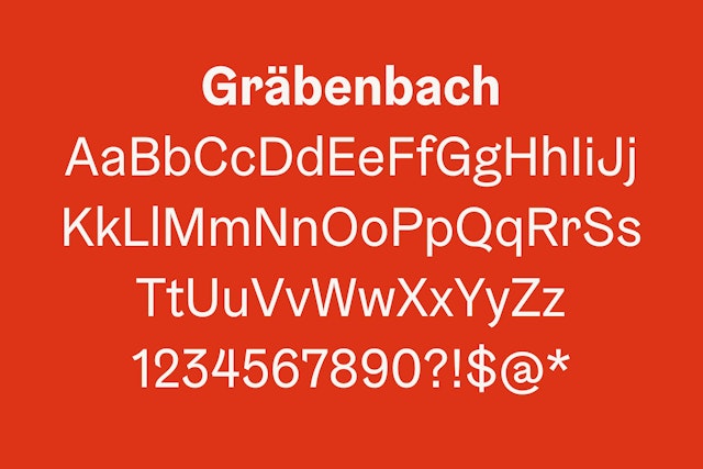
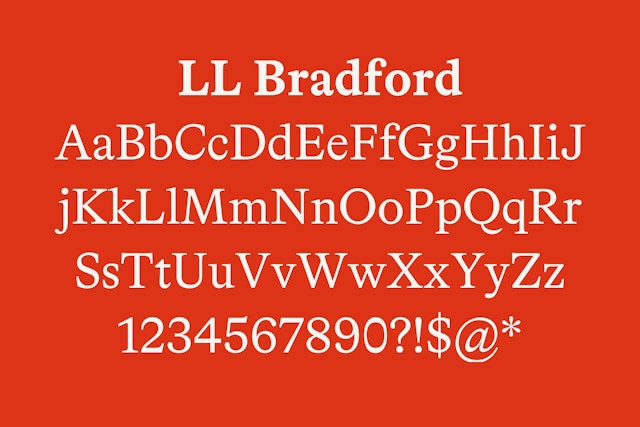
Each section has its own type treatment that gives it a distinct identity but still feels like part of the Tablet family. The designers assembled a varied suite of typefaces that nod to period sources. Headlines are set in the warm ITC Cushing, and supporting type in Gräbenbach, a sans serif that features details inspired by brush-painted signs. Article text is set in the versatile and highly readable serif LL Bradford.
The background color is a newspaper-y beige, which gives the site a visual softness akin to ink on newsprint. Images appear in black and white, then become color on rollover. A series of “widgets” are placed like small sidebars or classified ads among the blocks of articles. Some offer timely and relevant information on topics like holidays, food and community events, with details like sundown on shabbat geo-located for the reader. Other spots feature pull quotes, various marginalia and infographics, or links to Tablet podcasts and events.
The flexible, varied grid is designed to accommodate a wide range of content without endlessly repeating the layout. The structure is entirely modular, with headlines, titles and bylines set within the articles blocks, so editors can easily compose the pages themselves. A special “hero mode” format for big news stories and holiday-themed editions takes coverage across the full width of the site’s homepage, a la the front page of broadsheets.
Office
- New York
Partner
Project team
- Shigeto Akiyama
- Austin Maurer
- Elyanna Blaser-Gould
- Laura McNeill
- Ryan Smith
