

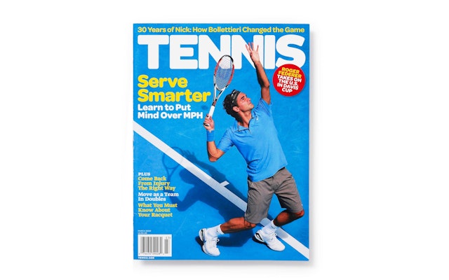
Drawing from the visual language of three decades past, the designers merged it with sporty, bright and youthful colors, alongside bold photography, to give Tennis a more contemporary look that would still appeal to its established audience.


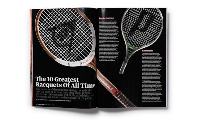


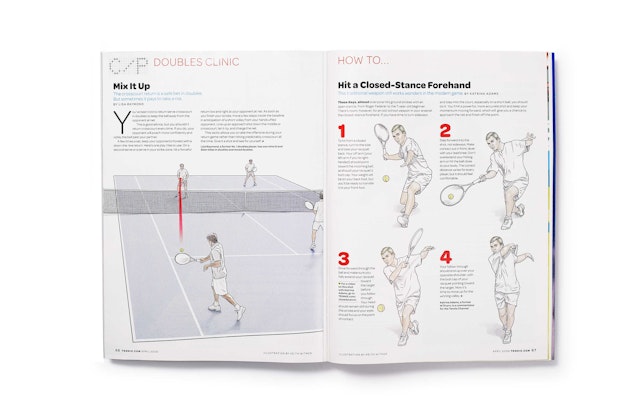
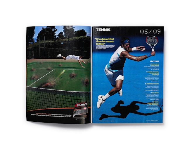
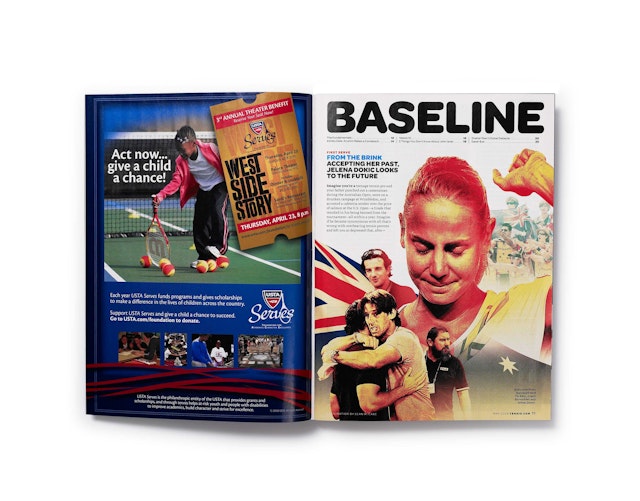
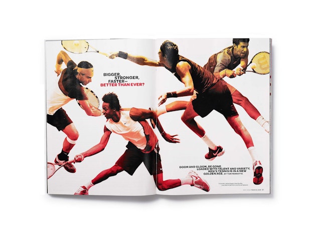
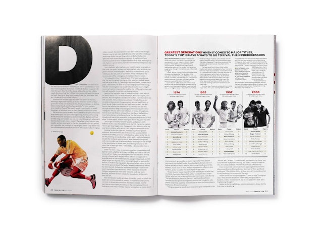


When James Martin assumed the position of editor of Tennis magazine in 2009, he chose Pentagram to bring back the publication's swing. Martin and art director Gary Stewart teamed up with Pentagram to rediscover the magazine’s youthful spirit. The designers found new inspiration, ironically, in the archives of Tennis itself. They wanted to invoke the intensely action packed and competitive glory days of tennis—those of John McEnroe, Björn Borg, & Jimmy Connors—but with fewer short-shorts. Drawing from the visual language of three decades past, the designers merged it with sporty, bright and youthful colors, alongside bold photography, to give Tennis a more contemporary look that would still appeal to its established audience.
Pentagram first provided Tennis with a new font family to draw from. Working with designer Rami Moghadam, the team created a custom logo for the masthead, based on the rounded fonts and typographic language of the mid-seventies to early eighties. Moving away from the generic and static Helvetica, the main font became Omnes, modified by Joshua Darden of Darden Studios. The new faces combine the sport’s outdoor energy with the soft springy roundness of a tennis ball; you can almost hear it bounce on the white space.
Along with the typography, the imagery has undergone some changes. Dynamic visuals aim to highlight the action and make use of dramatically angled and energetic court shots, as well as the amazing athletic bodies of the players. The “Complete Player” section has some of the team's favorite new elements. Silhouetting and clipping, mixed with technical info-graphic overlays, clarify the imagery while eliminating redundant and distracting background elements, emphasizing the section's focus as a player's manual.
Where illustration is used the Pentagram team decidedly stayed away from line art in favor of a softer hand-drawn look. It’s slightly retro, mixing playfulness with communication, and maintains a consistent harmony with the overall new style.
With its bold new look Tennis has been invigorated with a new sense of purpose, style and balance. Working with Pentagram, the magazine has not only improved consistency, clarity and navigation across its pages, but has brought a new energy to the game.
Office
- New York
