The Coterie is a new platform created to help founders, particularly in the tech industry, use their equity in ways traditional banks are not equipped to do.
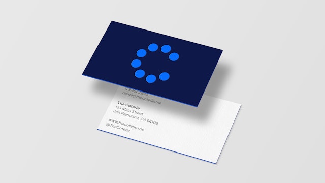
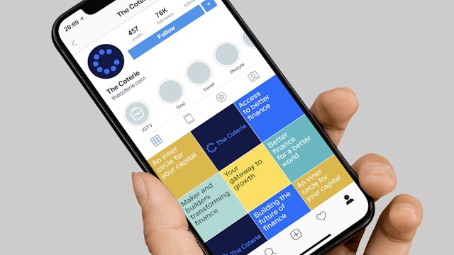
The team created an identity based on the uncomplicated nature of the “C” to convey trust and approachability.

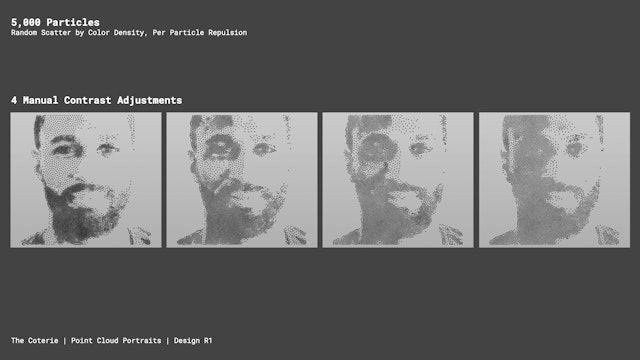
A key idea in the visual language is the rendering of portraits representing the members of the Coterie.


The Coterie is a new platform created to help founders, particularly in the tech industry, use their equity in ways traditional banks are not equipped to do. It allows investors to diversify their risk, take loans, plan estates, and engineer tax-efficient exits.
Targeting a market consisting largely of millennials with $1–10 million in assets, usually locked in privately held companies, the brand seeks to connect with an audience that is more self-directed in their financial planning than previous generations. This niche market generally views traditional financial services as poorly attuned to their unique needs.
Pentagram worked with strategist Robin Haueter to analyze the needs and desires of the target market along with the competing brands and offerings available to them. The team also studied brands that are successfully reaching this audience, identifying the qualities that resonate with them.
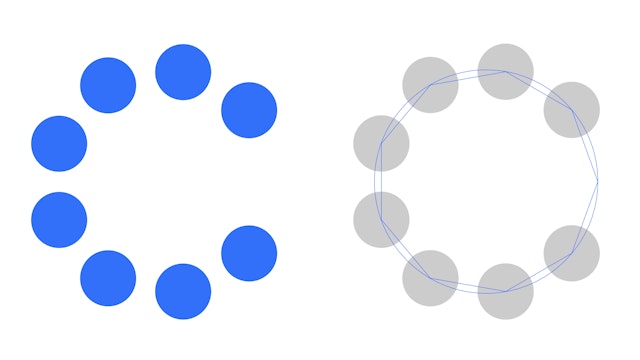
The team created an identity based on the uncomplicated nature of the “C” to convey trust and approachability. Its form—a circular group circle with one missing—suggests both the exclusivity implied by the name and desired by the market, along with an opening that invites a prospective client to join.
A key idea in the visual language is the rendering of portraits representing the members of The Coterie. The initial idea stemmed from the familiar dot portraits used by the Wall Street Journal. Pentagram worked with Robert Hodgin and team at Rare Volume who developed software to create hypothetical member portraits out of chrome spheres in a three-dimensional space. Each portrait consists of 12,000 spheres and smoothly transitions from one to another, ending with The Coterie icon.
In addition Pentagram created a language of three-dimensional objects to use as visuals for the launch website and on screens within the app.
The brand’s primary typeface, Arizona Flare, is a bold serif (from Dinamo Typefaces). The secondary typeface is Riforma LL, a sans serif for supporting copy (from Lineto Type Foundry).
Office
- New York
Partner
Project team
- Shigeto Akiyama
- Liam Hamill
- Ben Law
- Avery George
Collaborators
- Robin Haueter, strategist
- Rare Volume, Portraits
