
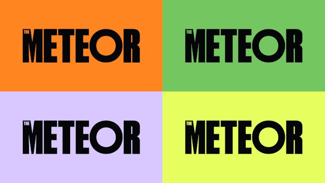
The vibrant visual language is inspired by the call-to-action graphics of protest and activism, updated for digital contexts like social media.


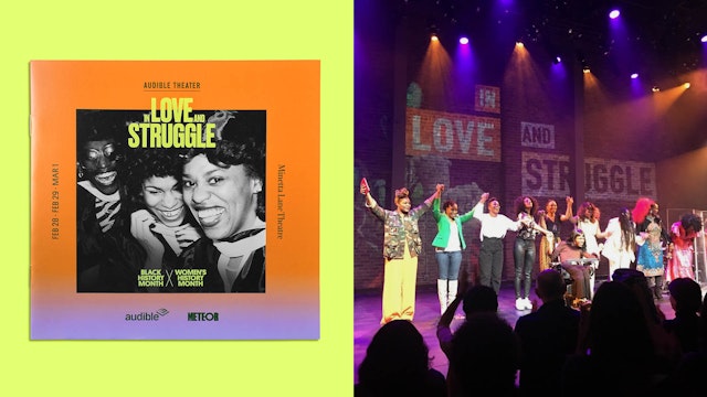
Type, image and color come together in a brand framework that can grow and evolve along with the platform.

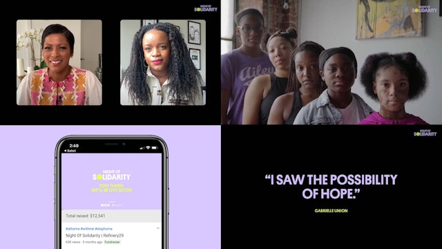
The designers consciously avoided pink and pastel colors, instead choosing a contemporary palette and strong black-and-white imagery.


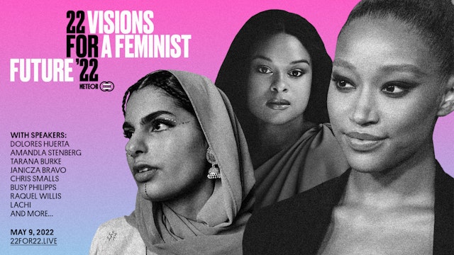
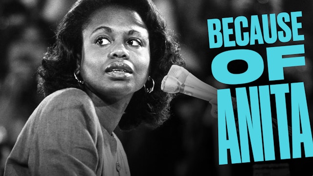
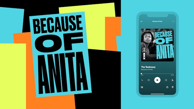

The Meteor is a collective dedicated to using journalism, art, culture and creativity to advance gender and racial equity and justice. Pentagram has designed a brand identity for the group that captures its bold and empowering mission with a vibrant visual language inspired by the call-to-action graphics of protest and activism. The brand framework establishes a cohesive look and feel for The Meteor across a diverse range of programming, with more to come when it officially launches in 2021.
The collective wants to expand and deepen the conversation for a more inclusive and intersectional feminism that works to improve the lives of all women, girls and nonbinary people. The organization’s name was inspired by a quote by the Black feminist writer and civil rights activist Audre Lorde, who promised: “I am going to write fire until it comes out of my ears, my eyes, my noseholes––everywhere. Until it’s every breath I breathe. I’m going to go out like a fucking meteor.” This ambition guides The Meteor as it builds a brand platform that will eventually span podcasts and publishing, education and entertainment, and workshops and digital events.
The Pentagram designers worked closely on the project with leadership at The Meteor, including founder Cindi Leive, collective members Paola Mendoza, Sarah Sophie Flicker, Mariam Ehrari and Treasure Brooks, as well as other members of the organization’s advisory board, which comprises 25 writers, filmmakers, artists and other creative leaders. (With her work on the project, Pentagram Partner Emily Oberman was invited to join the board.)
Prior to its official launch, the collective has been introducing itself with a series of events including “In Love and Struggle,” a live evening of monologues, storytelling and music, brought together by a group of prestigious womxn of color at the intersection of Black History Month and Women’s History Month, now available for listening on Audible Original; “Night of Solidarity,” a virtual benefit to address the epidemic of domestic violence during the Covid-19 pandemic; and “30 Days Until Tomorrow,” a voting rights countdown with daily programming in advance of the 2020 general election. The Meteor has also launched multiple podcasts, including “Doctor’s Log,” with Dr. Esther Choo reporting from the frontlines of the pandemic, “Undistracted,” with the activist Brittany Packnett Cunningham, and “Because of Anita,” with Professor Anita Hill exploring the impacts of her testimony still today in conversation with both Kerry Washington and Dr. Christine Blasey Ford. “Because of Anita” went on to receive extensive press coverage, and won numerous podcast awards.
With its wide-ranging programming, The Meteor needed a flexible identity that could expand along with it. The Pentagram team developed a visual language that uses type, image and color to create a vibrant, powerful and instantly recognizable look for the platform, while providing a kit of parts for brand architecture that can grow and evolve.
The typography evokes the strong lettering on protest signs and updates it for digital contexts like social media. The Meteor logotype is set in a customized version of the condensed sans serif Druk, with the “O” appearing as a perfect circle, a visual echo of the name. The designers developed a typographic strategy for the brand, selecting font families with variations that can carry a range of content and voices––from editorial to corporate to expressive. Along with Druk (from Commercial Type), these include the elegant serif William Text (designed by Maria Doreuli) and the geometric sans Platform (designed by Berton Hasebe at Commercial Type).
Black and white photography is used as a way to link old and new in the same space, connecting the legacy of activism with the urgency of current events. As photography is integral to The Meteor’s platform, the Pentagram team also explored washing the brand color palette over sourced imagery to create a cohesive, engaging and ownable visual system.
The designers consciously avoided anything pink and pastel colors especially pink and pastel colors, which have historically been co-opted when commodifying feminism. Instead, the program employs a vibrant, contemporary palette of unexpected colors including purple, bright orange, yellow and black, with the use of purple and yellow as a direct nod to the history of the women’s suffrage movement. These colors are carefully coordinated across the branding to differentiate the various sub-brands and provide a little extra punch in treatments like highlighting “act” in “Undistracted.”
The system’s expandability is demonstrated in the logo for The Meteor Fund, a nonprofit charitable organization affiliated with The Meteor. Using typography reminiscent of the parent identity, the mark sets “The M Fund” in a green rectangular shape with the proportions of a dollar bill, linking it to the Meteor universe but making it different enough to stand on its own. The Meteor’s visual identity also extends to branding for “21 for ’21,” a virtual gathering in May 2021 that will bring together a cross-generational group of visionary leaders to create a blueprint for the future for women, girls and nonbinary people.
Office
- New York
Partner
Project team
- Laura Berglund
- Mira Khandpur
- Katherine Killeffer
- Zoe Chrissos
- Elizabeth McMann
