


During research in the Review’s archives, the designers were drawn to the cool minimalism of issues from the late 1960s to the early 1970s.

The refreshed brand identity still reads as literary but is more contemporary.


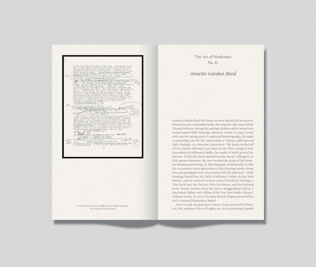
For the past seven decades, the pages of The Paris Review have helped launch the careers of many of the world’s most influential writers, from Jack Kerouac, Philip Roth, Adrienne Rich and Samuel Beckett to David Foster Wallace, Jonathan Franzen, Zadie Smith and Ottessa Moshfegh, among others. This diverse mix of literary voices has been matched by a design that has continuously evolved since the quarterly was founded in 1953. Pentagram partner Matt Willey has updated the visual identity and editorial design of the Review with an elegantly minimalist look that signals a new era. The refresh launches with the Winter 2021 issue, on newsstands this month.
Willey worked closely on the project with new editor-in-chief Emily Stokes, who joined the Review in May 2021, and art director Na Kim. The clean, modern aesthetic of the redesign is a significant departure from the previous iteration, which crowded the covers with copy, but has its roots in the magazine’s heritage. During research in the archives, the team was drawn to the cool minimalism of issues from the late 1960s to the early 1970s, which also had a smaller book-like size that felt more intimate.
This accessibility is reflected in the new nameplate, which has been changed from the serif of the previous logo to a bold, simple wordmark (set in the sans Founders Grotesk) that still reads as literary but is more contemporary.
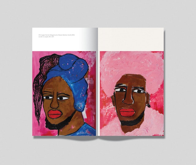
The Paris Review has a long tradition of showcasing art on its covers, as well as in interior portfolios, a nod to the relationship between literature and the visual arts. After considering numerous images, the team selected a painting of a pair of cherries by the British artist Rose Wylie for the first issue of the relaunch. Going forward, the magazine plans to commission new pieces for the covers.
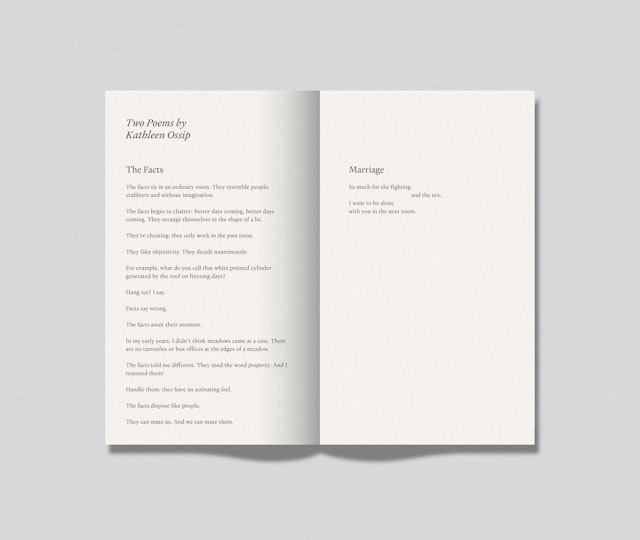
The new format makes more space for this featured artwork by moving cover lines to the spine, which now features the issue number and a list of contributing writers for easy reference on a bookshelf. The size has been slightly reduced, so the publication is small enough to be easily held in one hand or stuffed into a bag or tote, but still feels substantial, like a book. This utility extends to a softer reading experience, with tighter page margins and warm, textured paper reminiscent of book stock.
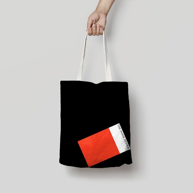
The sharp identity is shown off on stylish t-shirts and totes that will help introduce the Review to a wider audience (along with collaborations with brands like Warby Parker and Aesop). Featured motifs include the Review’s hadada bird emblem and the new format rendered in abstract geometric shapes. As a throwback, the designers also resurrected a drawing by the artist Joe Brainard of the Ernie Bushmiller’s comics character “Nancy” in a Paris Review t-shirt, an image that appeared in one of the magazine’s house ads in the 1970s.
In the press: The Paris Review, Creative Review, AIGA Eye on Design.
Office
- New York


