
The season campaigns typically originate with the Shakespeare in the Park posters, linking the Public to one of its most popular programs.


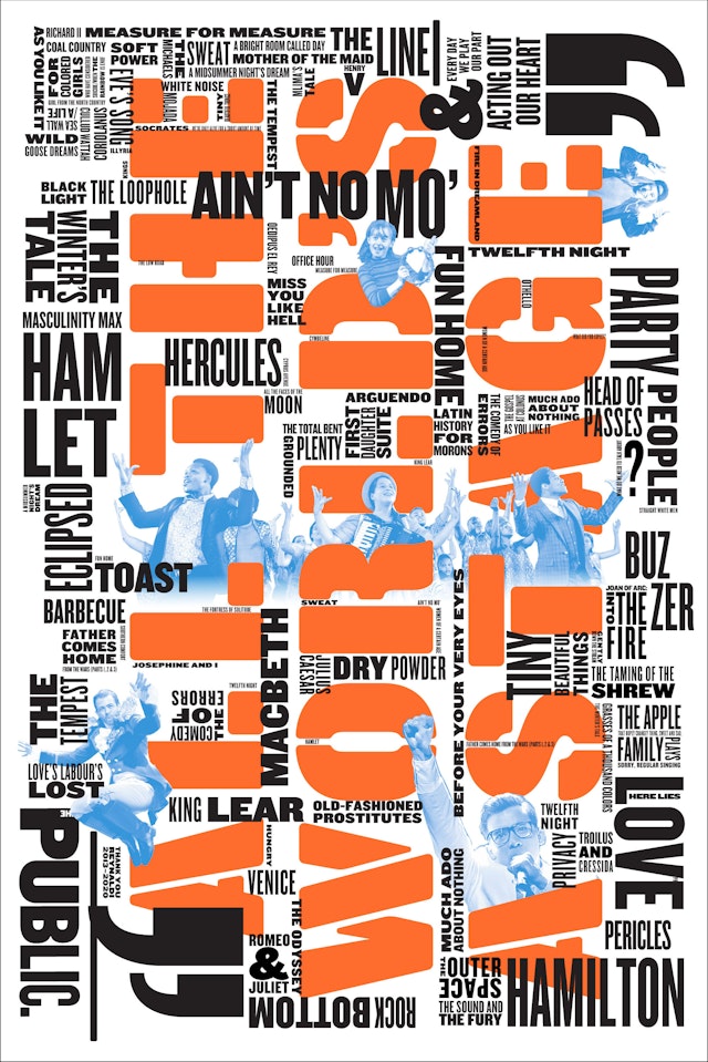
Each season campaign is a reaction to the one before, with the designers looking for new ways to change the spirit and use of Knockout, the font of the Public identity.


For the first time in a quarter century, Paula Scher’s typographic posters for Shakespeare in the Park, the annual free performances presented by the Public Theater, went missing from the streets and subways of New York when the 2020 festival was cancelled due to Covid-19. As a result, the new look of the promotional campaign for the Public’s 2020-2021 season was held back until fall without its usual summer tryout.
The season campaigns typically originate with the Shakespeare in the Park posters, linking the Public to one of its most popular programs. The approach gives the Public a bigger, more recognizable presence on the cultural landscape, with a cohesive look that extends from the festival flagship all the way through to smaller productions, as well as nightly events at Joe’s Pub.
When the pandemic scuttled Shakespeare in the Park, Scher and the in-house team at the Public found themselves without a fully developed visual language for the new season. The design direction had already begun––with a “Revolt/Love” theme inspired by Richard II and As You Like It, which were originally announced back in January––but the final posters were never completed. (Richard II was ultimately presented as a four-part podcast produced with WNYC, but with graphics from the previous season.)
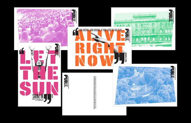
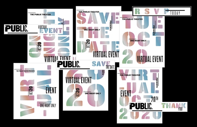
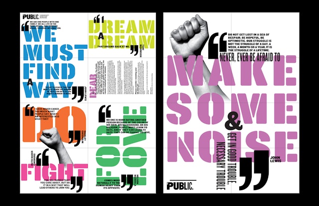
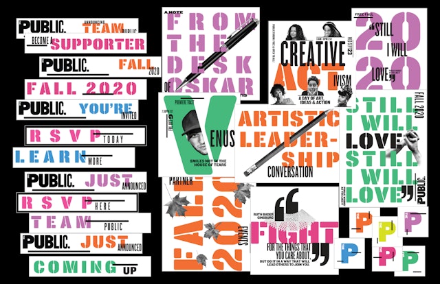
Each season campaign is a reaction to the one before, with the designers looking for new ways to change the spirit and use of Knockout, the font of the Public identity. Variations have included typography that is outlined, inlined, slashed, stretched, slanted, skewed, reversed and extended––but amazingly, never stenciled. The 2020-2021 campaign reinterprets the Public identity in stencil typography that resonates for a season that is still under construction and a work in progress. The campaign appears in a bright, colorful palette that looks great on screens.
The look will finally be seen as it is applied to the upcoming season, which will take place entirely online. The in-house team at the Public will build out the system as the programming comes together, including the season brochure, membership materials, posters and banners for the facade of the theater itself, and most importantly for a fully virtual season, digital marketing, email newsletters and social media.
The new season coincides with the publication of Twenty-Five Years at the Public: A Love Story, a comprehensive survey of Scher’s work for the institution, out now from Princeton Architectural Press.
Office
- New York
Partner
Project team
- Rory Simms
- Tam Shell, The Public Theater
- Gina Roi, The Public Theater
- Katie Hodge, The Public Theater


