
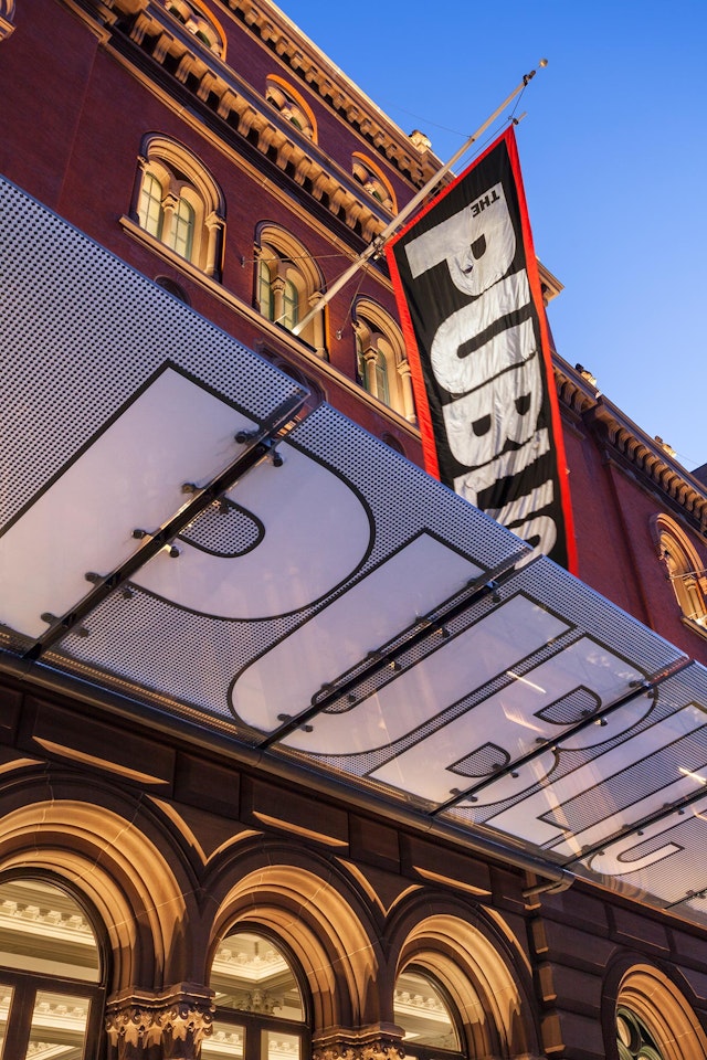


Remarkably light and airy, the canopy provides a monumental entrance feature but does not significantly alter the appearance of the historic façade.
In 2013, the lobby of the Public Theater was transformed into one of New York’s most vibrant and welcoming spaces for theatergoers. As part of a major renovation by Ennead Architects, Pentagram has created a program of environmental graphics for the space that integrates the iconic identity for the Public into the architecture of the theater itself.
In the two decades since Pentagram first designed the identity for the Public, the exuberant graphics (including two subsequent redesigns) have become a familiar presence on New York’s cultural landscape. Pentagram worked closely with Ennead to translate the identity into signage and wayfinding that helps make the lobby dynamic and accessible and celebrates the Public’s status as a theater for the “public.”
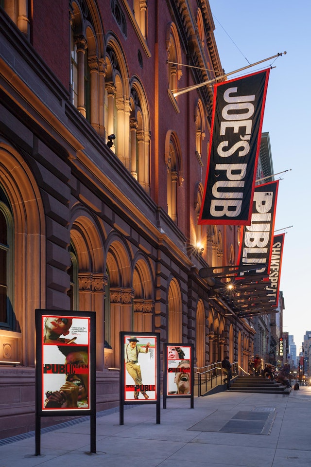
The theater is housed in the former Astor Library, a historic 1853 building on Lafayette Street in the East Village that was originally constructed as the city’s first public library. The Public's founder Joseph Papp (who also established Shakespeare in the Park) moved the theater into the space in 1967, helping to save the building and win it landmark status. The interior was converted into six individual theaters of various sizes (originally designed by Giorgio Cavaglieri), as well as Joe’s Pub, the popular nightclub that opened in 1998.
Ennead has been working over the past decade on various upgrades to the building, but the current revitalization is the first significant intervention since the Public opened in the space. The design features a redesigned entry, expanded lobby, and restoration of the façade that adds a canopy and moves the building’s steps back onto the sidewalk. Under the guidance of Artistic Director Oskar Eustis, the Public’s mission is theater for everyone, and the renovation makes this explicit by opening up the space while also preserving the landmark building.
For the exterior, Pentagram designed a new marquee canopy that dramatically renders the Public logo in glass over the steps of the entrance. To win approval by the city’s Landmarks Commission, the awning is only connected to the building at two points. The letters of the logo are clear and transparent, reversed out of the custom frit pattern of the glass. Remarkably light and airy, the canopy provides a monumental entrance feature but does not significantly alter the appearance of the historic façade. The awning is accompanied by illuminated poster boxes that run along the street in front of the theater.
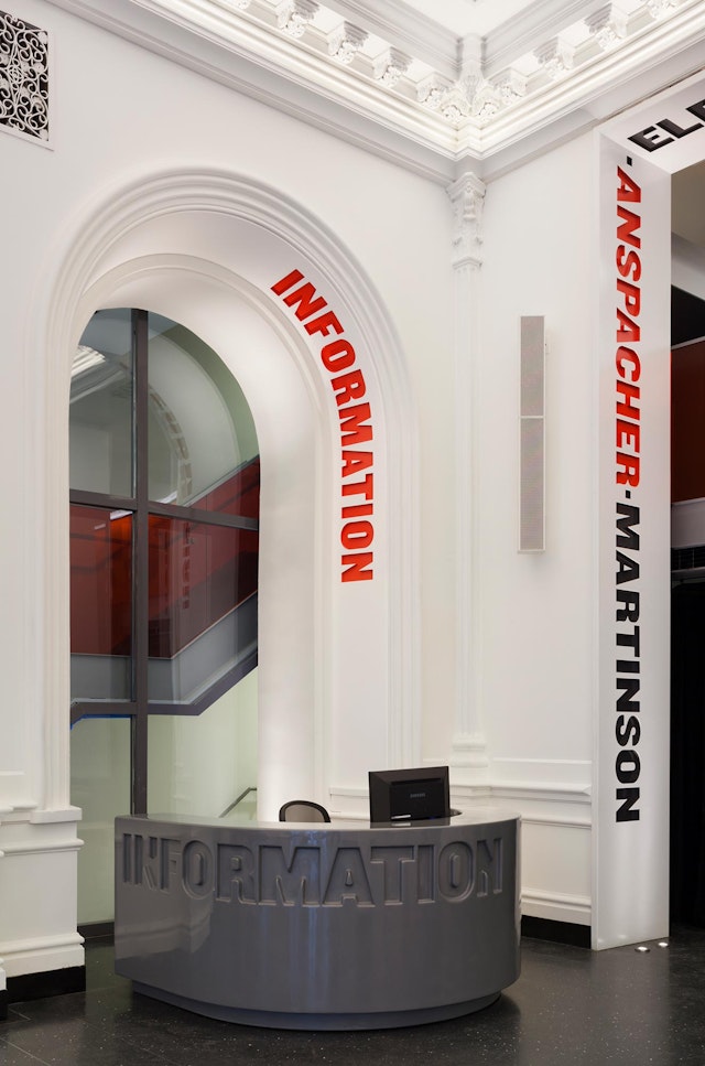
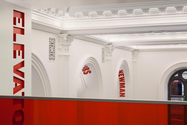
Inside, the environmental graphics inventively marry type and architecture to make the Public identity feel like an integral part of the building. Pentagram's graphics for the Public are recognized for their expressive use of typography (set in Knockout, the font of the identity), and here the type performs in the space, guiding theatergoers and setting a friendly tone that invites audiences to linger.
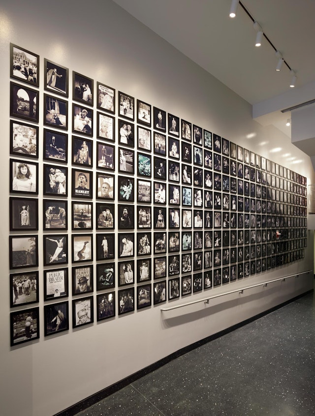
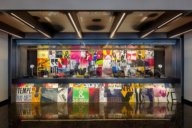
The reconfigured lobby centers on a circular front desk that features a dimensional, large-scale version of the Public logo. The designers helped commission a chandelier-like multimedia sculpture designed by the artist Ben Rubin that hangs over the desk. Called the Shakespeare Machine, the piece randomly generates phrases from Shakespeare’s works (also set in Knockout, a specific dictate of the project) and is flanked by projections that provide information of current productions. The box office at the back of the lobby features a colorful collage of sniped Public posters from the past two decades.
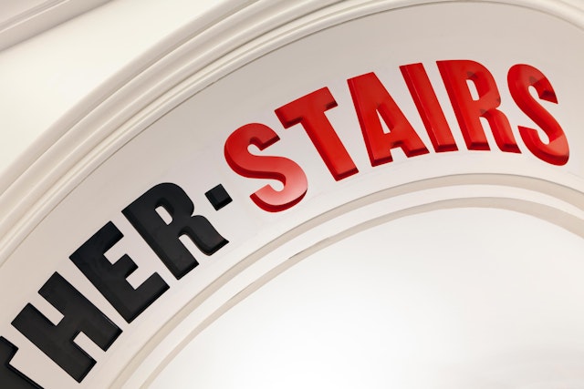
The various theaters in the building are identified with dimensional typography that has been etched into the lobby’s distinctive arches. Plaster archways feature routed typography painted with textured paint; steel archways use laser-cut steel sheets. The color echoes the red and black typography of the first identity Pentagram designed for the institution, back in 1994. A red railing also runs around the balcony lounge on the lobby’s second level; this line was referenced in the "Open the Public" campaign that accompanied the official reopening of the space last fall.
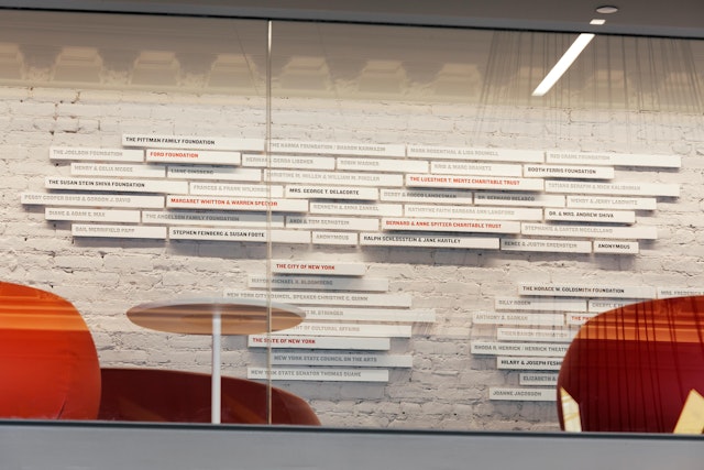
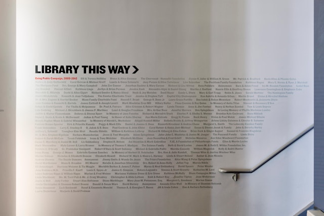
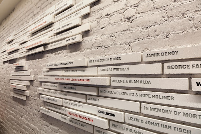
For donor recognition signage, the designers created a dimensional installation that presents donor plaques as bricks that extend from an arrangement in the wall. The bigger the gift, the bigger the brick. Other donor signage appears as supergraphics on the doors to the various theaters, acknowledging specific gifts for the various performance spaces.
The environmental graphics were honored with a Bronze Cube in the Art Directors Club 92nd Annual Awards.
Client
The Public TheaterSector
- Entertainment
- Arts & Culture
Discipline
- Signage & Environmental Graphics
Office
- New York
