


The cover features no cover lines; these have been moved to the spine, where they appear as brief descriptions (“Mansueto Library,” “1970s West Side Photos,” etc.)




Perhaps more than any other magazines, alumni publications target highly specific audiences––readers with a shared personal experience of a school––yet beyond insignia and colors, many of these institutional publications appear interchangeable. Pentagram redesigned The University of Chicago Magazine, the school’s alumni magazine, in an elegant new format that uniquely reflects the U of C’s distinct sensibility and long tradition of academic scholarship and intellectualism.
The designers worked closely with the magazine’s editors to recalibrate the look of the magazine. The new format feels smart and literary––it’s designed to be read––and makes the magazine seem less ephemeral and more like an object to be kept. The new cover design sets the tone for the enhanced literary feel of the magazine. Issues are now perfect-bound and the covers feature illustrations surrounded by a white frame. Conceptual and imaginative, the illustrations convey that the magazine is original and smart. The previous masthead design emphasized the word “Chicago,” which made the magazine look like a city magazine. The designers restored the full name of the school to the masthead, which now appears in the upper left hand corner and is the only type on the cover. The cover features no cover lines; these have been moved to the spine, where they appear as brief descriptions (“Mansueto Library,” “1970s West Side Photos,” etc.)
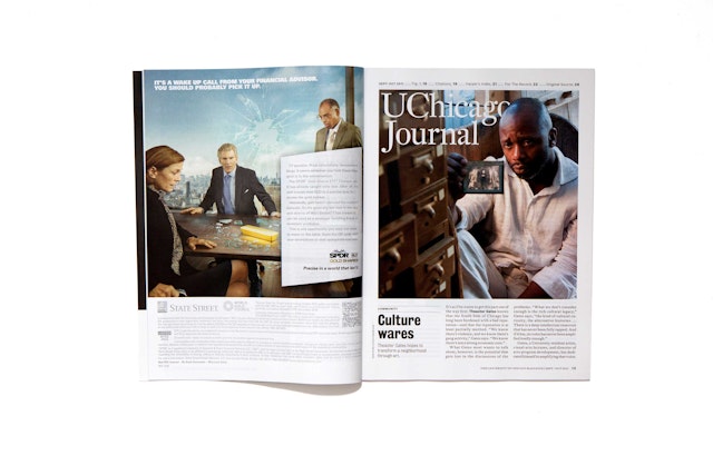
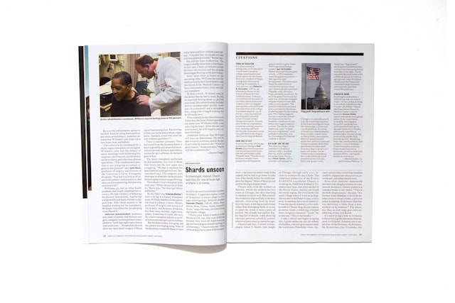
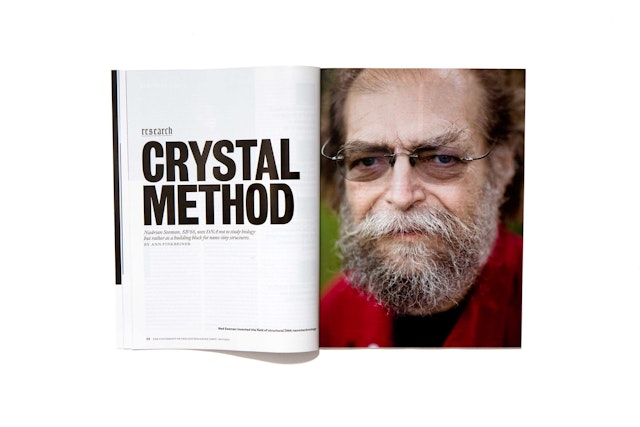
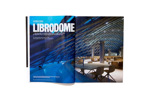
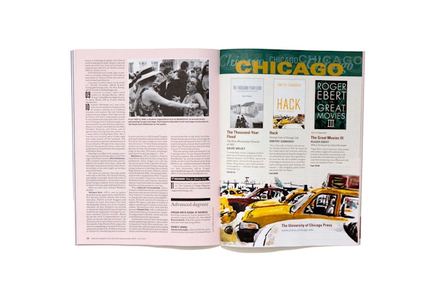
The designers helped restructure the content of the magazine and its departments. The front-of-book UChicago Journal section (formerly the more generic Chicago Journal) includes updates of innovations by U of C alumni, with interesting asides like a “Harper’s Index” of student facts, here named the William Rainey Harper’s Index, for the university’s first president. Features in the editorial open with strong photography and headlines in bold type. Some features play with expected magazine formats: a photo portfolio of a West Side neighborhood flips the magazine on its side, to showcase the pictures in landscape orientation.
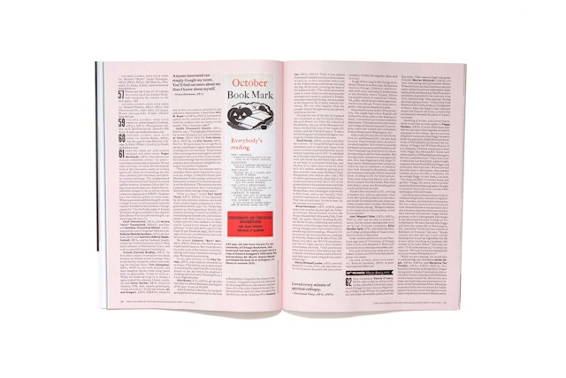
The magazine closes with a back-of-book “Peer Review” section that features alumni news and notes, essays and book releases. The section is printed on a different paper stock that is textured and colored pink, for the school colors of maroon and white. News is listed by class in order of graduating year, and to give the section visual texture, the designers have mixed in images of period ephemera from the school, including posters, photos and other visual notes, as well as pull quotes of comments by alumni (“Chinese sucked. I cried for my C.”) “Lite of the Mind,” the magazine’s back page (a play on “Life of the Mind”) features school-centered humor.
The magazine logotype and headlines are set in Bureau Grotesque, a strong sans serif American wood type font. Body text and headlines appear in DTL Fleischmann, a literary-looking font, while Goudy Text Lombardic Capitals inspired by the Collegiate Gothic architecture of campus are used for rubric. The Plan Grotesque family is used for sidebar text and captions.
Office
- New York
