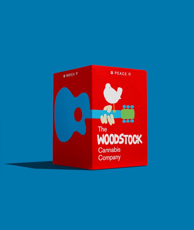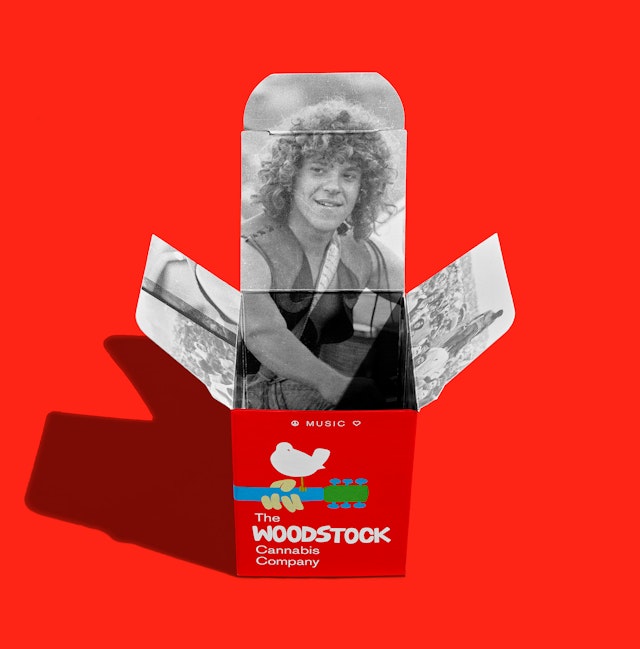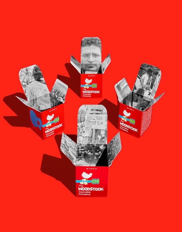

The packaging is branded with the eye-catching red of the original Woodstock poster and the interiors of the boxes are lined with a dozen different black-and-white photomontages.


Woodstock—formally, The Woodstock Music & Art Fair—was originally billed as “An Aquarian Exposition” but it became one of the pivotal events in rock-and-roll history and a defining moment of the sixties counterculture generation. The free music festival, held during the summer of 1969, was organized by Michael Lang and John Roberts and attracted an audience of over 400,000 young, idealistic souls to Max Yasgur’s dairy farm in the Catskills of upstate New York to get high on peace, love, music—and marijuana, of course. Thirty-two acts performed on an outdoor stage for what ended up being four, sometimes rainy, days featuring legendary musicians of the era including Crosby, Stills Nash & Young, Joni Mitchell, Creedence Clearwater Revival, Arlo Guthrie, Joan Baez, Santana, Grateful Dead, Janis Joplin, Sly and The Family Stone, The Who, Jefferson Airplane, The Band, Joe Cocker, and Country Joe and the Fish. Jimi Hendrix closed out the event early in the morning of the last day with his psychedelic rendition of “The Star-Spangled Banner” which became his signature performance. By the time Jimi walked off the stage, the soggy, blurry-eyed group that remained—and America—knew that something epic and defining of a generation had just gone down.
Now, almost a half-century later, Pentagram has been tapped to design the branding and packaging for The Woodstock Cannabis Company, a line of marijuana extracts that are very different from the comparably mild strains of pot the sixties counterculture—the hippies—were smoking to “turn on, tune in, and drop out.”
Pentagram worked with Woodstock festival co-founder Michael Lang (Roberts is deceased) who provided the design team with a series of grainy, black-and-white photographs documenting the four-day happening and the “bird-on-guitar” image created for the original Woodstock poster by Lang’s friend Arnold Skolnick. According to Lang, Skolnick’s rendering of a white dove (symbolic of peace) perched on the neck of an acoustic guitar actually resembled a Catbird, a large white bird found in the upstate New York region. Skolnick cut out the words and the bird image out of paper and tried several different layouts before landing on the final poster design. Skolnick was hired on a Thursday and delivered the poster the following Monday. He was paid $15 for the job. The artist went on to have a successful design and publishing career but his claim to fame remains his humble Woodstock logo.
Given the time-tested recognition power of the bird-on-guitar icon the Pentagram team decided to use the well-known symbol in its original form, unaltered, except for the idea of adding the rest of the acoustic guitar. The poster Skolnick designed in 1969 only included the neck of the instrument because the image bled off the left side of the paper. The icon appeared in that truncated form from that point on–until now. The transformation of the bird-on-guitar symbol to three-dimensional packaging gave the design team the opportunity to imagine and create the rest of the guitar.
The logotype for The Woodstock Cannabis Company is composed of Akzidenz-Grotesk, a late nineteenth century sans-serif typeface that re-emerged in the sixties and was featured on the original Woodstock poster, and a redrawn facsimile of Skolnick’s handcrafted, cut-paper type for the word “Woodstock.”
The initial line of packaging designed by Pentagram includes three boxes, one box each for the three main species—sativa, indica and hybrid (labeled as “PEACE,” “LOVE,” and “MUSIC”), and a small slider box for vape cartridges. All of the packaging is branded with the eye-catching red of the original Woodstock poster and the interiors of the boxes are lined with a dozen different black-and-white photomontages, “surprise reveals,” depicting the iconic crowd scenes, music acts, hippies and personalities from the festival. One of the box interiors features a photograph of co-founder Michael Lang, with his signature curly locks and leather vest, sitting on his BSA motorcycle.
A short blurb on one panel of the boxes tells the Woodstock story and provides context to an audience that may not be familiar at all with one of the defining cultural milestones of the baby-boomer generation. To this new crop of cannabis enthusiasts, The Woodstock Cannabis Company is definitely “not their parent’s pot experience.”
