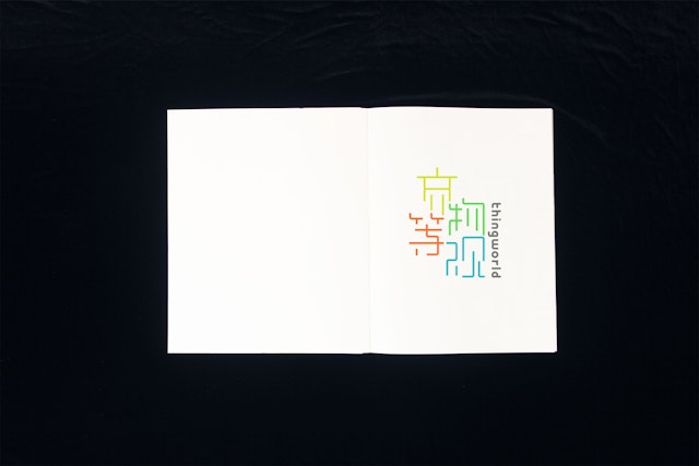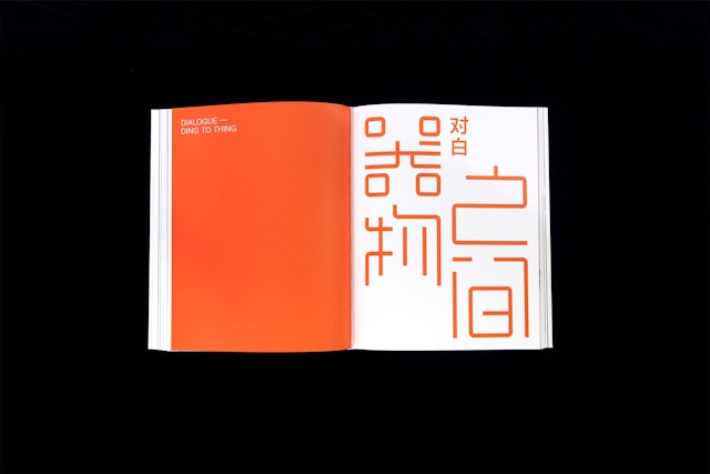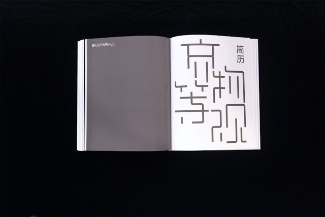


Chinese characters are pictograms—representing things—and the thingworld letterforms have themselves been objectified through modification.


Presented by the National Art Museum of China, thingworld: International Triennial of New Media Art is the third edition in the museum's series of large-scale surveys looking at current trends in art created with new media technologies. One of the most comprehensive international exhibitions staged in China, the 2014 triennial features 58 works by 65 established and emerging artists from 22 countries around the world. Pentagram has designed the identity, graphics and catalogue for the exhibition.
Following earlier editions that focused on more ephemeral forms of new media art, the theme of this year’s triennial is “thingness”—object-based works that explore the salience of things. As triennial curator Zhang Ga describes it, “The world is a thing world...Thing is everything.” Many of the displayed works examine how objects mediate experience between people and the world around them.
The identity for the exhibition is built around customized Chinese typography. Chinese characters are pictograms—representing things—and the thingworld letterforms have themselves been objectified through modification. Chinese typography has an extremely nuanced design; characters are drawn with specific angles and curvatures, and carefully composed of thick and thin lines. The designers looked at a way to objectify the typography by neutralizing the idiosyncrasies. The characters have been re-engineered based on a square grid. The lines are all the same thickness, and the curves and angles are shaped according to the horizontal and vertical grid. The resulting typography appears like an abstract network or system, a maze of pattern that emphasizes the “thingness” of the letterforms. The proportions have been equalized so each character has its own mass, making it uniform and conveying the idea that all things are equal.
The exhibition logotype translates the title into an arrangement of characters in a bright, contemporary palette. (In Chinese, the word for “thing” is a compound of the characters that represent East and West, a geographic breadth that encompasses everything.) The show is divided into three sections—“Monologue,” “Dialogue,” and “Ensemble”—and the sub-brands for each extend the graphic identity, rendering the title in modified Chinese characters.
The grid of the letterforms is echoed in the elegant catalogue design. Exhibition sections are coded by color, and English and Chinese versions of the essays and artist statements are paired alongside images of the featured works.
