
The new identity helps position the brand as a desirable alternative to traditional alcohol-free drinks, suggesting a ‘third way’ of drinking that’s plant-based, celebrates ingredients and puts people in control of how they’d like to feel.
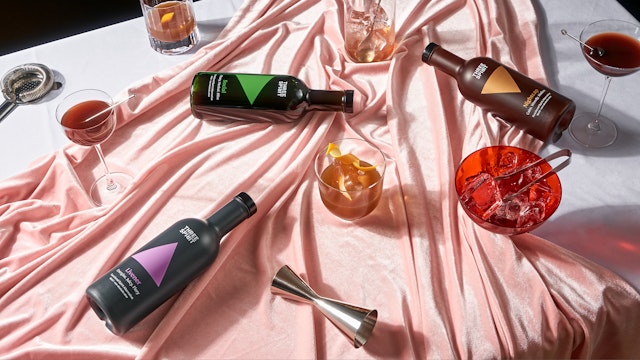


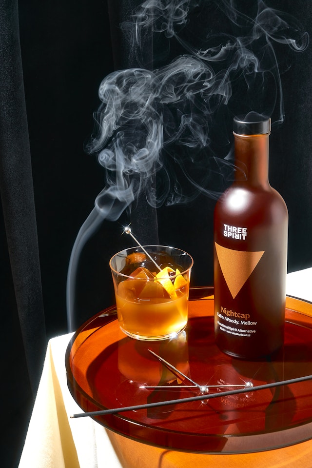

Three Spirit creates meticulously crafted plant-based alternatives to traditional alcoholic drinks, made using the highest-grade botanicals and natural actives.
Rather than focusing on what’s been left out, Three Spirit celebrates the incredible ingredients that go into its drinks. Challenging the conventional norms of ‘alcohol’ or ‘no alcohol’, Three Spirit’s concept of ‘The Third Way’ embraces a new approach to drinking. It encourages people to choose from a range of elixirs, brews and vines that are designed to cater to different moods and occasions. Using adaptogens, nootropics, herbs, distillates and ferments, its drinks are formulated to help people energise, socialise, or just provide a calming and relaxing experience.
Three Spirit’s founders approached Pentagram to create a bespoke new brand identity system, including branding strategy, positioning, and tone of voice, as well as a set of brand templates for website, mobile, email and presentations. Pentagram also developed a range of Three Spirit products, including merchandise and packaging.
Pentagram worked with Adam Kaveney and Bert Preece from Simple Revolution to refine and develop a simplified and more useable brand strategy and story. Adam Kaveney, one of Simple Revolution’s founders, have worked with Domenic and Pentagram on numerous projects developing strategy and narrative for many of Pentagram’s clients. Adam and Bert landed on a brand positioning of ‘Fanatical Curiosity’.
Three Spirit’s approach revolves around the concept of botanical alchemy. Defined as the blend of mixology and scientific precision with the richness of plant flavours, this was a central theme throughout Pentagram’s new brand identity. From the outset it was important not to use the traditional graphic treatments for much of spirit and wine branding. Three Spirit is a true alternative to existing alcohol brands rather than a non-alcoholic alternative to say Gin or Vodka.
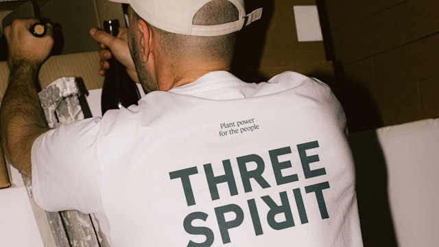
The new identity centres around the Three Spirit wordmark and logomark symbol. Bold and confident, the wordmark is custom-drawn, allowing the letters to align with precision. The flipped letter ‘R’ nods to the sense of a change of perspective, a key element of the Three Spirit brand ethos.
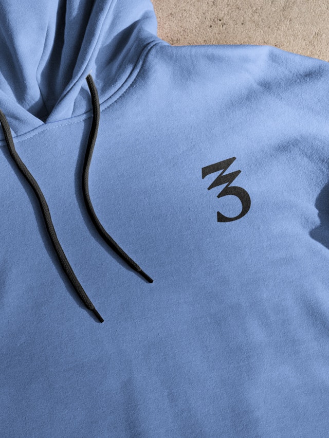
The logomark symbol is based on the numeral 3 and is distinctive, contemporary, and rooted in alchemy. Based on the typeface FS Kim, it has been crafted so that the angles are equal to and align with those in one of the key Three Spirit brand assets, the equilateral triangle.
These join the existing Three Spirit triangular logomark which has been with the brand since the beginning, offering consumers a sense of familiarity. With three points and three leaves, it appears on the top of all bottle lids and on other brand collateral.
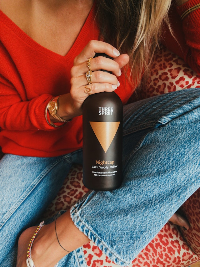
The equilateral triangle is a key asset of the Three Spirit brand, reflecting both the brand name and its three founders. The triangles are positioned at different angles on the packaging according to whether the drink is a Livener, Social, or Nightcap.
Three Spirit’s display typeface is Fontsmith’s FS Kim Regular, which showcases the content in a stylish and striking way. Dalton Maag’s Aktiv Grotesk is the supporting typeface and supports any message without overpowering it.
The triangle and the 3 symbol both play different roles at times—sometimes the triangle is central to the brand such on the Spirit and wine packaging, other times it has a more supportive role such as in marketing and comms where triangles can sit in the corner or be used as patterns. Equally, the ‘3’ symbol can be used subtly on the back labels.
The design team created a custom colour palette for Three Spirit to communicate the different moods, feelings and flavours of the product. These colours are used within imagery to create different textures and allow flexibility. Imagery is sophisticated and ethereal, and suggests the idea of curiosity and trying something new. The team also designed a set of bespoke icons for use across printed and digital applications.
With increasing numbers of people either ‘sober curious’ or abstaining altogether, Three Spirit offers a timely choice for those who don’t want to drink. Pentagram’s new identity helps position the brand as a desirable alternative to traditional alcohol-free drinks, suggesting a ‘third way’ of drinking that’s plant-based, celebrates ingredients and puts people in control of how they’d like to feel.
Office
- London
Partner
Project team
- Kimberley Langham
- Lily Smallwood
- Lili Phillips
- Florent Gomez-Siso
- Anthony Morgan
- Edie Lippa
- Ry Coleman
Collaborators
- Adam Kaveney & Bert Preece, Simple Revolution (brand strategy and positioning)
