Tomo’s purpose is to revolutionize the way people buy homes with an intuitive platform assisted by empathetic experts at a competitive value.


Hello TOMO!
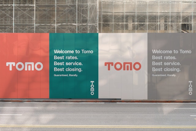
Pentagram has designed the identity for Tomo, a new mortgage company promising to improve the typically unpleasant experience of getting a mortgage by transforming home buying into a customer-centric, streamlined experience.
Tomo’s purpose is to revolutionize the way people buy homes with an intuitive platform assisted by empathetic experts at a competitive value. Working with co-founders and CEOs Carey Armstrong and Greg Schwartz, formerly colleagues at Zillow, and creative director Leslie Kang, Pentagram designed the identity to stand apart from the traditional players in the category. The goals of the brand were to represent the company’s key attributes: the spirit of innovation and a deeply customer-centric approach.
The new identity compliments this unique name, conveying itself as attentive, joyful, and bold. Developed by Luke Hayman and the team, Pentagram designed a wordmark (which also stacks vertically), an icon, the supporting typography and the color palette. The wordmark hints at two images reminiscent of a shelter: a protective roof implied by the T and a doorway hidden in the M.
The name - derived from the Japanese word Omotenashi - is a distinct aspect of Japanese culture that differs from just plain customer service. It is a small act of kindness that serves to improve a person’s experience with no strings attached.
Office
- New York
Partner
Project team
- Shigeto Akiyama
- Janny Ji
- Avery George
Collaborators
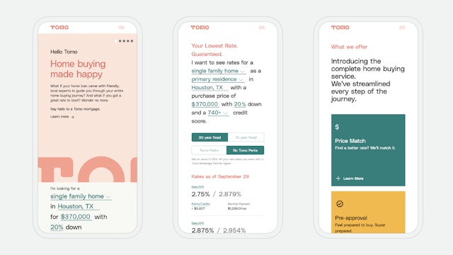
- Leslie Kang, website and application design