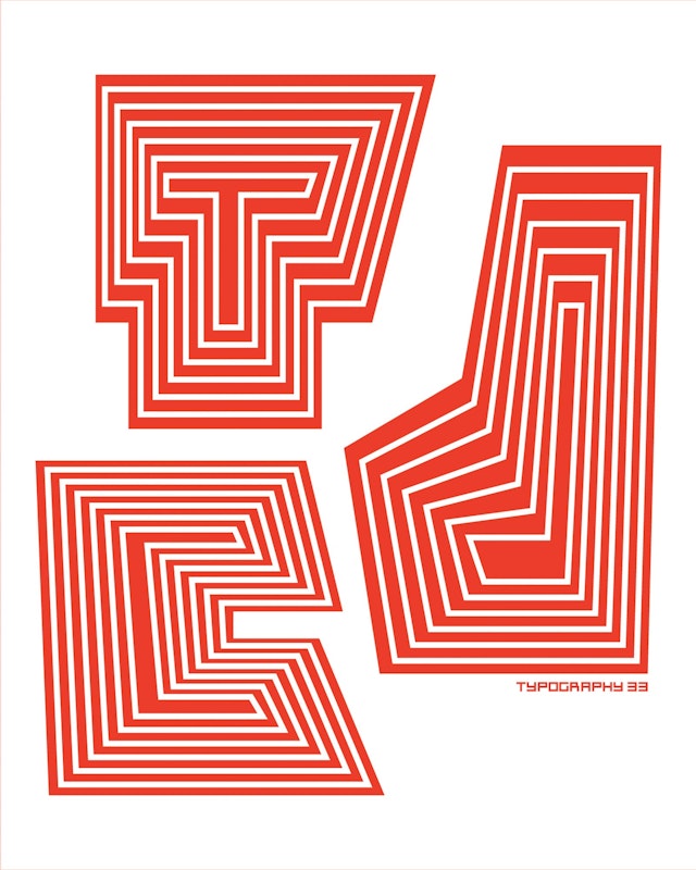
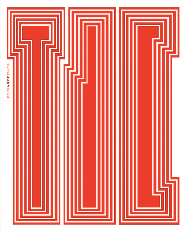
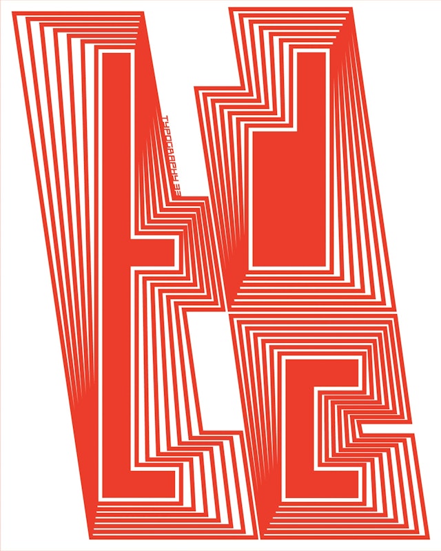

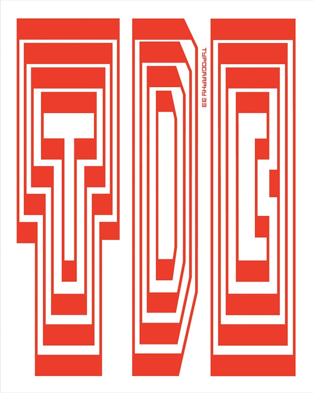

The designers saw the project as an opportunity to explore creating a cohesive, recognizable program of graphics without repeating forms.


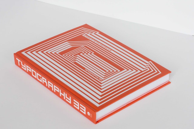
The annual awards competition of the Type Directors Club (TDC) presents the best typographic design in the world. Long a favorite of the design community, the awards are renowned for the quality of their selections and the accompanying annual book published by the TDC. Pentagram has created a bold graphic program for this year’s competition, TDC 58, that launches with the call for entries, out today.
The designers saw the project as an opportunity to explore creating a cohesive, recognizable program of graphics without repeating forms. The TDC 58 graphics treat the organization’s acronym in a series of variations on experimental letterforms constructed of straight lines and concentric shapes.
This is the first year that designers can enter the competition digitally, that all the promotion is digital and that the TDC did not produce a traditional print mailer. Based on this the designers decided to make a series of posters for the organization to sell as a fundraiser.
In their exploration, the designers created a set of guidelines to develop the letterforms:
1. Only straight lines can be used to create type forms.
2. Upper and lowercase letterforms can be used.
3. Each type form should be made up of one smaller type form inside of a larger form.
4. Inner and outer forms should be simple.
5. There should be at least two concentric lines of transition between the inner and outer forms.
6. Lines can alternate between thick and thin along different planes.
7. Only one color may be used with white (Warm Red 032 to be used in this series).
The team played with the shapes and arrangements of the letters to fine-tune the system. In theory the guidelines may be applied to a full alphabet and still have it look like part of the program.
This is the first year the competition will be accepting submissions online via the competition website. The program works particularly well in digital applications like the website, email bulletins and banner ads, where the letterforms have been animated to move, pulse, expand, contract, come together and change, dynamically bringing the graphics to life.
The winning projects in TDC 58 will be featured in Typography 33, the Annual to be released next year. Following the competition judging, the team will be designing the book using the new graphics.
Office
- New York
