Urbint wanted the branding to feel young and innovative, but also mature and trustworthy—gas safety is a serious issue.


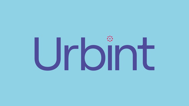
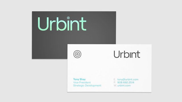
The logomark merges ‘urban’ and ‘intelligence,’ adding a dot to the right arm of the ‘u’ to make it an ‘i.’

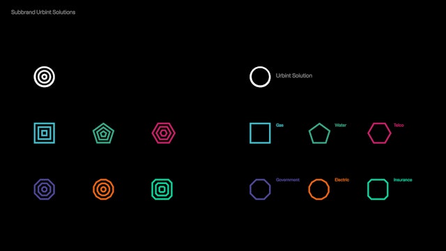


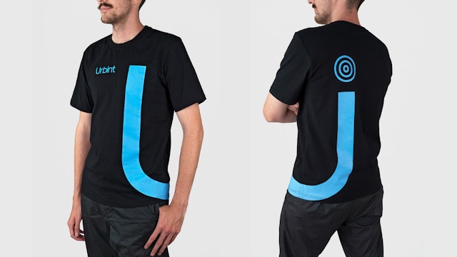
The dynamic dot can be customized with dimensional complexity or different shapes, movements and color treatments, and used on its own for various sub-brands.


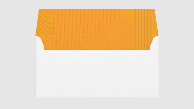
Highly graphic patterns are abstractions of the process and understanding of communities and data.


The visual identity has a modular, layered look and feel that evokes city grids and urban topology.


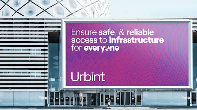

Urbint is a technology company that develops AI-powered solutions to maximize safety and reliability in utility lines. Urbint stands for “urban intelligence,” and the company is transforming gas infrastructure safety in cities, using AI and machine learning to reduce risk with early warning systems—including its own custom software, GRID—that detect issues, pinpoint problem areas and give a prognosis to replace pipes when necessary, saving time and money. Pentagram has designed a brand identity and website for the company that reflects its smart, dynamic and responsive approach.
Pentagram worked closely with Urbint leadership to develop the identity. The company wanted its branding to feel young and innovative, and also mature and trustworthy—gas safety is a serious issue. At the same time, AI technology can feel cold, remote and impersonal, but with a focus on urban environments, Urbint should be seen as energetic, responsive and human. The identity framework illuminates the company’s technology and processes with a clear, lucid design that helps make them accessible.
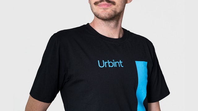
To create the logo, the designers carried out a series of typographic experiments that played with the structure of the letter “u.” Like the name, the final logomark merges “urban” and “intelligence,” adding a superscript dot, or tittle, to the right arm of the “u” to make it an “i.” The tittle is formed of radiating circles, a graphic signal for Urbint’s built-in intelligence. The dynamic dot can be customized with dimensional complexity or different shapes, movements and color treatments to suggest functions like scanning or to reflect the data at hand. It can also be extracted from the mark and used on its own to represent various sub-brands, categories and products.
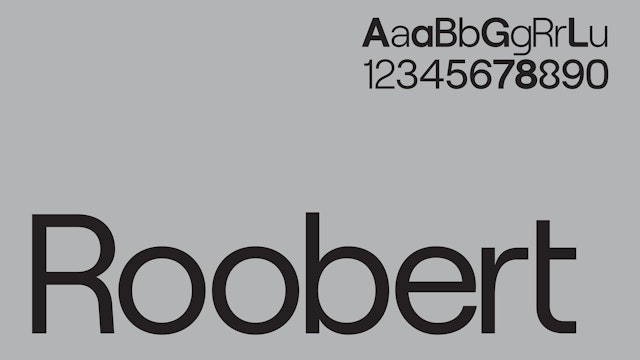
The wordmark and other typography are set in Roobert (from Displaay Type Foundry), a geometric sans serif with a typeface family in six weights. The various weights can be used in single content blocks to create rhythm and pacing for messaging. (The custom tittle is drawn from the Roobert “o,” and can replace the letter in display typography.)
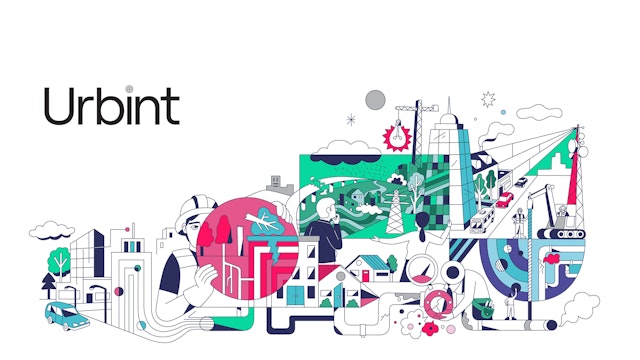
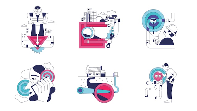
The visual identity has a modular, layered look and feel that evokes city grids and urban topology. As part of the framework, the designers developed a comprehensive kit of parts that can be built out for everything from the website to promotional collateral to in-the-field safety gear. The iconic logo is complemented by an eye-catching palette that pairs contemporary colors in individual applications. Highly graphic patterns are abstractions of the process and understanding of communities and data. Data visualizations and infographics depict complex systems with a simple, straightforward style. Illustrations are lively and playful, and photography has an editorial sensibility that emphasizes real-world people and locations.
Office
- New York
Partner
Project team
- Ken Deegan
- Jack Collins
- Paul Yoon
- Raoul Gottschling