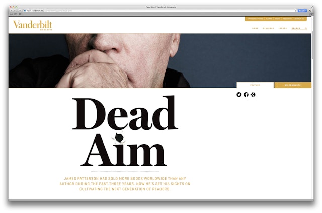


The first thing the designers suggested to the Vanderbilt team was dropping the large initial "V," which had acted as the publication's primary cover identity for several years, and simply replacing it with the word "Vanderbilt" spelled out confidently across the top of the magazine in upper- and lowercase Electra.


Pentagram redesigned the alumni magazine of Vanderbilt University and its website. The completely revamped publication and its online counterpart launched in 2013.
Vanderbilt is a private research university located in Nashville, Tennessee. Founded in 1873, the university is named for shipping and railroad magnate "Commodore" Cornelius Vanderbilt, who gave the school its initial $1 million endowment even though he'd never been to the South. The Commodore hoped that his gift and the greater work of the university would help to heal the sectional wounds inflicted by the Civil War. Vanderbilt now enrolls approximately 12,000 students from all 50 states and over 90 foreign countries in four undergraduate and six graduate and professional schools.
The first thing the designers suggested to the Vanderbilt team was dropping the large initial "V," which had acted as the publication's primary cover identity for several years, and simply replacing it with the word "Vanderbilt" spelled out confidently across the top of the magazine in upper- and lowercase Electra. The team also encouraged the Vanderbilt magazine staff to embrace the vibrant city the school calls home by featuring stories and imagery about the city of Nashville in addition to the standard fare about the university itself.
The launch issue does feature a gallery of rarely seen photographs of John F. Kennedy's visit to Vanderbilt in 1963 and a cover feature about bestselling fiction author James Patterson, who received his masters from Vanderbilt in 1970 and then returned to establish a writing scholarship. And of course the new issue features university-specific pieces too, like an infographic page that outlines the steps needed to demolish a large section of dormitories on campus and a multi-page photo essay about Vanderbilt's connection to the neighborhood and community where it resides.
Office
- Austin


