The logo marries a regal ‘crown’ monogram with the flourish of human handwriting.

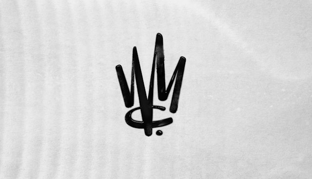

The expressive mark suggests graffiti and calligraphy, allowing it to represent a diversity of songwriters and musical genres.
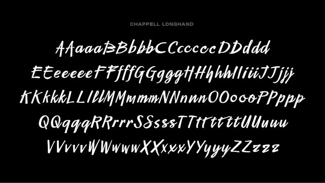
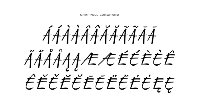


The script logotype inspired a full custom-drawn typeface that extends the look of artistic handwriting into other brand applications and expressions.


Warner Chappell Music is one of the world’s largest music publishing companies, home to an extraordinary catalog that includes works by over 70,000 songwriters and composers, with a collection of more than one million copyrights worldwide. Its roster of writers and producers features some of the most popular and celebrated songwriters in the world, including Lizzo, Gucci Mane, Frank Ocean, Bruno Mars, Radiohead, Madonna, Led Zeppelin, Kacey Musgraves, Katy Perry, Dr. Dre, Talking Heads, Ray Charles, Stephen Sondheim and Lin-Manuel Miranda, to name just a few.
Pentagram created strategic positioning for Warner Chappell Music that reflects its status as an industry leader and the importance the company places on the craft of songwriting. Based on that position the new logo balances a sense of prestige and artistry in a hand-drawn monogram that resembles a crown. The expressive mark suggests graffiti and calligraphy, allowing it to represent a diversity of songwriters and musical genres. The identity also encompassed brand strategy, naming and messaging, and a full custom typeface inspired by handwriting and notation.
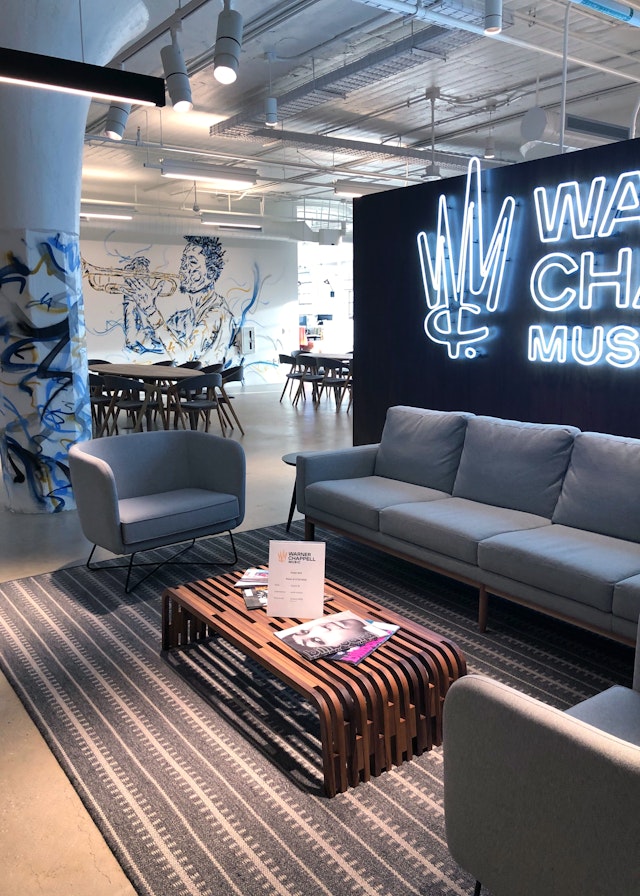
The Pentagram team worked closely with leadership at Warner Chappell Music on the identity, which helped mark the beginning of a new era for the global publishing powerhouse. The company had recently welcomed the duo of co-chair and COO Carianne Marshall and co-chair and CEO Guy Moot. In addition to the new leadership, the rebranding coincided with the company’s move to a state-of-the-art headquarters in a former Ford assembly plant in Downtown Los Angeles’ Arts District that is also the home of Warner Records. (The WCM project coincided with the launch of a new identity for Warner Records, also designed by Pentagram.)
Warner Chappell Music has an incredible heritage that dates back to the founding of Chappell & Co. in London over 200 years ago, when the company’s origins helped establish the concept of music publishing itself. The identity represented the first significant rebrand since Warner/Chappell was formed when Warner Bros. Music acquired Chappell in 1987 and the Warner Bros. logo was adopted for the launch of the combined company. Warner/Chappell remained part of the Warner Bros. group of companies until 2000, and by prior agreement, could no longer use the “WB” shield in its logo after 20 years.
The challenge for the designers was to create a timeless and contemporary brand identity that would pay tribute to this remarkable legacy, keep WCM relevant to today’s songwriters, and carry it into the future. Publishing is a business largely hidden from the view of music consumers and fans, but a very important part of the music industry. WCM is the source of some of the best music in the world, and the designers wanted to make it look the way its songs sounded.
This focus on songcraft formed the basis of the brand strategy. Pentagram first helped in an effort to modernize and clarify the name, recommending the company drop the slash from Warner/Chappell and adding the word “Music” to the logo, to help make it clear that’s what the company is all about.
In interviews conducted with WCM leadership and staff, the Pentagram team repeatedly heard an internal mantra—“Songwriters First”—that neatly summed up the company’s mission. The Pentagram team translated this idea into a new messaging statement, “Where songwriters are heard,” that conveys to existing and prospective songwriters that WCM will make them feel like a priority, listen to them, and get their songs out into the world. Some of WCM’s most essential functions are administering the copyrights of compositions, and collecting and distributing royalties—taking care of their songwriters.
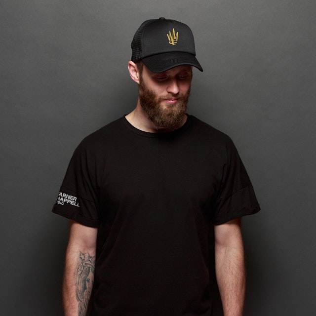
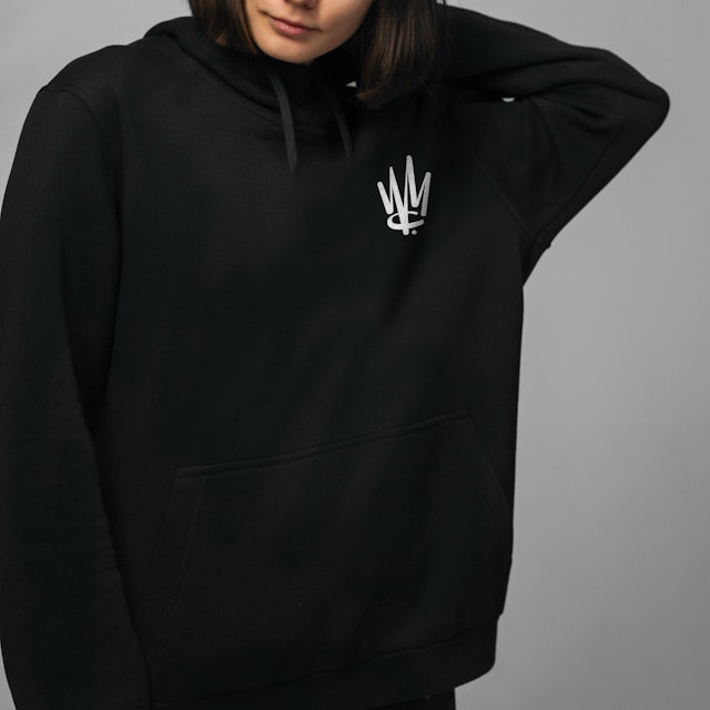
This idea helped inspire the logo concept. WCM’s songwriters are music industry royalty, and the company treats them as such. The new logo marries a regal “crown” monogram with the flourish of human handwriting. The crown symbolizes the prestige of the company and its leadership of the industry (with a wink to songwriting “royalties”). The designers noticed the letter “W” already resembles a crown, and added the “C” and “M” to form the distinctive custom-drawn monogram. Chappell is the origin of it all, so the “C” sits at the base of the mark, supporting everything else.
Rounded terminals and high contrast strokes give the logo the look of hand-drawn graffiti and calligraphy, making it appropriate for hip-hop, classical and everything in between. The handwritten look pays homage to a moment of scribbled inspiration—what songwriting is all about—and the highly individualized art of writing and composing.
The fluid monogram is balanced by a strong, solid wordmark customized from the typeface Plaak (designed by 205T Foundry), which has a sturdy, industrial look that sets off the handwriting. The brand identity appears in a refined palette of high-contrast black and white—a reference to ink and paper—and gold, reserved for the crown.
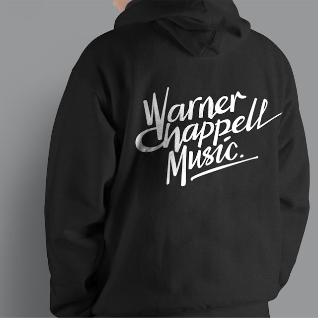
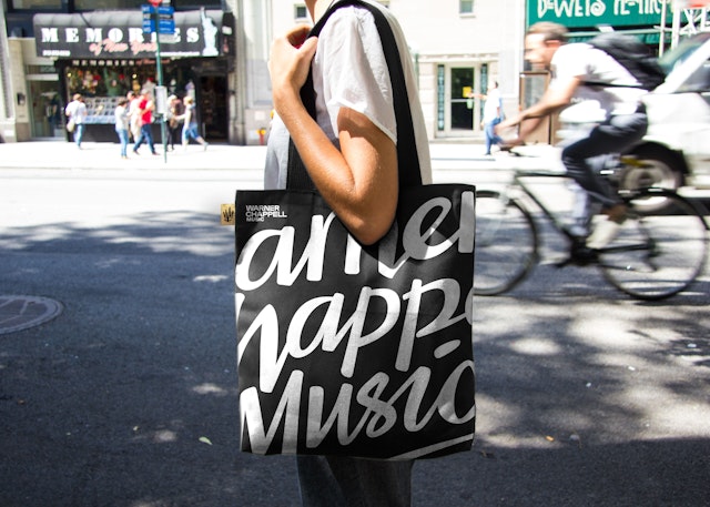
An alternate version of the logotype appears in a custom drawn script that references handwriting. The “W” and “C” are joined to create a ligature similar to the one in the crown monogram. Varying stroke widths and irregularities in the lines of the letters add a warm, human touch, and the logotype is completed with a period and underline, like a personal signature.
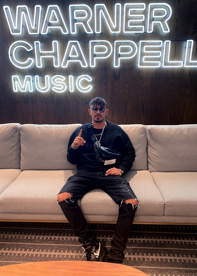
The script logotype inspired a full custom typeface called Chappell Longhand, created by Pentagram in collaboration with Graham Bradley, that extends this sense of artistic handwriting into other brand applications and expressions. The designers created a brand animation that shows the crown logo being “written” with liquid ink, complete with splashes and splatters. The distinctive monogram and script logotype appear on everything from stylish swag to a neon sign at the WCM headquarters.
At the time of the launch, Marshall and Moot said: “We’re thrilled to be opening this new era with a new look that reflects both our heritage and our future. We love our new logo, which is a tribute to our songwriters and the power, emotion and timelessness of their craft. They’re our constant inspiration, and we’re their devoted partners, collaborators and crusaders.”
Office
- New York
Partner
Project team
- Todd Goldstein
- Mira Khandpur
- Joey Petrillo
- Lisa Grant
Collaborators
- Shira Inbar, animation
- Chris Bruffee, animation
- Graham Bradley, type design
