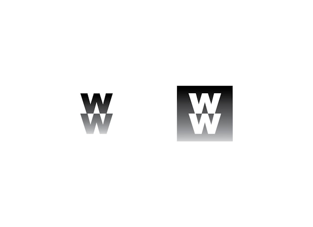
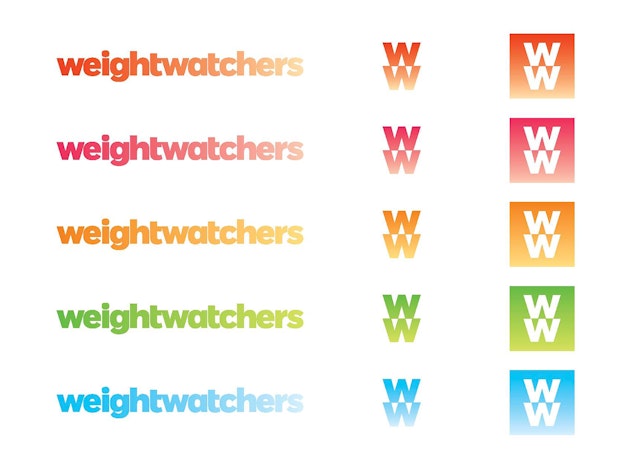


In addition to the grayscale gradient of the primary logotype, the gradation appears in the primary palette of five bright, bold colors.


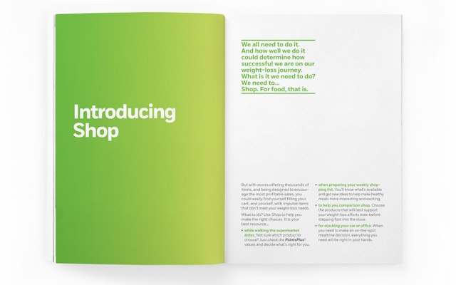
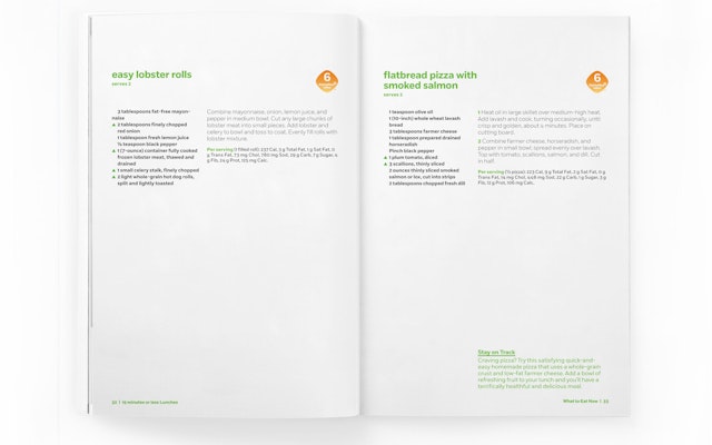

Pentagram has designed a new brand identity for Weight Watchers, the world’s leading provider of weight management services. Modern, open and energetic, the identity brings to life the transformation that members experience when they adopt a new lifestyle that can lead to significant weight loss.
Weight Watchers is one of the most trusted brand names among weight-conscious consumers. Each week approximately 1.3 million members attend over 45,000 Weight Watchers meetings around the world, and last year consumers spent almost $5 billion on Weight Watchers branded products and services. The new identity captures the brand’s spirit of change with a fresh, vibrant color palette, bold typography, and graphics that use gradation to visually embody transformation.
The designers worked closely with Weight Watchers on development of the new identity, which will contribute to an integrated marketing and communications strategy to position the company as a lifestyle brand. Rather than telling members what they can and cannot eat, the Weight Watchers approach helps members establish a healthy lifestyle to lose weight successfully and learn to keep it off. The new identity conveys a narrative of positive transformation.
Weight Watchers has many divisions and sub-brands, and its existing identity lacked visual cohesion. The new program establishes a disciplined, highly recognizable system that ties together the look and feel of the brand across its various programs, publications and products.
The new identity features a friendly, accessible logotype with the Weight Watchers name set in lowercase. The logotype appears in a gradient that visibly lightens from left to right, embodying the idea of transformation and losing weight. The designers also developed a logomark version that can function as a monogram or icon, as well as logotypes for PointsPlus, the new Weight Watchers 360º program, and the various Weight Watchers sub-brands. The identity uses a proprietary typeface designed by Jeremy Mickel, based on a customized version of his font Fort.
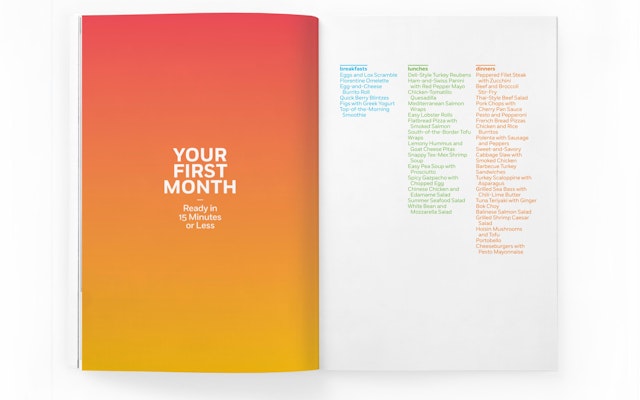
Gradation is an essential element of the entire program, symbolizing change. In addition to the grayscale gradient of the primary logotype, the gradation appears in the primary palette of five bright, bold colors. In horizontal elements, the gradation appears from left to right; in vertical elements like logomark, from top to bottom. The transition may also use multiple colors, appearing as a dual gradation, but always moving from dark to light. On print pieces and packaging, the gradation is applied to a colored bar, a distinctive graphic element that helps tie the brand together. This bright band of color is complemented by images of food, photographed on simple, neutral backgrounds.
The new identity will be applied to Weight Watchers publications including Weight Watchers magazine, newsletters, and cookbooks; digital channels like WeightWatchers.com and mobile applications; and packaging for food sold at Weight Watchers stores and in supermarkets. The designers are also developing signage and environmental graphics for Weight Watchers stores and meeting rooms, part of the continuation of a phased approach to transforming the Weight Watchers store experience, which has been implemented in more than 65 percent of company-owned locations in the U.S.
Office
- New York
