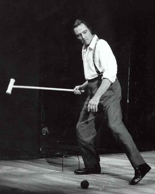

At the heart of the identity is a visual metaphor of space, taking the form of an abstracted stage that dynamically shifts with new content.

The typographic signature brings together the classic serif Times New Roman with the bolder Review Condensed Heavy to achieve a combination of timelessness and immediacy in every piece of communication.
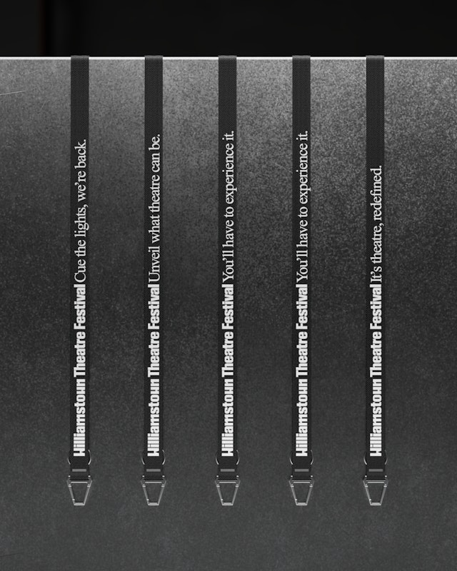


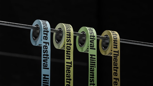
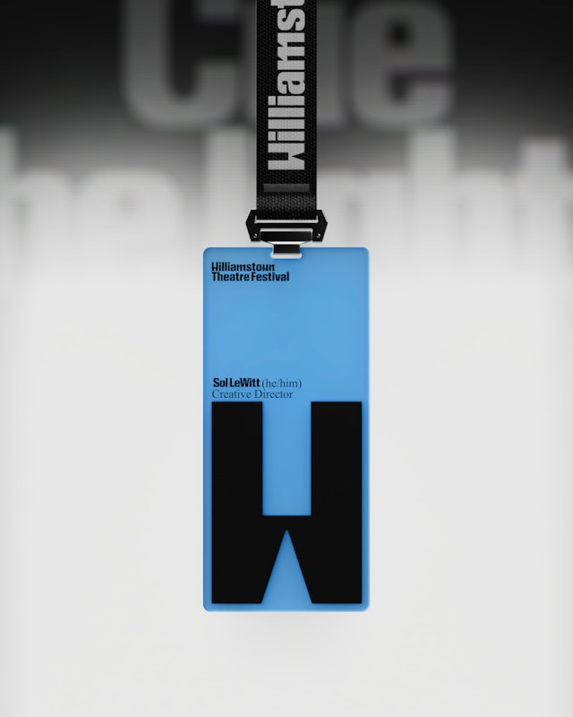
The stage system is powered by a motion behavior that adapts and reveals new content––visually capturing the multiple perspectives of a viewer in space.


The Williamstown Theatre Festival is one of the most prestigious performing arts events in the US, presenting innovative theater in the small-town setting of Williamstown in the Berkshires of Western Massachusetts. Founded in 1954, the Festival has helped shape American theater over the past seven decades, with more than 75 productions that have transferred to Broadway, Off-Broadway and regional theaters across the country. Thousands of actors, writers, designers, directors and aspiring theater professionals from all fields have come through the Festival.
Pentagram partner Andrea Trabucco-Campos and team have created a new identity for Williamstown Theatre Festival that matches an artistic vision that brings many theatrical forms together in exciting and innovative ways. Bold, imaginative and direct, the framework is anchored in Williamstown’s mission to expand the expression of theater and its essential role in society. At the heart is a visual metaphor of space, taking the form of an abstracted stage that dynamically shifts with new content.
Pentagram worked closely on the project with leadership at the festival, including Raphael Picciarelli, Williamstown Theatre’s managing director of strategy and transformation, translating the new vision into a creative strategy that served as a foundation for the brand identity and design system. The new look coincides with the appointment of the Tony-nominated playwright Jeremy O. Harris (“Slave Play”) as the inaugural creative director of the Creative Collective, a new initiative that will help guide the organization’s artistic direction.
Harris wanted to reinvigorate Williamstown with a sense of excitement akin to music festivals that draw fans from across the country and around the world. Every summer, Williamstown brings emerging and professional artists together to form a community where theatre is both a shared practice and the foundation of the ecosystem for thousands of festivalgoers and artists. Williamstown wanted to raise its profile and attract new audiences.
Most importantly, with the new identity, the festival wanted to signal a break from the past. “We’re pushing the (theatrical) form in really expressive ways,” Picciarelli said. “We want this season to be a reflection of many different sensibilities and many different artists.”
The powerful wordmark is built of custom letterforms with geometric cuts and angles inspired by stagecraft. The typographic signature brings together the classic serif Times New Roman with the bolder Review to achieve a combination of timelessness and immediacy in every piece of communication. A new naming structure pairs the “W” monogram with the numerical designation for this year’s edition of the festival (the 2025 season is W71). The color palette references the natural landscape of the Berkshires, with evocatively named colors like Sky, Earth, Grass and Sun.
The magic of the stage provides the visual foundation for the identity and its motion behavior. In theatre, the stage communicates meaning, defines context and establishes the relationship between the viewer and the performer. This looks different from every angle of the audience and can house infinite interpretations.
The identity positions the Festival and its programming as a force in changing perspectives and expanding experiences. Constructed of connecting lines and squares, the abstract dimensional space can be built, deconstructed or flexed in a variety of ways, shifting scale to interact with images and typography. The stage system is powered by a motion behavior that adapts and reveals new content––visually capturing the multiple perspectives of a viewer of live performance.
Office
- New York
Partner
Project team
- Mònica Losada
- Hyowon Kwon
- Sofia Flores
- Camila Pérez
Collaborators
- XXIX, website design
- Gerard Mallandrich, animator
- Jorge Rivera, animator
- David Mallén, 3D
