

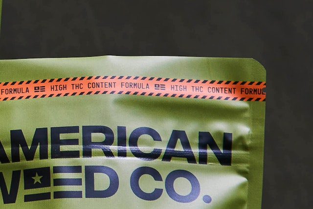
The designers considered the spray-painted stencil typography, numerals, symbols and other markings of military weapons and vehicles.


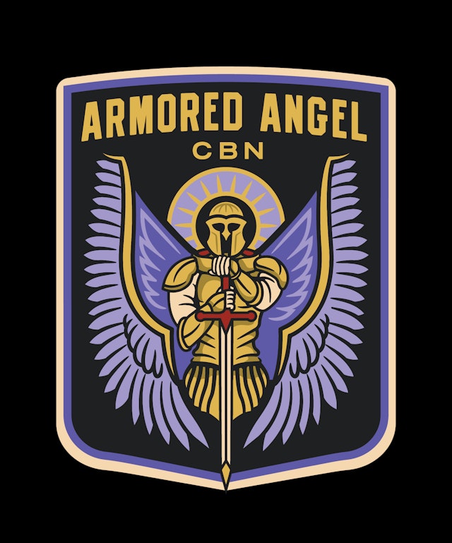
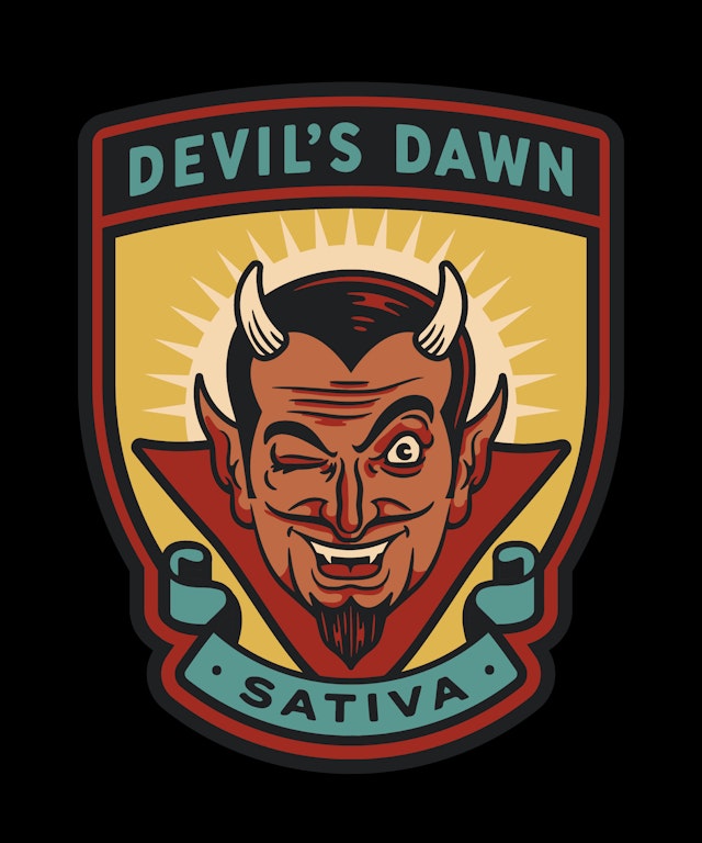


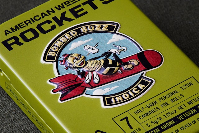
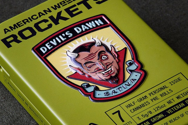
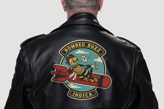
To differentiate the three different strains of cannabis, the design team commissioned Austin-based illustrator Mike Tabie to create emblems in the style of military squadron insignias

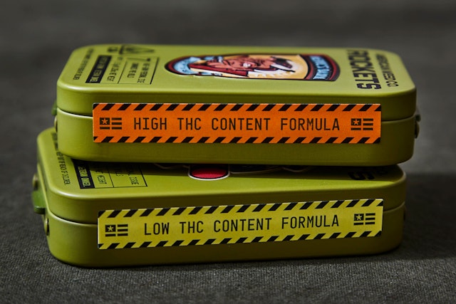
The tins feature the faux squadron insignias punched into the metal so they appears to rise off the “government issue-looking” containers.


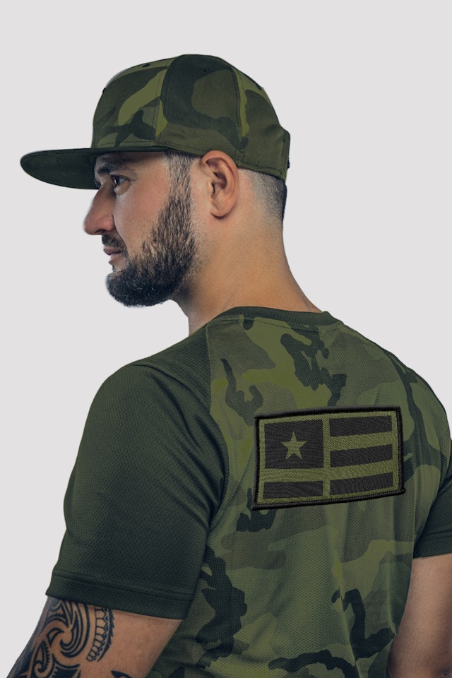


Pentagram Austin designed the identity and packaging system for a new cannabis brand called the American Weed Company (American Weed Co.). The veteran-founded brand caters to a veteran audience, specifically retired and newly decommissioned military personnel, who have an affinity for their service and embrace their identity as veterans. The unique company was co-founded by Sean Gilfillan, a former Senior Officer in the U.S. Army, along with Ryan Brooks and Jess Latham, both high-level entertainment executives and entrepreneurs, who run the day-to-day.
The project began with a thorough discovery process, including in-depth conversations with the founders and other military veterans to get an understanding of the intended audience. The design team then began researching American military history, ephemera and government issued gear including ammunition boxes, C-rations, footlockers and helmets. The designers considered the spray-painted stencil typography, numerals, symbols and other markings of military weapons and vehicles. The iconic styles of uniforms and the traditional décor of rank and achievement – specifically medals, ribbons insignias and patches – were a major visual inspiration to the designers as well.
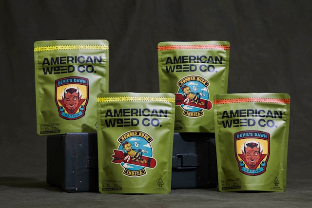
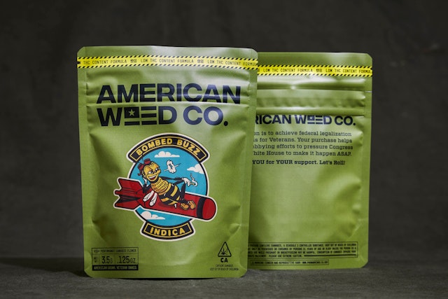
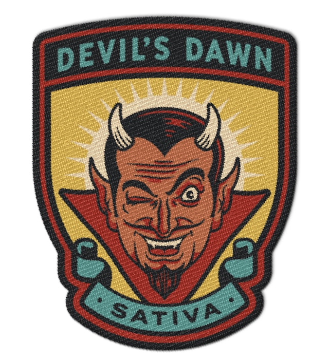
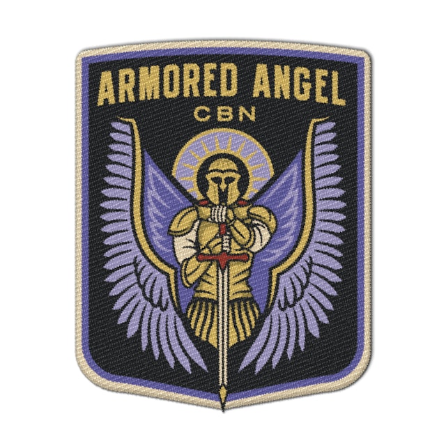
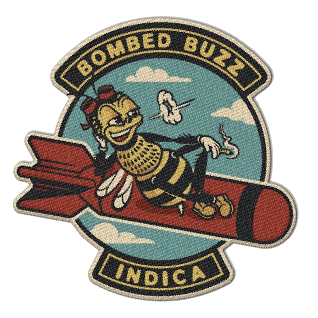
To differentiate American Weed Co.’s three main cannabis offerings, the Pentagram team assisted in the name development of the products and commissioned Austin-based illustrator Mike Tabie to create emblems in the style of military squadron insignias. The indica strain “Bombed Buzz” features a bee with goggles riding on a bomb in the style of Slim Pickens in Dr. Strangelove. The sativa strain “Devil’s Dawn” features a dashing devil character. “Armored Angel,” a winged armor-clad angel wielding a sword, is American Weed Co’s infused CBN offering. All three products are available as flower in child-proof bags or as pre-rolls in tins called “Rockets.” The tins feature the faux squadron insignias punched into the metal so they appears to rise off the “government issue-looking” containers. The three emblems are also available as decals and embroidered patches.
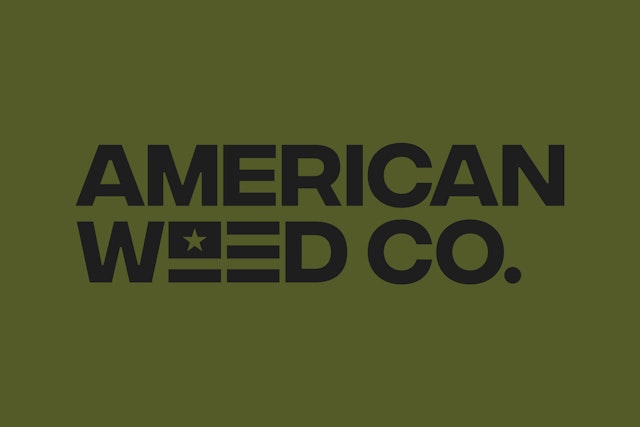
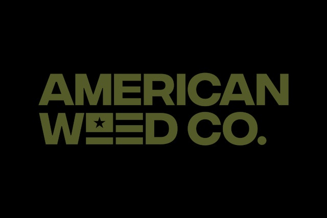
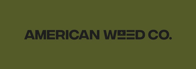
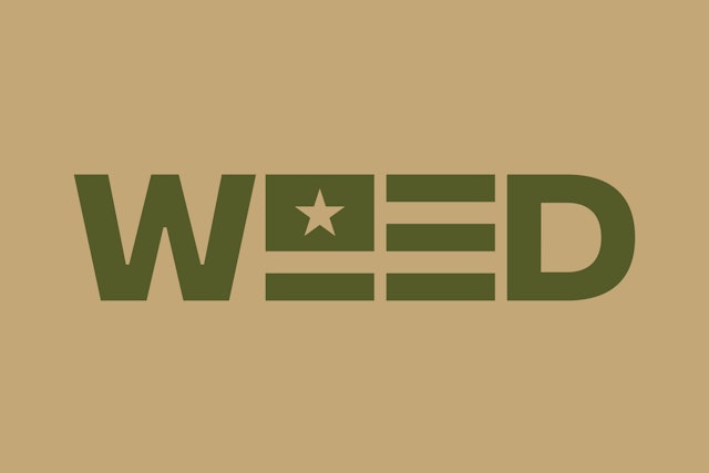
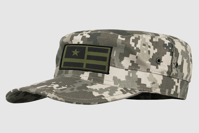
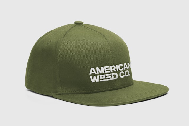
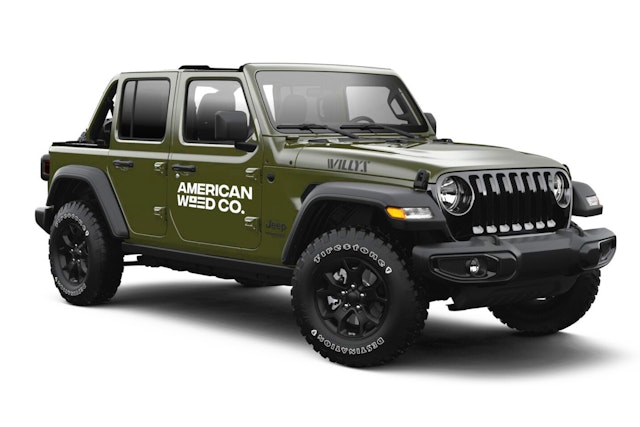
The American Weed Co. logotype is set in a military style sans serif called Integral, designed by Connary Fagen, and includes a simplified American Flag icon that can be used as a stand-alone logo or as a shorthand mark featuring the word “WEED.” Supporting typefaces for the identity include a condensed sans serif called Motor and a slab-serif font called Vitesse.
The launch of the American Weed Co. brand was a resounding success as expressed in this email from the client: “Our first pilot offering was amazing! We got a ton of compliments on the unique design and packaging. Every single dispensary wants to order our products–which was unheard of by our sales company. Typically, they get 30% on average. Honestly, the new brand is a HUGE hit!”
Office
- Austin
Partner
Project team
- Stu Taylor
Collaborators
- Mike Tabie, illustrator
- Hayden Spears, photographer
