


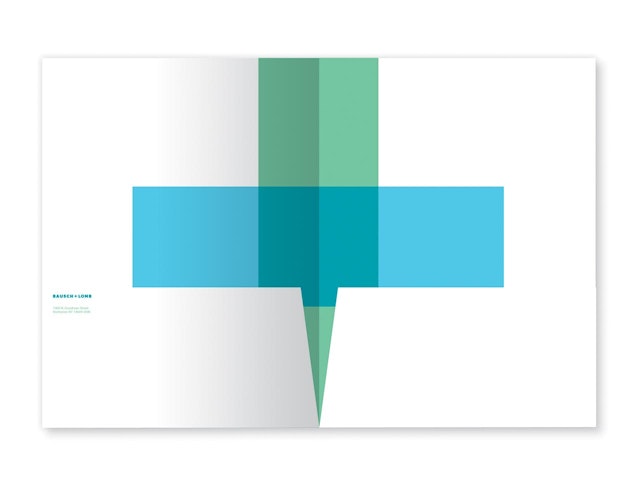
In the new identity, the ampersand becomes a transparent medical plus sign that conveys that Bausch + Lomb is open and committed to partnering with the medical community.
The new renu® packaging drops the allusion and uses an actual photograph of a wave of water that wraps around the package.


If you’re reading this with the aid of glasses or contact lenses, chances are you’re using a Bausch + Lomb product or innovation to help improve your eyesight. One of the biggest healthcare brands in the world, with products sold in over 100 countries, Bausch + Lomb is synonymous with lenses and eye care. The company was founded in 1853 and pioneered countless breakthroughs in optical science, from microscopes to photographic lenses to Ray-Ban sunglasses. It brought the first soft contact lens to market in 1971. More recently it has moved into pharmaceuticals and surgical implants. Pentagram has designed a new identity for Bausch + Lomb that reflects its growing presence in ophthalmic care.
Based in Rochester, NY, Bausch + Lomb was once primarily known for its optical instruments: optical glasses, microscopes, magnifiers, vision testers, binoculars, telescopes, periscopes, photographic lenses (the first Kodak camera featured a Bausch + Lomb lens), projectors, Ray-Bans (originally developed for the military), and CinemaScope technology for the movies. It became a familiar consumer brand with its contact lens lines like Soflens and PureVision. In recent years it has increased its focus on eye health with a growing pharmaceutical division that develops and markets everything from over-the-counter eye drops and vitamins to prescription medicines treating allergies, glaucoma, dry eye and other ailments. It also has a surgical division that develops products like the Crystalens, a surgical replacement lens for the treatment of cataracts.
The new identity deftly shifts the focus to incorporate the company’s commitment to eye health care and its pharmaceutical and surgical divisions. The previous Bausch + Lomb logo (internally known as “pathways”) represented the science of lenses with a graphic element that suggested angles of refraction. In the new identity, the ampersand becomes a transparent medical plus sign that conveys that Bausch + Lomb is open and committed to partnering with the medical community.
The element of transparency also suggests vision, as well as the liquid solutions that are an integral part of the company’s product lines. The traditional corporate colors of blue and green have been reinterpreted in modern hues that suggest water, moisture and ecology. In developing the symbol, the designers were inspired by the blue and green pharmacy signs found in France.
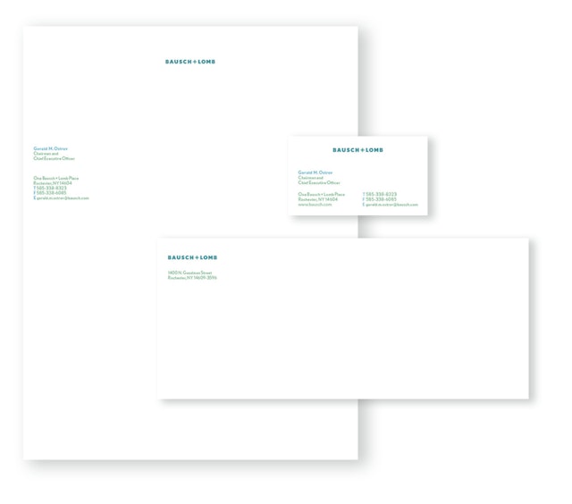
The program includes a corporate icon that functions as a simple, recognizable B + L. This monogram can be applied in various treatments and will be embossed on packaging. The new Bausch + Lomb logotype is set a proprietary font called Nobel BL, based on Nobel. The font is also used as a secondary typeface in all Bausch + Lomb communications.
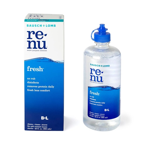
Pentagram has also redesigned the identity and packaging for renu® multi-purpose solution, one of Bausch + Lomb’s signature products and the category leader in contact lens solutions. The new renu® logo has been set in Belizio and breaks the word into two syllables, with a drop as the hyphen. The identity appears fresh and modern and conveys a personable, friendly quality that is appropriate for a personal care product.
The renu® identity and packaging have been designed to stand apart from the competition in the category, which includes brands from manufacturers like Alcon, Allergan and Ciba Vision. The packaging of all these brands uses colors of blue and green and motifs of waves, curves and circles (or bubbles) to allude to water, liquid and moisture. The new renu® packaging drops the allusion and uses an actual photograph of a wave of water that wraps around the package.
The renu™ packaging redesign avoids the unrecognizable overhaul of other recent redesigns and instead reinterprets the familiar brand elements in a new way. The placement of the new wave is the same as on the brand’s previous packaging, with the color band wrapping around the lower two-thirds of the box. The two renu® sub-brands—renu® fresh™ and renu® sensitive™—are clearly designated by different colors. The solutions are now dispensed in the new translucent bottles introduced by Bausch + Lomb that allow users to see how much solution is left in them.
Office
- New York


