
The branding prominently features the work of Black artists and designers and conveys B3’s message of activism with typography inspired by protest graphics.
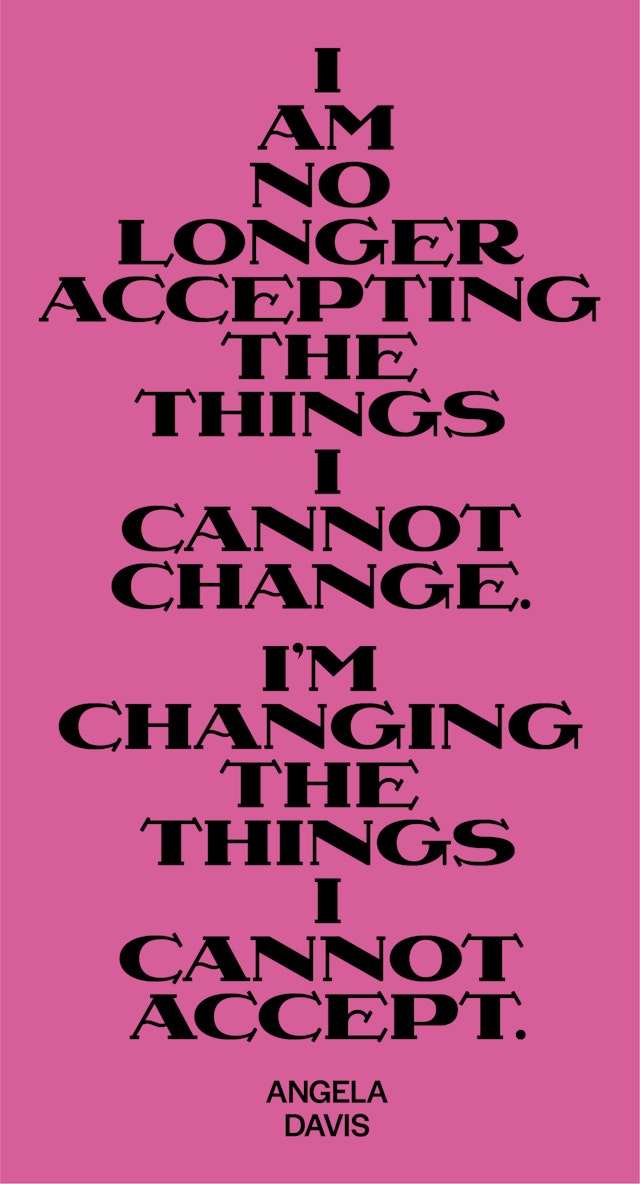

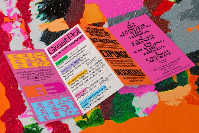
The packaging is covered in calls to action to decarcerate and deschedule cannabis, along with powerful quotes from Black leaders like Angela Davis and Nelson Mandela.


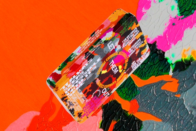
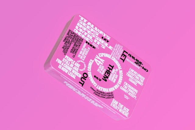
The immersive typography is layered with striking visuals by Black artists, and launches with two commissioned pieces—one from the multimedia artist Dana Robinson and the other from Opara himself.


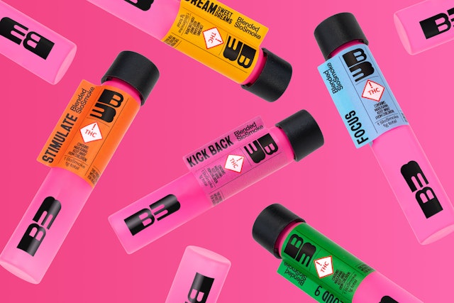
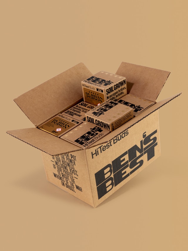
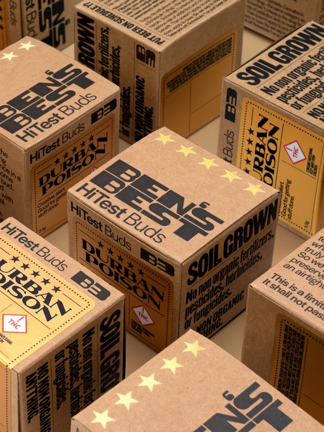

B3 is working to bring change to a broken system, and the identity itself has the freedom to transform, adapt and grow.

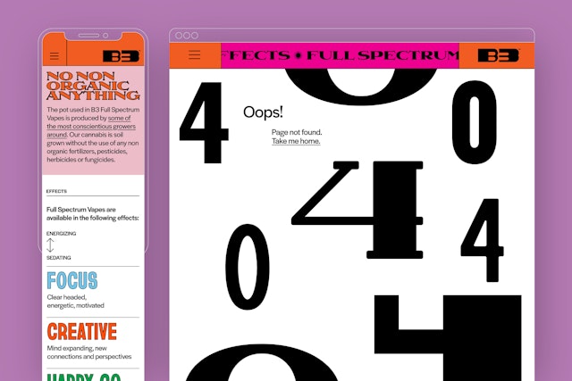
The system of type, color and artwork extends to digital spaces such as the website and social media, as well as merchandise such as t-shirts, hats and posters, all sold in support of the brand mission.


Black people have borne the brunt of America’s failed five-decade War on Drugs, being arrested at four times the rate of whites, despite marijuana use being roughly equal among both groups. As pot becomes legalized in more states, the fight to decarcerate Blacks with cannabis-related charges and to support the formation of legitimate businesses to cultivate and sell marijuana is just beginning.
Ben’s Best Blnz (or B3) is a new cannabis company founded by Ben Cohen, the co-founder of Ben & Jerry’s Ice Cream, that will invest 100% of its profits back into the Black cannabis community and groups advocating for criminal justice reform. Pentagram’s Eddie Opara and team have collaborated closely with Cohen on a brand identity framework and packaging for B3 that prominently features the work of Black artists and designers and conveys the company’s message of activism with typography inspired by protest graphics.
The Challenge
Ben’s Best Blnz describes its mission as “to sell Great Pot and use the power of our business to Right the Wrongs of the War on Drugs.” The company advocates for the decarceration of those convicted of nonviolent cannabis crimes and the descheduling of marijuana as a Schedule 1 substance. Where possible, B3 will prioritize work with Black-owned vendors and partners.
Cohen is already recognized as an activist, and well known as the co-founder of Ben & Jerry’s, but B3 is an independent non-profit organization and the new brand had to stand on its own. Given the seriousness of the issue, Cohen wanted B3 to be a category changer that addresses racial injustice around cannabis in a way that is impactful and responsible.
“We don’t want to freely be using cannabis when people—disproportionately Black—are locked up for doing the same thing,” he says.
Cohen also knows that he is an “old white guy” (as he puts it) and he wanted B3 to appeal to and work in support of Black entrepreneurs. As part of its mission, B3 has been envisioned as a creative space or platform for Black designers, illustrators and artists.
The challenge for Pentagram was developing a visual language that reflected B3’s activist positioning, that allowed for the featuring of Black artists and collaborators, and that would stand out in the cannabis space, which is already visually saturated with fairly sophisticated branding. As an additional consideration, much of the design had to work within specific safety regulations guiding marketing and packaging around cannabis.
The Strategy
To highlight the social activism that sets B3 apart, the brand identity framework is vital, creative and purposeful. The team wanted to avoid the typical cannabis tropes—marijuana plants, leaves, the color green—and keep the focus on the message. With its roots in protest graphics, the bold typographic approach speaks to the serious objectives at the heart of B3’s work.
“The goal for the Ben’s Best graphics was to be honest and artful—to reflect the quality of our products and the social mission of our brand—to help Right the Wrongs of the War on Drugs which disproportionately affected Black people,” says Cohen. “The focus on this issue is something that a lot of other brands might mention, but virtually no other brand makes it so prominent. Pentagram helped us to integrate typefaces created by Black designers and original artwork by Black artists into our packaging, which is our major form of marketing.”
The Solution
B3 is working to bring change to a broken system, and the identity itself has the freedom to transform, adapt and grow. This built-in flexibility can accommodate the rules around the marketing and packaging of cannabis, which are continuously evolving and vary by state.
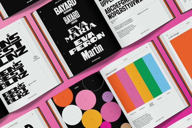
The branding is driven by expressive typography, using typefaces created by Black designers and rooted in historical context. These center on a group of fonts from Vocal Type Foundry, founded by Tré Seals, that highlight pieces of history from a specific underrepresented race, ethnicity or gender—from the Civil Rights Movement in the US (the typefaces Martin and Bayard) to the Women’s Suffrage Movement in Argentina (the font family Eva, with variations Eva Maria and Eva Peron). Supporting type is set in Halyard, created by Joshua Darden. The logo itself embodies transformation with dynamic letterforms that can shift in size and scale, or act as a window for images.
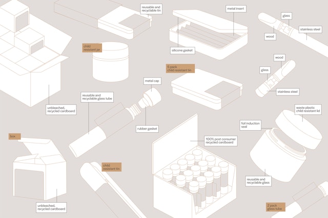
Sustainability is a priority for B3, and Pentagram worked closely with Cohen on each element of the packaging to make as much of the line sustainably produced and recyclable as possible. The team avoided typical plastic solutions like child-proof pouches and instead focused on recyclable and renewable materials such as tin, glass, metal and cardboard.
The designers wanted B3 to look and feel crafted and special, and they imagined the containers being passed around while getting high, doubling as intricately detailed vessels of messaging, as well as pot. The packaging is covered in calls to action to decarcerate and deschedule cannabis—slogans like “Let them out” and “Keeping people in jail for pot destroys lives”—along with powerful quotes from Black leaders like Angela Davis and Nelson Mandela, and B3’s mission statement.
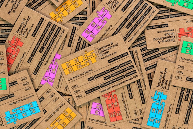
Wrapped in words and phrases, the distinctive packaging is intended to generate conversation and moments of introspection, and to be engaged with over time, saved, collected and reused. Some type on the tins is embossed, giving them a tactile quality, and type also covers the slipcases and belly bands that go around the containers, as well as the fold-out insert inside.
Even the effects of the products are illustrated with typography—expressions like “Stimulate,” “Focus” and “Kick Back” are playfully rendered to look like what they say. (Every package also includes a small symbol of an ice cream cone, a wink to Cohen’s background.)
“The packaging is deliberately heavy on type and text; it is designed to be explored and discovered over time as the reusable tin lays around the house,” says Cohen. “At times we thought of the packaging as an artfully designed Dr. Bronner’s soap bottle. But it turned out to be so much more than that.”
From exterior elements like sleeves and tin artwork to pamphlets and inserts inside each container, as well as product displays and shipping containers, each part of the packaging has been carefully considered. The immersive typography is layered with striking visuals by Black artists; B3 launches with two commissioned pieces, one from the Brooklyn-based multimedia artist Dana Robinson and the other from Opara himself.
Robinson’s piece follows the processes of her Ebony Reprinted series, in which advertisements and imagery taken from Ebony magazine are translated into smeared, pressed and textured monoprints that eliminate the original intent of the inherently white, capitalist and commercial visual language. As part of the commission, the design team selected an ad from Ebony set in an ice cream parlor (another nod to Cohen).
Opara’s photo collage depicts the profile of a Black man in an orange incarceration jumpsuit, with his face and hair built from images of flowers––a play on marijuana’s flower or “bud.” The artwork features specific flower types that represent truth, freedom, sorrow and forgiveness.
Color is used generously and purposefully throughout to give B3 a vibrant presence. The dynamic system of type, color and artwork extends to digital spaces such as the website and social media, as well as merchandise such as t-shirts, hats and posters, all sold in support of the brand mission.
“Working with Pentagram has been a pleasure and inspiration,” says Cohen. “The professionalism with which they approached the project—especially how they rolled with all the punches and changes along the way in this nascent industry—was beyond my expectations.”
B3 will launch first in Cohen’s home state of Vermont. Products will be available for purchase at a selection of local dispensaries and can be viewed online at BensBest.com.
Client
Ben’s Best BlnzSector
- Food & Drink
Discipline
- Brand Identity
- Digital Experiences
- Packaging
- Brand Strategy
Office
- New York
Partner
Project team
- Jack Collins
- Raoul Gottschling
- Ruben Gijselhart
- Dana Reginiano
Collaborators
- Claudia Mandlik, photography
- Dana Robinson, illustration
- Vocal Type, typography
- Darden Studio, typography
- Michael Justiz, type animations
- Jacob Macdonald, web development
