


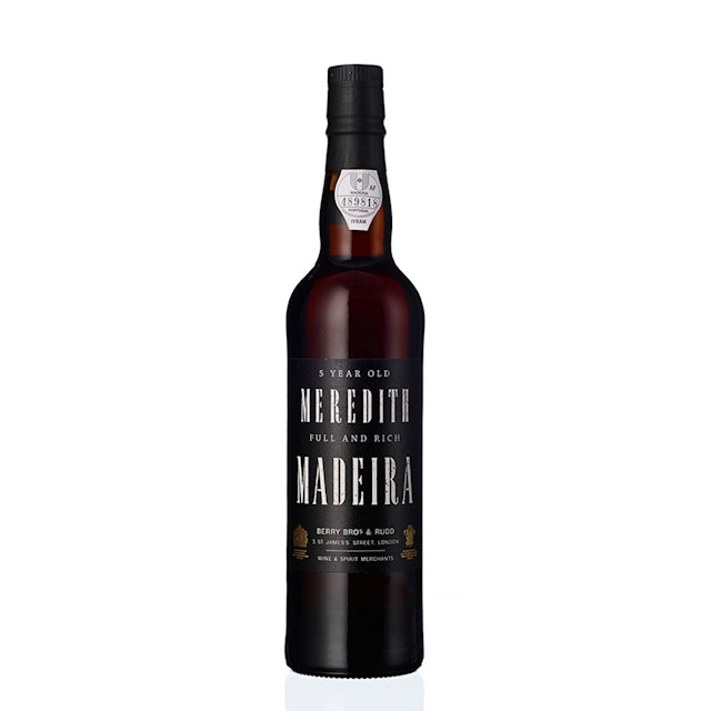
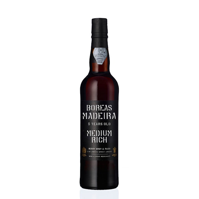
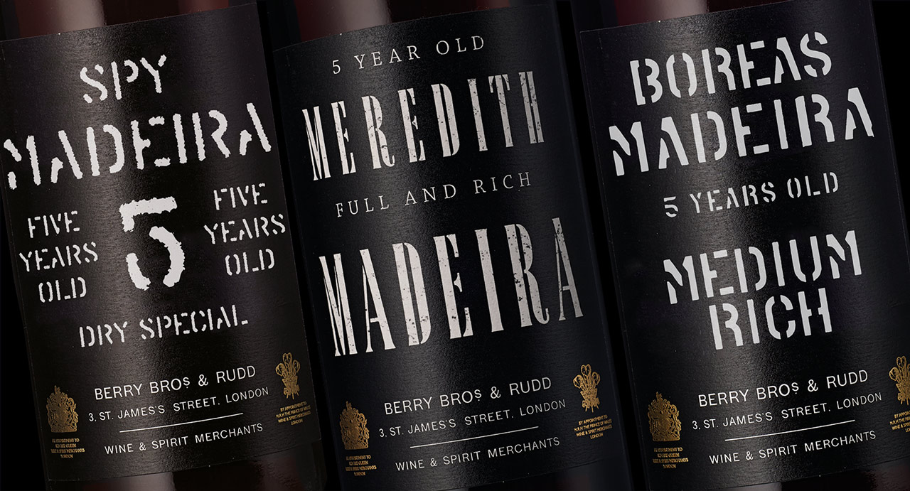
For the Madeiras, as tradition dictates, the typography is bold and on a black background with stencilled lettering often applied.

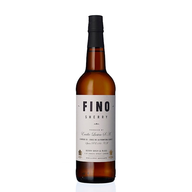
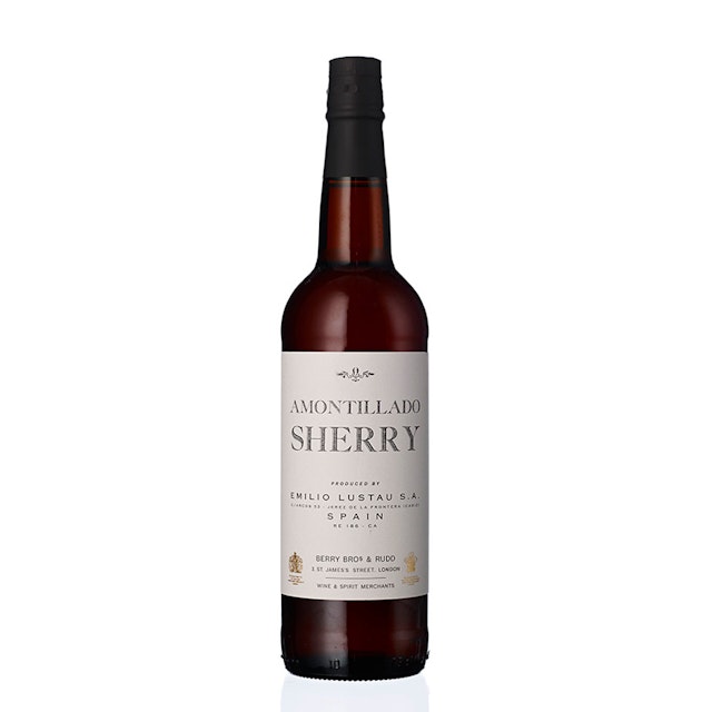
The sherries are far more delicate in design, with occasional tiny pieces of ornamentation added, along with the typography, sourced from old typographic volumes.

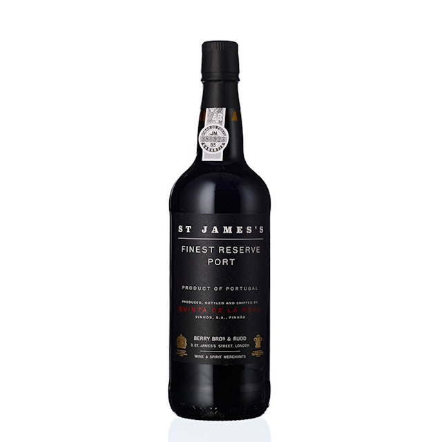
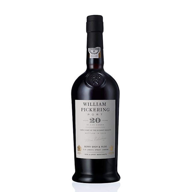
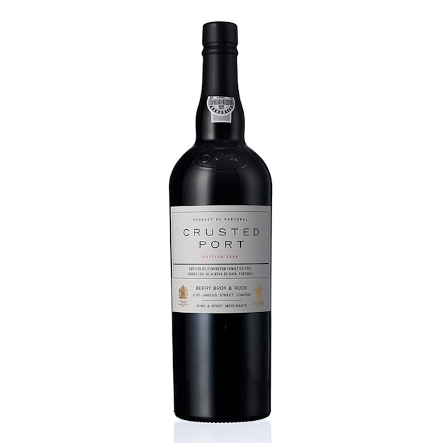
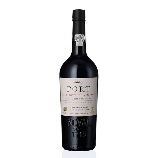
The Ports have the most individual character: label by label, they switch from black to white backgrounds with a touch of red.
Since 2014 Pentagram has been working with Berry Bros. & Rudd, one of the world’s oldest and most respected wine merchants. The relationship has encompassed an overall brand identity, advertising campaigns and individual wine labels. After the completion of 60 labels for Berry Bros. & Rudd’s own brand selection, Pentagram has released it’s latest designs for the merchants – labels for Madeiras, Ports and Sherries.
As with all of the Berry Bros. & Rudd work the central tenet of each design is authenticity. When first researching the brand, the Pentagram team spent days in their St. James Street base, going through photographs, archives and hundreds of labels. During this time, they realised that the visual manifestation of the brand was typographic. This typographic custom was honoured in the brand’s logotype and is extended to all its labels.
For the Madeiras, as tradition dictates, the typography is bold and on a black background with stencilled lettering often applied; the name of each batch taken from the boats that brought the wines from Portugal to the British shores 200 years ago.
The sherries are far more delicate in design, with occasional tiny pieces of ornamentation added, along with the typography, sourced from old typographic volumes. The Ports have the most individual character: label by label, they switch from black to white backgrounds with a touch of red.
Office
- London


