
The new name adds clarity and helps define Blood Cancer UK’s scope, covering a broad spectrum of blood cancer types and helping people across the whole of the UK.
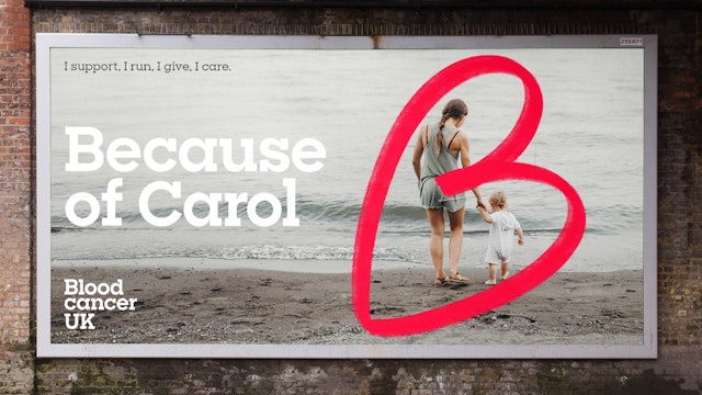
Pentagram’s team proposed the word ‘Because’ as a way of referring each activity and each individual back to the same cause. This became a central part of the tone of voice.
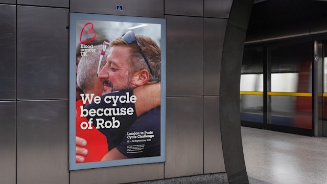
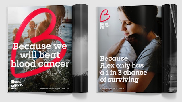
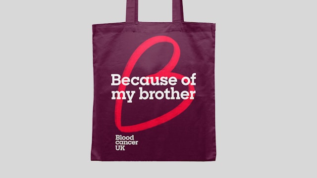
It's likely that the current generation will see a cure for many types of blood cancer, and Pentagram’s new brand system can play an important role in supporting Blood Cancer UK’s vital work in achieving this.
Pentagram has created the new brand identity for Blood Cancer UK, a charity which funds vital life-saving research into all types of blood cancer and provides care and support to those affected by blood cancer and their families.
Formerly named Bloodwise, the charity has been a crucial source of support for those living with blood cancer.
The charity was founded in 1960 by David and Hilda Eastwood who lost their daughter Susan to leukaemia. At that time survival rates were low, with most children dying from the disease, so David and Hilda started fundraising in the hope of finding a cure. Since then, the charity has spent over £500million on blood cancer research and now 8 in 10 children diagnosed with blood cancer survive. The charity doesn’t just fund childhood blood cancer research but supports anyone affected by blood cancer—those with the condition, their families, carers and friends. It has dramatically improved blood cancer survival rates over the last 60 years, through carrying out research, giving patients support and information, and campaigning to raise people’s awareness.
There are a high number of charities working in the blood cancer space, but there are over 100 different types of blood cancer, and Blood Cancer UK can claim to be the only one that funds research and provides support for them all.
In the last few years, in contrast to many other charities, Blood Cancer UK has seen its donations fall—one of the reasons was a lack of clarity with its name and a lack of connection with the brand.
Once it was clear that the charity was reaching too few people affected by blood cancer, the charity needed a new brand identity and a clearer name to help it grow its income, gain better engagement from supporters and help as many people suffering from blood cancer in all of its many forms.
The new name adds clarity and helps define Blood Cancer UK’s scope, covering a broad spectrum of blood cancer types and helping people across the whole of the UK.
The new brand identity also needed to bring together all dimensions of the charity’s activities from funding research, to emotional and practical support. The charity was born from the story of one family’s loss and keeps the sense of family at the heart of how it operates.
To connect the different strands and convey both the practical and the emotional elements, Pentagram’s team proposed the word ‘Because’ as a way of referring each activity and each individual back to the same cause. This became a central part of the tone of voice:
Because we research, we care, we support.
Because of Lisa, because of Norah, because of Richard.
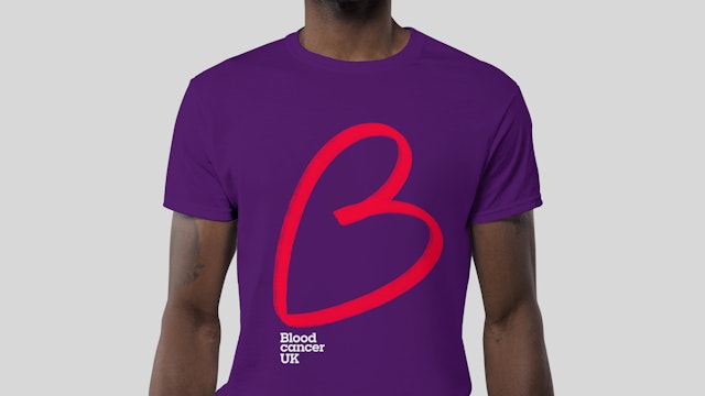
The symbol is a hand-drawn letter ‘B’, which stands for Blood Cancer UK. It also connects links with ‘Because’ and resembles a love heart—a simple symbol that embodies passion, conviction and kindness. The typography is friendly and yet scientific to indicate professional rigour and the colour red (already used by the charity), also expresses its passion for this important cause.
As well as the logo, Pentagram’s team created the tone of voice, graphic language, animation and photography style.
While the prognosis is positive, there is still much work to do. It's likely that the current generation will see a cure for many types of blood cancer, and Pentagram’s new brand system can play an important role in supporting Blood Cancer UK’s vital work in achieving this.
Office
- London
Partner
Project team
- Stuart Gough
- Cleber de Campos
- Ana Lapa
- Marta Gaspar
- Kate Blewett
Collaborators
- Mark Radda (strategist)
