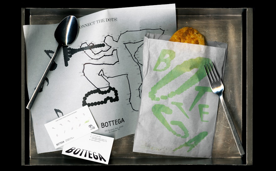
Pentagram partner Andrea Trabucco-Campos and team developed a new visual identity and environmental graphics with an inviting, dynamic, yet elegant attitude.
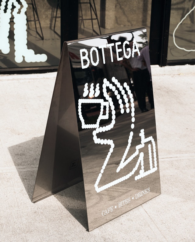
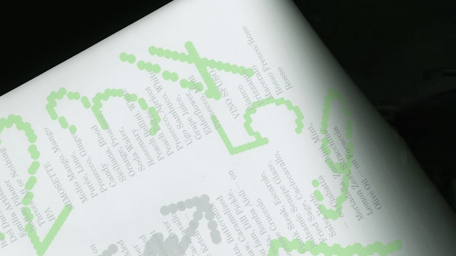
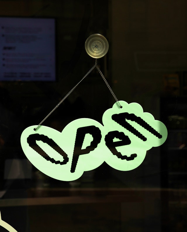
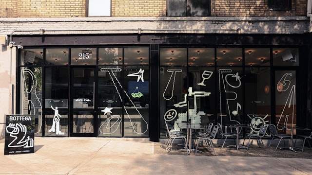
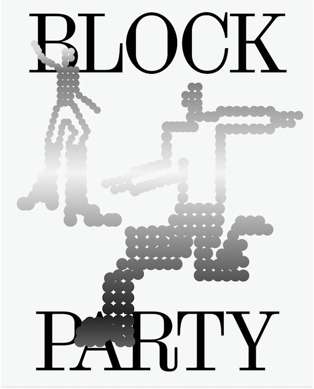
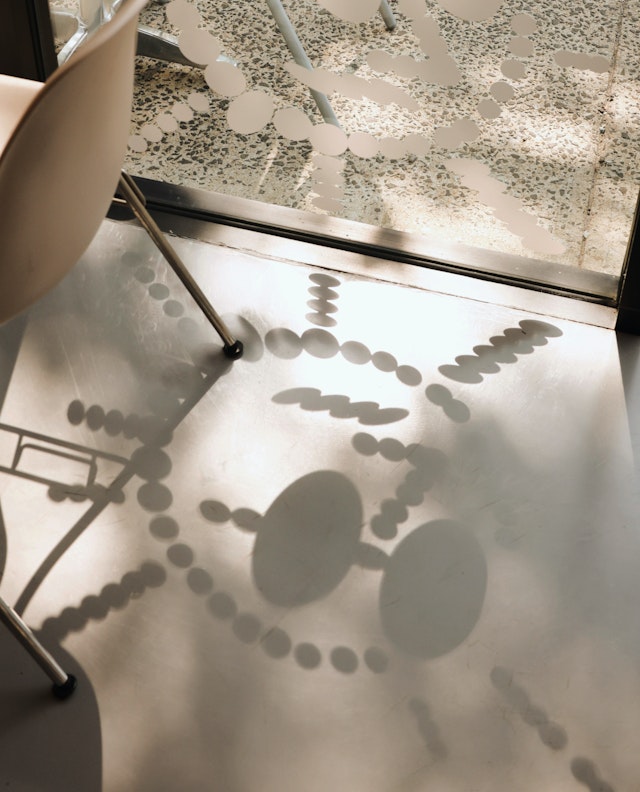
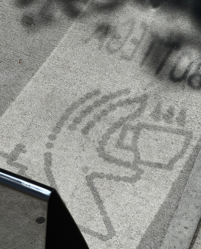
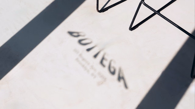
The core visual gestures (shadow, reflection, and perspective) use dots that swell to imply light movement, generating eclectic variations on the letterforms and unique positions for the illustration.
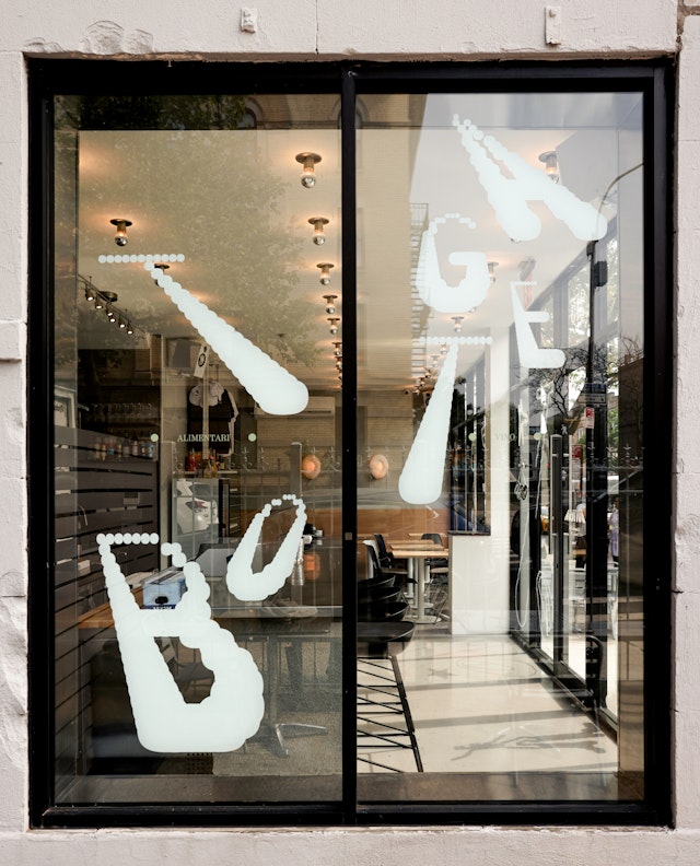
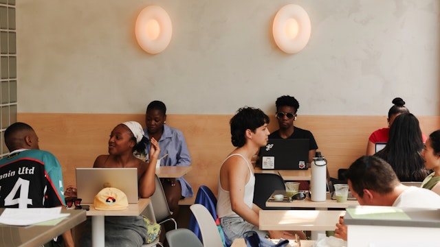
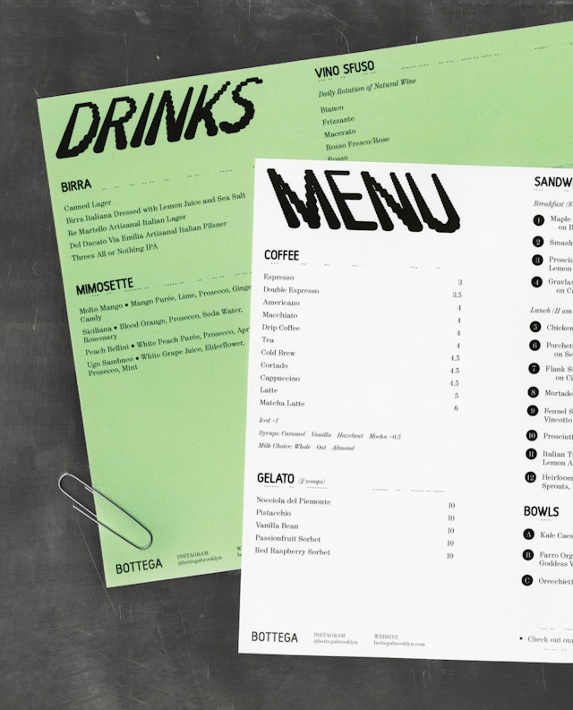
Even in static form, the identity conveys an active space, constantly moving and changing, much like the diverse Crown Heights community that Bottega is now a part of.
Bottega is a new mom-and-pop Italian café and sandwich shop nestled in the heart of Brooklyn. More than just a café, Bottega aspires to become a modern-day social club—an inviting space inspired by the European ideal, where people of all ages drop in, gather, connect, and create community. At the center of it all is the food: vibrant, seasonal, and eclectic, anchored by artisanal breads. Pentagram partner Andrea Trabucco-Campos and team developed a new visual identity and environmental graphics with an inviting, dynamic, yet elegant attitude.
Bottega’s space features floor-to-ceiling windows all around that allow the sunlight to fill the space at all times of day. This presence of light is the source of inspiration interpreted through a unique typeface and illustration system: the design system is built on how shadows shift throughout the day.
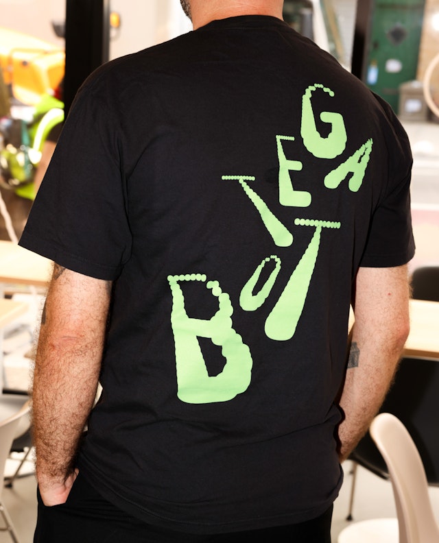
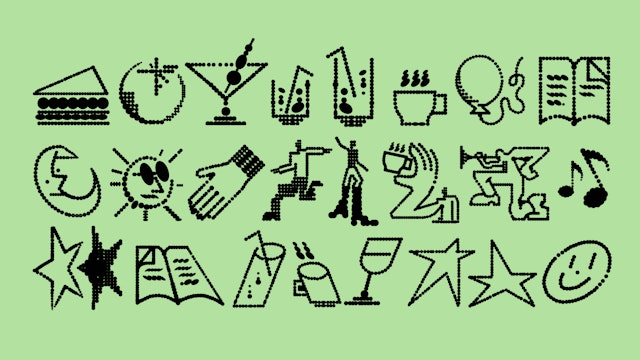
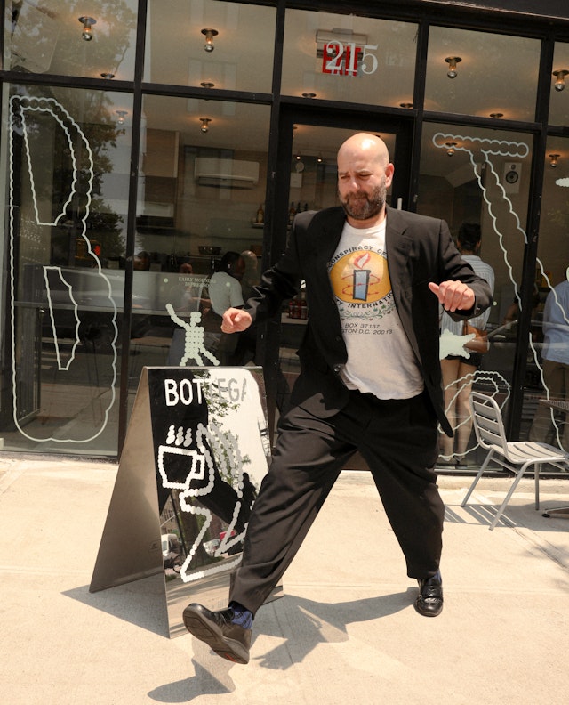
The core visual gestures (shadow, reflection, and perspective) use dots that swell to imply light movement, generating eclectic variations on the letterforms and unique positions for the illustration. The typographic palette is composed by a variable typeface, Harber (BB-Bureau), used as the main playful display and Montiac (SuperContinente) as the elevated text companion. The illustrations were drawn in-house to match the typographic attitude and shifts in point-of-view. The materials used in the space (zinc and industrial steel surfaces) become part of the vocabulary for the design system, often implemented as reflective surfaces to extend the metaphor of light and shadow in a physical form.
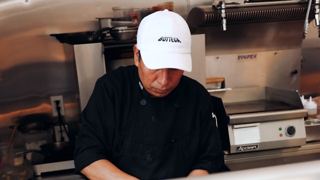
The identity permeates every aspect of the coffee shop: from interactive displays, website, social media framework, menus, tray paper, to-go bags, merchandise, packaging for sauces and pastas, to signage and environmental that feature a combination of letterforms and illustrations. Even in static form, the identity conveys an active space, constantly moving and changing, welcoming all perspectives, much like the diverse Crown Heights, Brooklyn community that Bottega is now a part of.
Coming soon, Bottega will expand its alimentari with to-go sauces, meals, and curated books that reflect its values as an Italian, Black, and women-led business.
Office
- New York
Partner
Project team
- Lauren Rush
- Doyeon Kim
- Pablo Nietos
- Sofia Flores
