


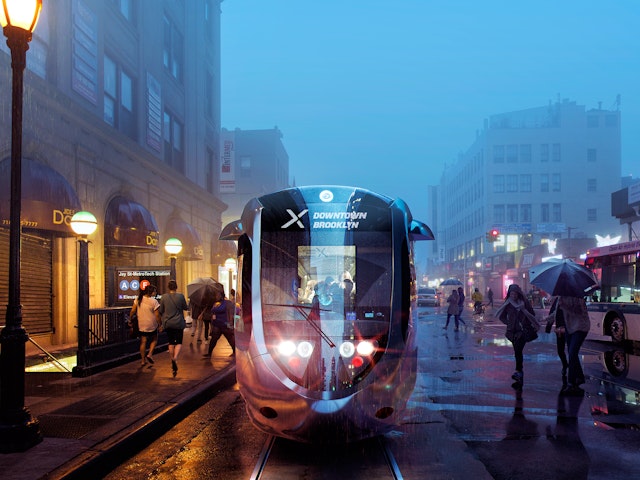
Combined with an arrow, the ‘X’ becomes an iconic symbol for the line, graphically representing speed and connection and the streetcar as an express mode of transportation that will get commuters where they need to go.
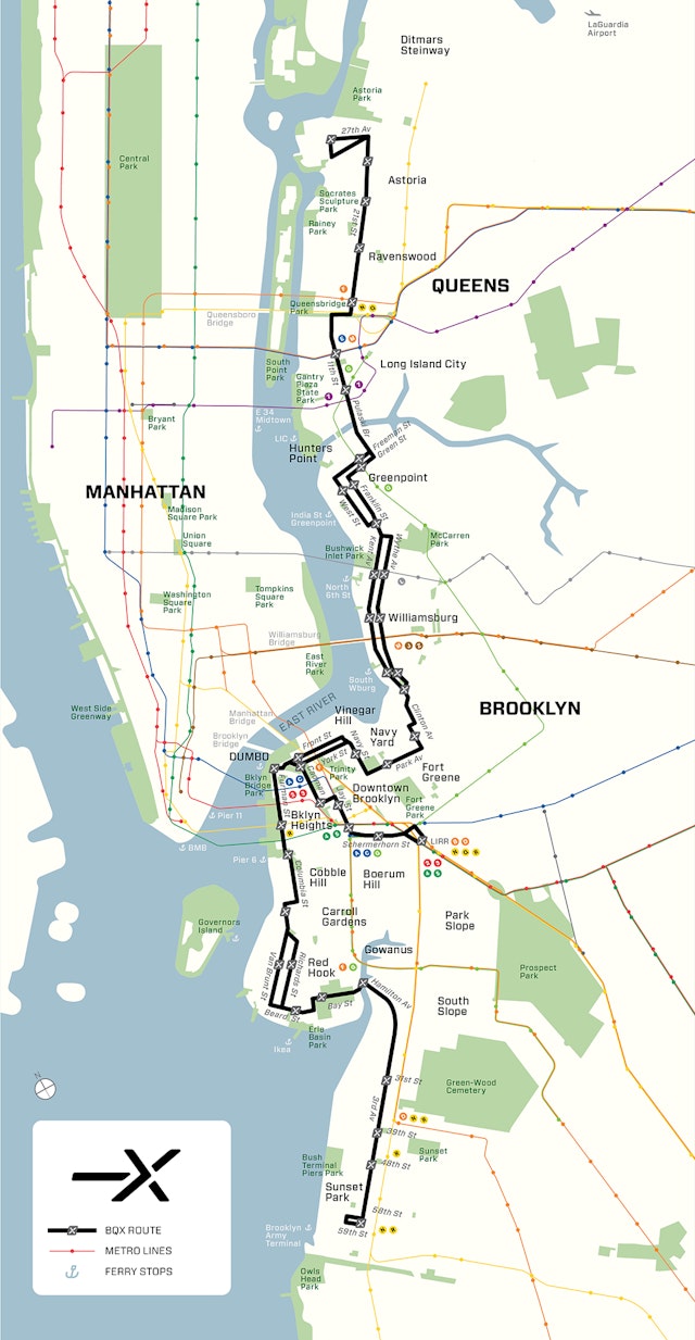

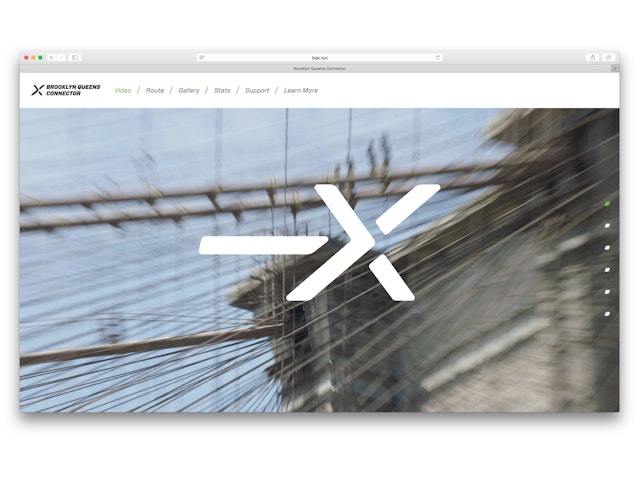
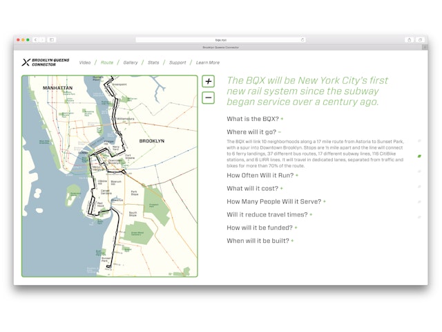

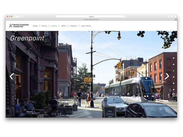

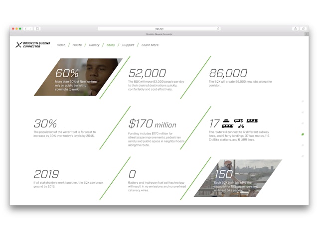

As innovation hubs like the Brooklyn Tech Triangle, Long Island City and Sunset Park continue to grow along New York's East River, transportation in these underserved areas is becoming critical to job growth and opportunities. Earlier this year, Mayor Bill de Blasio announced the Brooklyn Queens Connector, a proposed modern streetcar that will run along the Brooklyn and Queens waterfronts, improving mass transit and connectivity in neighborhoods from Sunset Park to Astoria. Pentagram has designed the identity, website and visual system for the proposal and for Friends of the Brooklyn Queens Connector, the not-for-profit organization that is supporting the City's efforts to make the streetcar a reality. The logo incorporates a segmented arrow and “X” that come together to suggest connection, speed and efficiency.
The BQX streetcar is a landmark initiative for New York. The line represents the first new rail system since the subway began service more than a century ago, will help relieve overburdened subway lines and congested streets along the route, and is projected to serve more than 15 million annual riders by 2035. For the designers, the challenge was creating a forward-looking identity that would help position BQX as an important and viable transportation system. The program also needed to provide graphic elements—maps, custom icons and visual guidelines—that will be used in the campaign to build support over the next several years.
Naming was the first consideration in the development of the identity. The project could not use the acronym “BQC,” because it sounds too much like BQE, the name that New Yorkers colloquially use for the Brooklyn Queens Expressway, the highway that already links the two boroughs. But “BQX” works as shortened moniker for the streetcar, and stands apart from the BQE. Along with express, the “X” can suggest external, or extra—the system will be above-ground, outside of Manhattan, and runs apart from the subway. The streetcar can also begin to be thought of as the “X train,” a letter not currently used by the existing subway system.
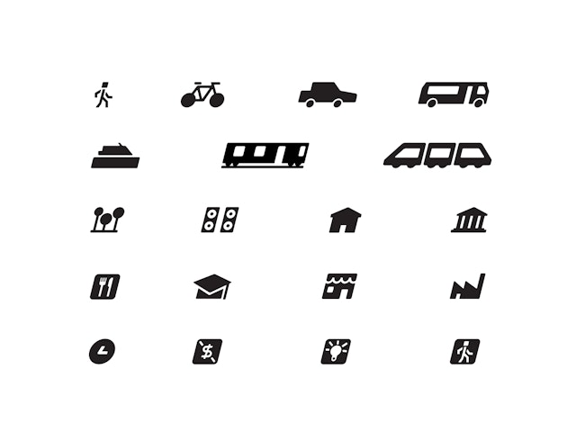
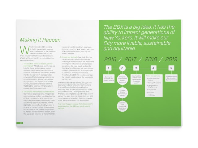
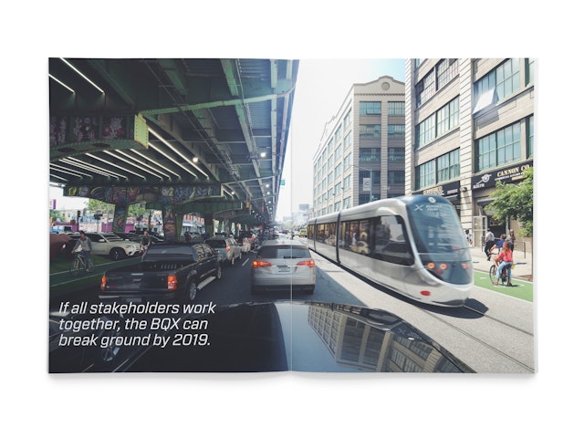
Combined with an arrow, the “X” becomes an iconic symbol for the line, graphically representing speed and connection and the streetcar as an express mode of transportation that will get commuters where they need to go. The segments of the logo come together to form the shape. The typography and icons lean forward, to suggest motion and speed. The team also designed a complete visual system for the BQX streetcar, including the map for the system, friendly custom icons, graphic standards, the website, the official report for the City of New York, and press kits used in the launch of the proposal. The logo can be seen in the renderings of what BQX might look like, helping to convey the idea that the streetcar can be a reality.
Sector
- Civic & Public
- Transport
Discipline
- Brand Identity
