
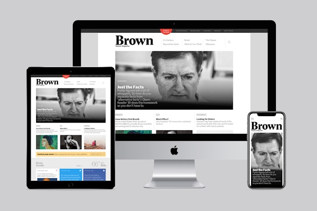
Brown has a reputation among the Ivies for being quirky and unconventional, and the redesign incorporates this unorthodox point of view.
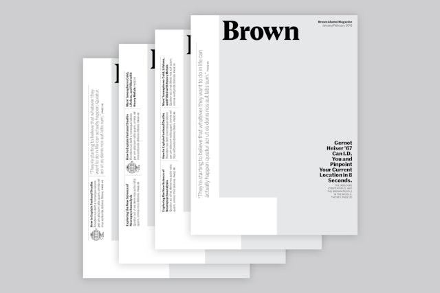
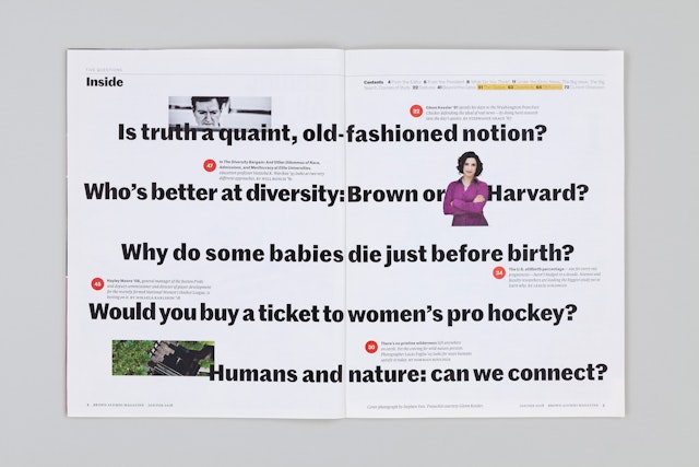
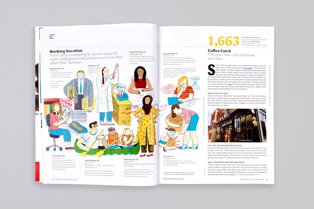
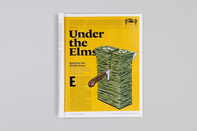

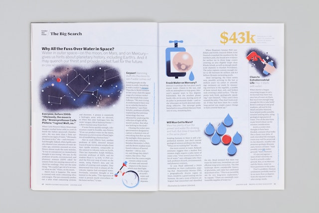
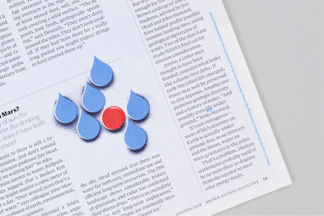
The design adds visual texture and detail—spot illustrations, pull quotes, factoids and typographic variety—to make the publication richer and more active,
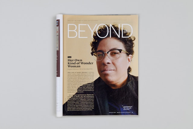

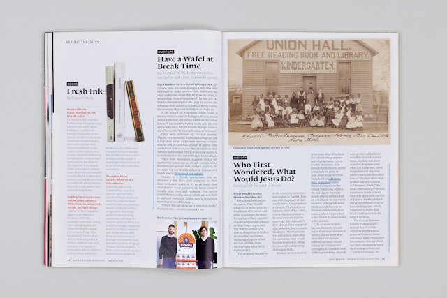
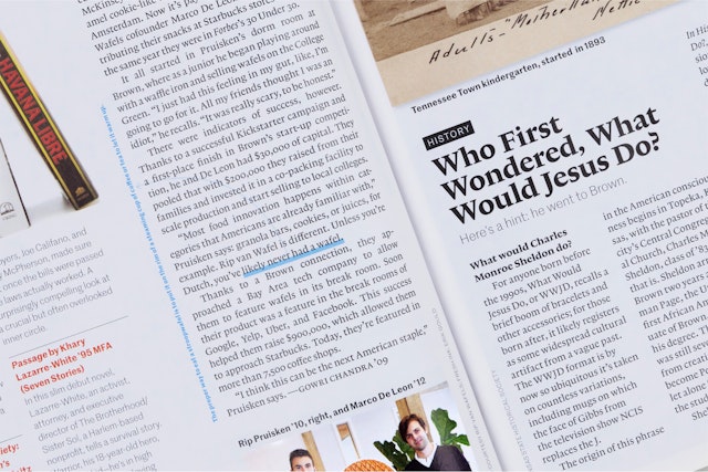

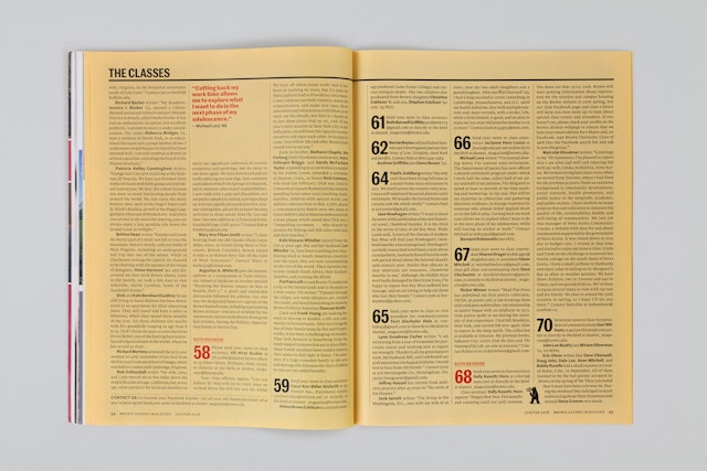
A goal of the site was to help alumni feel connected again, and give them an idea of what it’s like on campus today.
Brown Alumni Magazine has a mission to bring the Ivy League research university in Providence, Rhode Island, to its alumni in ways that are meaningful to their lives today. Pentagram collaborated with the 118-year-old publication on a redesign that would help it better connect with its community. The project includes an updated BAM website that makes the magazine’s content more accessible to readers than ever.
Pentagram worked closely with BAM editor Norman Boucher, who initiated the project before stepping down in 2018 after 20 years at the helm. For strategy, Pentagram joined forces with Jay Heinrichs, an editorial consultant who has worked extensively with schools on publications.
Brown has a reputation among the Ivies for being quirky and unconventional, and the redesign of the magazine incorporates this unorthodox point of view, along with details that feel true to the Brown experience. The content introduces new sections and departments, balancing short pieces for quick browsing with longer reads. An updated front-of-book section “Under the Elms” highlights new events, developments and discoveries on campus in brief updates, along with sidebars like “Bits,” collecting factoids.
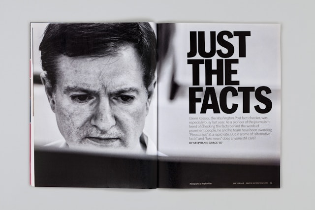
The design adds visual texture and detail—spot illustrations, pull quotes, data-points and typographic variety—to make the publication richer and more active, and to offer more entry points for the reader. Cover lines are highlighted in a modular block that runs up the left edge of the cover, and the retooled table of content stretches across a full spread. Throughout the magazine, greater use of illustration, photography and infographics are used to create a varied and vibrant presentation.
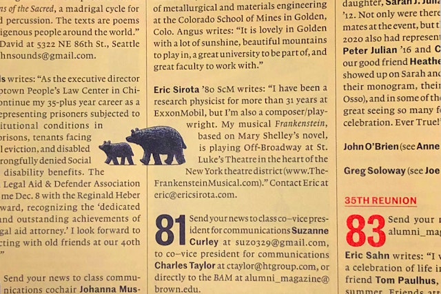
Leading into the back-of-book, the “Beyond the Gates” section spotlights innovative Brown alumni who are working on advancements in arts and culture, start-ups, science and more. This leads into the alumni notes section “The Classes,” which opens with a playful masthead illustration by Tom Gauld featuring Brown’s bear mascot that changes with the season. The section is set off with a different color paper, a yellow taken from the palette of the Brown identity.
The dimensions of the magazine have been reduced slightly for a more intimate and easy-to-handle size that helps it feel like a journal. The primary typefaces are the characterful grotesque Marr Sans and the contemporary serif Lexicon, which is ideal for typesetting at small sizes, making it perfect for the magazine’s long stories and text-packed class notes.
The redesigned website translates the look and feel of the magazine to its digital presence. As with the print publication, the goal was to make alumni feel connected again to each other and to current campus life. The homepage incorporates details like weather on campus and pulls in posts from Brown’s social media feeds.
The site’s modular design assembles the content, highlights major features and groups stories to find new juxtapositions and connections, while a robust advanced search allows readers to dig in deep. The “What Do You Think?” section posts reader comments and responses , as well as a series of alumni polls, represented with infographics. The alumni notes of “The Classes” can be sorted and navigated by year, and the section has been better integrated throughout the site: readers can jump to the notes from stories, and links to relevant editorial content are worked into the alumni listings.
Office
- New York
Partner
Project team
- Shigeto Akiyama
- Austin Maurer
Collaborators
- Jay Heinrichs, editorial consultant