Corporate design inclusive of a wordmarque, bespoke typeface suite, visual identity, linguistic identity, packaging design and custom publishing.
The custom designed wordmarque is derived from the rhythm and pace of the four syllables in the word Co·co·ri·co, utilising cyclical and geometric forms.
Cocorico’s linguistic identity – from the corporate slogan to assorted one-liners and publications – pays tribute to the company’s heritage and is a celebration of the entire food universe and natural world surrounding the brand.
Cocorico’s light-hearted one-liners converge with the brand values and set the tone of voice, while conveying useful and bite size information focused on natural and fresh food, health, ethical standards and sustainability.
The sans serif typeface is derived from the geometric curvature of the Cocorico wordmarque. In taking reference and inspiration from the circular forms of the wordmarque, balance, impact and synergy between the components have been created.
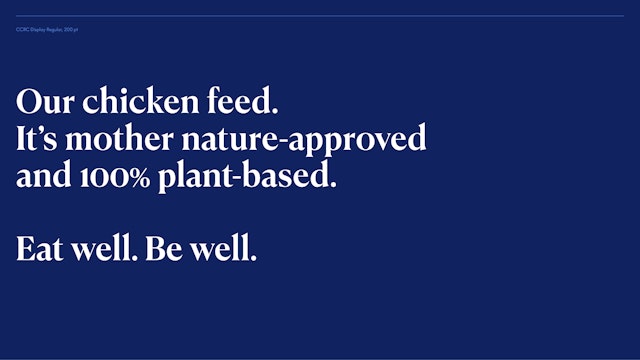
The display typeface CCRC Display Pro’s contrast between thick and thin serifs is particularly suited for culinary applications. With softly flared strokes, it is sharp yet pared back and is rhythmically balanced with the sans serif typeface suite, CCRC Text Pro.
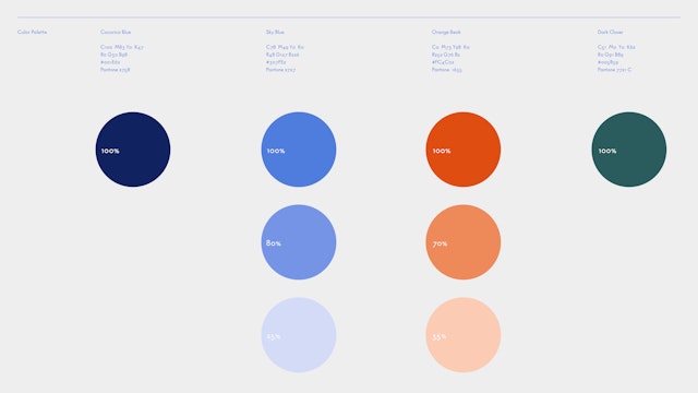
Cocorico Blue, the main brand hue, symbolises liberty and also stakes itself as a primary colour along with red and yellow. Sky Blue represents open spaces and fresh air.
A full spectrum of colours will be utilised in communications as a direct reflection of the richness of the culinary world.
The beauty of raw poultry is captured in unconventional, high contrast layouts and rich colours, appealing to food businesses – from greengrocers and gourmet shops to delicatessens and traditional butcher boutiques.
From campaign key visuals to The Health Hub, proteins are highlighted as the building blocks of life as Cocorico’s poultry contains all essential amino acids necessary for protein synthesis.
From the Cocorico printed brochure shared with business clients to corporate collateral and the print edition of The Health Hub magazine, all paper qualities and stocks provide a tactile and tangible experience of the brand, echoing the natural world as much as the digital.
Sausage making is an original craft that is thousands of years old. At Cocorico, real sausages start with 100% quality chicken and natural spices to create the most unique recipes. It begins and ends with the freshest chicken raised on an all-natural feed, the cleanest seasoning ingredients and natural smoking with beechwood.
Tableware and serving essentials migrate away from plastics, favouring quality over quantity and keeping with Cocorico’s sustainability and environmental stewardship initiatives.

The Health Hub, reflecting Cocorico’s commitment to health awareness, is a reserve for gourmet fare, culinaria, masterclasses, recipes and tips and tricks from chefs, cookbook authors and wellness leaders. It is also a growing encyclopedia of food curiosities, health-centric articles, pantry essentials and featured events.
The visual language for The Health Hub is balanced with a plethora of plant-based side dishes for a well-rounded and wholesome plate. From succulent mushrooms to microgreens and nutritious sage, tarragon, rosemary and thyme, chicken-based dinners will be family pleasers.
The website provides a wholistic view into Cocorico, serving as one of the brand’s primary activation points. The Company is Cocorico’s corporate arm geared to B2B audiences, while The Health Hub reflects Cocorico’s commitment to health awareness and caters to B2C audiences with a growing encyclopedia of food curiosities, health-centric articles, pantry essentials and featured events.
The Brand Identity
The food brand Cocorico has long been an advocate for animal welfare, environmental stewardship and health awareness—areas which consumers have become increasingly attuned to in the past decade. As a growing business, however, Cocorico has lagged on the visual and communications front over the years, concentrating company efforts on research and development. To bring the brand up to speed, Pentagram aligned and refined the brand’s overall strategy, creating a corporate identity expressed through a new wordmarque, bespoke typeface, visual identity, packaging design and custom publishing.
Wordmarque Onomatopoeia
Cocorico is the sound of a rooster’s wake up call popularised by the French and every language has its own phonetic rendition. In Germany, they say kikeriki. In Dutch it’s kukeleku; in Portuguese they say cucurucu; and the Finnish say kukko kiekuu. On the brand design front, the Cocorico wordmarque utilises cyclical and geometric forms informed by the rhythm and pace of the four syllables in the word Cocorico. The shapes in the wordmarque itself resemble chickens and their downward pecking gait across the farm grounds. The Cocorico heritage signet manifests the rooster in the Cocorico visual identity and iterates the company’s legacy and accumulated know-how since its founding in 1982.
Branding Strategy and Linguistic Identity
As a pillar of the branding strategy, Cocorico’s visual assets and communications have been reconciled to create an experiential brand around Cocorico’s values centred on providing the most natural, healthy and sustainable chicken. “The All-Natural Chicken Brand” positioning claim, a result of an in-depth brand audit, is derived from the food company’s brand ethos focused on fresh food, ethical production standards and social responsibility.
Building upon the linguistic audit and following findings from a Cocorico nutraceutical report, narratives have been developed around the world of protein, highlighting the protein content of Cocorico poultry and why the cleanest chicken produces high quality protein.
Visual Identity
The visual identity opts for a pared down aesthetic. The photographic language celebrates chicken and praises food production in unexpected juxtapositions, especially in its raw form. The entirety of the Cocorico poultry range is captured in macro shots, high contrast layouts and rich colours. The photographic direction on the B2C end represents the brand’s love of the entire food universe – a mélange of tastes and senses combined to perfection. It is a return to slow living and high quality food, inspiring consumers to get back into the kitchen, get together with their tribe, or even experiment on their own.
The illustration suite for Cocorico’s Ready to Eat range is vibrant and captivating with ample white space. The illustrations offer a youthful perspective and are animated through plenty of movement. Emphasis is placed on fresh and natural ingredients and how to prepare chicken-based meals.
The brand’s master colour palette appearing across the entire product range and key visuals, consists of Cocorico Blue, Sky Blue, Orange Beak and Dark Clover. Cocorico Blue, the main brand colour symbolises liberty and stakes itself as a primary colour along with red and yellow. Sky Blue is redolent of open spaces and fresh air, Orange Beak indicates a healthy chicken’s beak and Dark Clover references the farm grounds.
Typeface Swatch
The display typeface CCRC Display Pro’s contrast between thick and thin serifs is particularly suited for culinary applications. With softly flared strokes, it is sharp yet pared back and is rhythmically balanced with the sans serif typeface suite, CCRC Text Pro. The latter further references the Cocorico wordmarque to create balance, impact and synergy between the textual components.
Digital Platform and Custom publishing
The Company is Cocorico’s corporate arm on the website, home to many of the brand’s touchpoints including its heritage timeline, “The Cocorico Truth” dispelling fact and fiction surrounding poultry consumption, its full range of raw poultry products and Ready to Eat range, as well as its “10 Reasons to Buy Cocorico” and more. Both The Health Hub and The Company provide a wholistic view into Cocorico, with the website serving as one of the brand’s primary activation points.
The creative direction also extends to custom publishing in the form of The Health Hub, an offshoot of the Pentagram-designed website, featuring health-centric articles, recipes, cookbooks, wellness profiles, interviews and pantry items. Part of the experiential branding encompasses POS design and a QR campaign enabling shoppers to scan chicken packages linking back to healthy recipes on the Cocorico website, making The Health Hub a central point of the brand.
Client
CocoricoSector
- Food & Drink
Discipline
- Brand Identity
- Packaging
- Publications
- Campaigns
- Typefaces
Office
- London
Partner
- Sascha Lobe
Project team
- Louis Meeus
- Rommina Dolorier
- Shawden Sheabar
- Jonas Zieher
- Michel Bütepage
- Miltos Bottis
