


The logo shifted to a simple ‘CR,’ an acronym that was already used internally by the magazine and its readers.

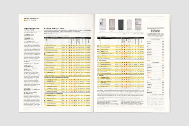
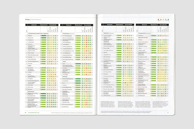


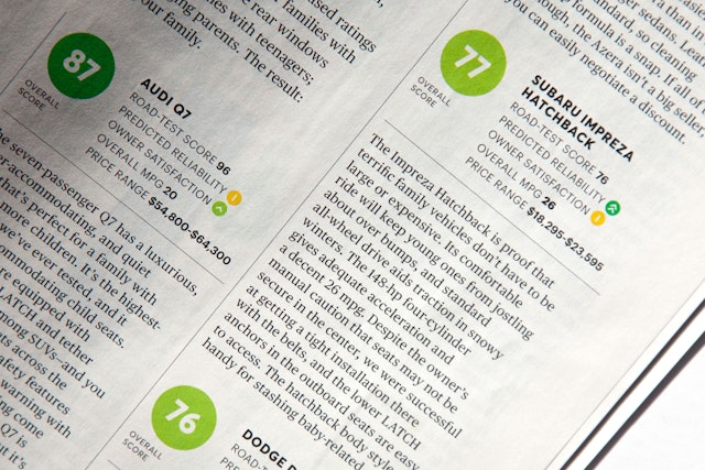

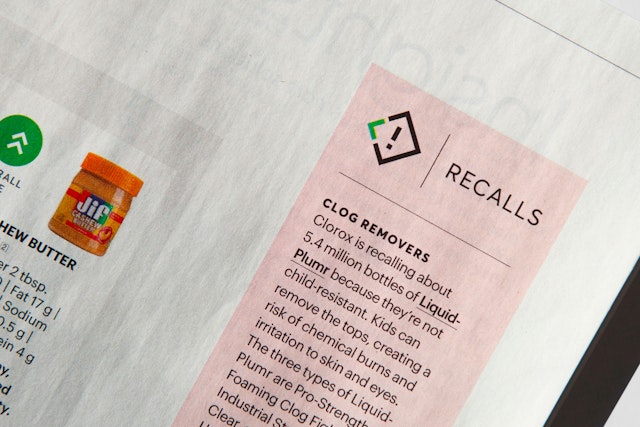
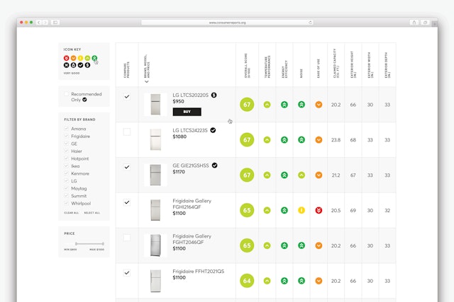
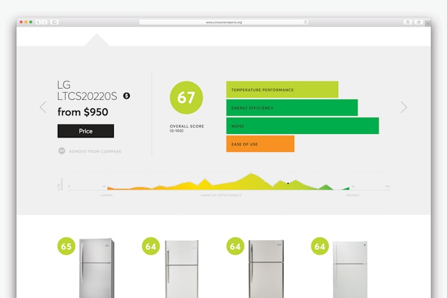
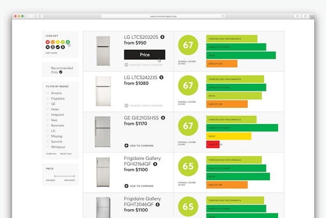
The redesign evolved the ratings to make them more intuitive, moving to a more universally understood scale where green is excellent and red is poor.


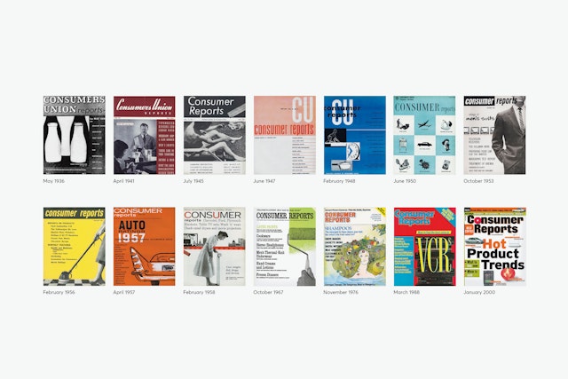
For over 80 years, the magazine Consumer Reports has helped American consumers find the best quality products in relation to cost. Each month the magazine reviews hundreds of products across all categories, from packaged foods and household goods to automobiles and electronics. It shares this highly trusted information with approximately 7 million subscribers (3.8 million print and 3.2 million digital). CR is published by Consumers Union, a non-profit organization that is dedicated to unbiased product testing, consumer-oriented research, public education and advocacy. To remain free of bias, CR does not accept paid advertising or free samples for testing. It purchases all the products it tests at retail, like consumers do, and conducts its testing at its in-house laboratories.
Pentagram developed a new brand identity for Consumer Reports that is designed to help the magazine reach new audiences, especially younger readers. The logo shifted to a simple “CR,” an acronym that was already used internally by the magazine and its readers. The iconic, instantly recognizable logo functions as a monogram that easily translates to digital applications and social media.
The refresh also introduces a new color scheme. The magazine’s former identity was black and red, and in the ratings charts, the best products were indicated with red. The redesign evolved the ratings to make them more intuitive, moving away from the red and black circles to a more universally understood scale where green is excellent and red is poor. This favorable green is also utilized for the new identity. Before it launched, the redesign was thoroughly reviewed using the the testing formulas the magazine has applied to countless products over the years.
