The brand strategy positions Coqual as a disruptor, a special organization that is transforming the status quo and a brand that companies should use to reach their full potential.

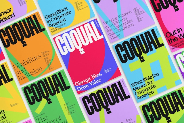
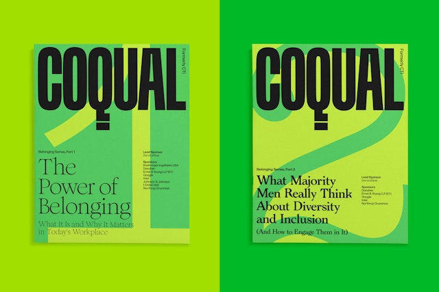
The framework establishes an editorial design for research reports, complete with magazine-like covers, headlines and the logo used like a nameplate for brand presence.


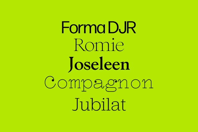
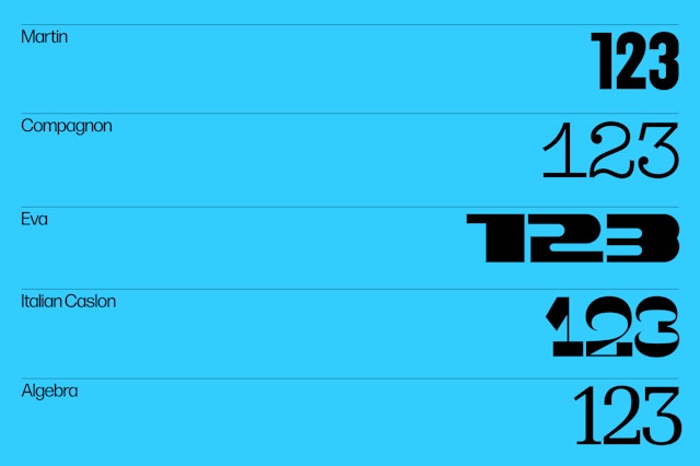
The system utilizes a suite of contemporary fonts by BIPOC and female type designers, groups who are largely underrepresented in the world of type design.


Data visualizations have a straightforward graphic simplicity inspired by the pioneering information design of the sociologist and civil rights activist W.E.B. Du Bois.

The bright palette serves as an organizing motif for the website, which features a modular design built around a simple grid of color blocks.


As social movements like Black Lives Matter and Me Too have led to a collective awakening and call for equity, including in the workplace, businesses and organizations now have an opportunity and an obligation to address systemic issues. Coqual is a nonprofit global think tank and advisory group dedicated to helping leaders create diverse and inclusive workplaces. Formerly known as the Center for Talent Innovation (CTI), the group studies diversity, equity and inclusion (DEI) and advises many of the world’s largest corporations.
Pentagram has developed a new brand identity framework for Coqual that positions the company as an innovator in the field. The program encompasses a new brand strategy, name and messaging, and website, and employs an eclectic approach to color and typography inspired by Coqual’s mission.
The project is part of a repositioning for the advisory group. Originally founded by the economist Sylvia Ann Hewlett in 2004, the New York-based company largely focused on gender discrimination. Over the years, its scope has grown to address systemic bias of all kinds, including racial equity. Its groundbreaking research has guided corporate DEI policies that impact millions of employees worldwide. It leads a Task Force of member companies, a community of global business leaders who are committed to diversity and inclusion. Its consulting arm, Coqual Advisory Services, works with companies to develop a customized approach and solutions so that their talent can flourish.
Pentagram collaborated closely on the rebranding with Coqual’s leadership, including Board Chairman Patricia Fili-Krushel and new CEO Lanaya Irvin. The designers first conducted a brand analysis with the company and its clients. DEI is an urgent issue, and Coqual wanted to reinforce its role as a pioneer in the area. If you want to change the world and shift culture, you can’t be shy, and must be bold and decisive. The brand strategy presents Coqual as a disruptor, a special organization that is transforming the status quo and a brand that companies should use to reach their full potential.
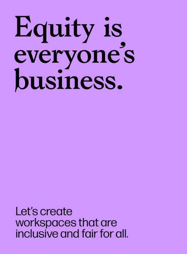
Along with the visual framework, the Pentagram team worked on developing a verbal identity, including an inventive name and messaging that foster a sense of connection. Vocabulary around DEI tends to be academic, but the program uses language that avoids jargon for something more relatable, human and empathetic. This included changing the group’s name to better reflect who they’ve become. The previous name, Center for Talent Innovation, was vague, corporate and unexceptional. It needed to be clear and precise, not an acronym or portmanteau.
Coqual helps design workplaces that are equitable for all; they are co-creators of equity at work. This mission inspired the new name, which was conceived as a call to action that references many aspects of what Coqual does: “Co” is for collaboration, community and co-creation; “Qual” stands for qualitative research, equality and the goal of an equitable world, and also suggests the high quality of the firm’s work. “Coqual” is actually an archaic form of coequal that refers to people who are equal in rank or ability.
The name captures the world Coqual is working towards; it is memorable and has meaning, and can grow along with the company’s focus. The dynamic point of view is also captured in the new brand line, “We are Coqual––the power of equity at work.”
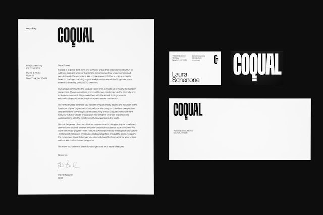
Just as Coqual made a decision to be more accessible in its messaging, it needed a visual personality that was bold, expressive and demanded to be seen. The custom-drawn wordmark is graphically powerful, with condensed typography and a tail of the “Q” that doubles as an equal sign. The designers also developed a logomark that combines the letter “C” with the equal sign, making a symbol that evokes a type of currency or factor of exchange.
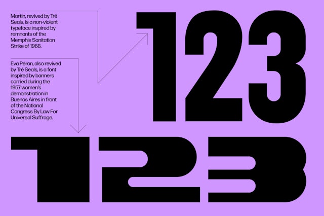
Coqual celebrates everyone, and so does its typography. The identity’s core typography is set in the neutral neo-grotesque sans Forma DJR. For titles and numbers, the Pentagram team selected a suite of expressive contemporary fonts created by BIPOC and female type designers, groups who are largely underrepresented in the world of type design. Titles and headlines are set in Compagnon Roman (by Juliette Duhé and Léa Pradine), Joseleen Regular (by Jungmyung Lee), Jubilat Light (by Joshua Darden), and Romie Regular (by Margot Lévêque). Numbers appear in Algebra (by Susana Carvalho and Kai Bernau), Eva and Martin (both by Tré Seals), and Compagnon, as well as Caslon Italian.
These typefaces are utilized in eye-catching covers for Coqual’s reports, presentations and key findings documents. Rather than treating these like conventional white papers, the framework establishes an editorial design for the series, complete with magazine-like covers, headlines and the logo used like a nameplate for brand presence. The numbers and letters are scaled up and cropped to typographic details—to suggest looking closely at issues—with color applied for graphic impact.
The corporations that Coqual works with typically have staid institutional profiles, and the identity’s bold approach to color helps set the advisory group apart and highlight its creativity. The brand palette features an eclectic mix of primary and secondary colors that suggest the idea of diversity, and is paired with black and white for contrast.
Infographics play an integral role in Coqual’s communications, and the framework introduces a distinctive and cohesive look for this data to make it a recognizable part of the brand. The team developed standards for charts, diagrams and other data visualizations with a straightforward graphic simplicity and vibrant use of color inspired by the pioneering information design of the sociologist and civil rights activist W.E.B. Du Bois.
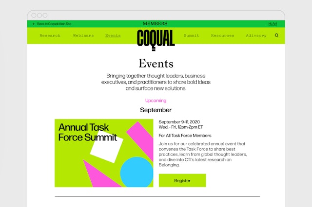
The identity’s bright palette also serves as an organizing motif for the relaunched website, which features a modular design built around a simple grid of color blocks. The homepage highlights interesting facts from Coqual’s research, surfaces the series of reports, and outlines consulting services to describe exactly what the group does. The branding is carried through to the digital context, with the wordmark placed front and center as a masthead for the site and a menu “hamburger” that echoes the equal sign in the logo.
Client
CoqualSector
- Non-profits
- Professional Services
Discipline
- Brand Identity
- Digital Experiences
- Brand Strategy
Office
- New York
Partner
Project team
- Brankica Harvey
- Mary Kate Henry
- Dana Reginiano
Collaborators
- Saundra Marcel, strategy
- Sam Morgan, developer
- Mark Lindsay, developer