Echo stands for Economy of Hours, a social enterprise that promotes the exchange of time as a direct and straightforward currency.

There is an added value of doing things in an Echo way—it catalyses the building of relationships and networks, creating a richer experience
Pentagram’s task was to create a brand that positioned Echo as a leader in the field, both clarifying what the economy of hours is and owning that category.

The new visual identity embodies the diverse spectrum of skills that Echo members bring to the table and emphasises the sharing of skills, advice, relationships, networks and goodwill that Echo represents.


Echo stands for Economy of Hours, a social enterprise that promotes the exchange of time as a direct and straightforward currency. Based on the principles of fairness, equality, and reciprocity, this is a platform where people can trade their skills, giving what they can and taking what they need, an hour for an hour.
Echo started in East London in 2013 as a local economic exchange scheme, trading services, skills and resources. Enabled by a time-style currency, it started small—local people would get their bikes fixed, practice languages and learn to bake. It soon grew to include local businesses—theatres traded tickets for front-of-house support and yoga teachers traded classes for venue spaces.
In 2020 Echo joined forces with Civic, a social enterprise helping to develop and scale social innovations within communities, making the digital platform and methodology shareable.
The digital platform works as a tool that nourishes a culture of creativity, entrepreneurship, and impact.
Moving on from a purely transactional exchange of skills and services, Echo is a more rewarding social exchange. There is an added value in doing things in an Echo way—it catalyses the building of relationships and networks, creating a richer experience.
Pentagram’s task was to create a brand that positioned Echo as a leader in the field, both clarifying what the economy of hours is and owning that category. With many other small businesses following a similar proposition but often with a more domestic focus, Echo’s focus was to reach independent professionals and start-ups.
The team proposed the brand position summarised as “It’s time”, a clear definition of what Echo stands for. The idea is to both acknowledge that ‘it’s time to do things differently’ and that the currency is based on the exchange of time.
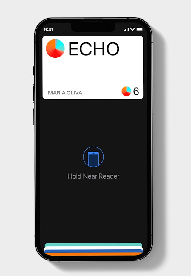
The Echo symbol represents a token, or a coin. That can be used as a tool for transactions. It’s the most straightforward way of representing time. 1 Echo=1 Hour.
The new visual identity embodies the diverse spectrum of skills that Echo members bring to the table and emphasises the sharing of skills, advice, relationships, networks and goodwill that Echo represents.
Pentagram defined the look, feel and behaviour of the user experience, creating a coherent language for the brand beyond the logo and graphic elements. The photography is natural, featuring the diversity of people and activities that engage through the platform.
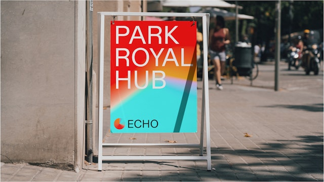
The combination of vibrant colours and gradients in motion, and the straightforward use of typography create a vibrant language which conveys a human but professional style, elevating Echo as a leader in its field.
Office
- London
Partner
Project team
- Hamlet Auyeung
- Cleber de Campos
- Jeremy Downes
- Natalia Witwicka
- Kate Blewett
Collaborators
- John Grant (strategy)
