The branding helps break the stigma around menopause and reinforces the idea that it should not feel like an ending, but rather a transition and breakthrough.
The brand strategy positions Evernow as a smart and empathetic partner who can help navigate the ups and downs of a complicated stage of life.
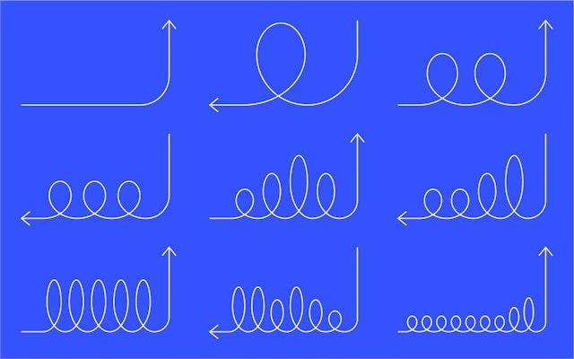
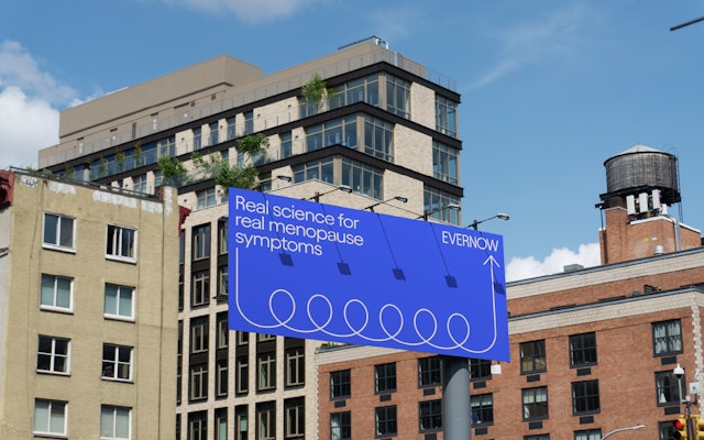
The looping arrows suggest a winding journey that ultimately ends in something positive, optimistically pointing upward towards personal growth.

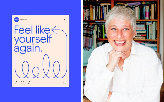
The identity translates to a friendly and engaging user experience on the site, where the arrows help direct users through the process.

Menopause is an experience that every woman goes through eventually––and each in her own way. Evernow is a science-based care company with a focus on helping women live longer, healthier lives, starting with menopause. The tech-enabled platform offers personalized treatment plans that give women power over menopause so they can continue to live their lives the way they want.
Pentagram has developed a new brand identity, strategy and positioning for Evernow that is designed to help break the stigma around menopause and to reinforce the idea that it should not feel like an ending, but rather a progression and breakthrough. Built around a vibrant visual language of looping lines and arrows, the new look enhances the delivery of Evernow’s care model and is accompanied by messaging that encourages an open dialogue about menopause and finding a way to “Feel like yourself again.”
The Pentagram team worked closely on the project with the leadership at Evernow, including founder and CEO Alicia Jackson, PhD. The relaunch coincides with a new infusion of $28.5M in series A funding led by global capital firm NEA and other institutional investors, along with notable angel investors including Gwyneth Paltrow, Drew Barrymore, Cameron Diaz, and other public figures who are advocates for women’s health and well-being.
The Challenge
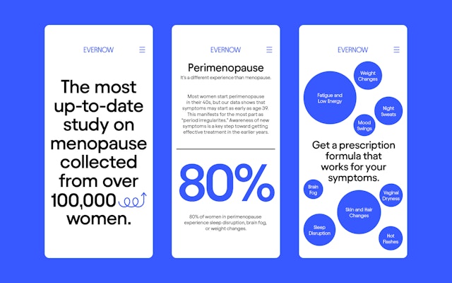
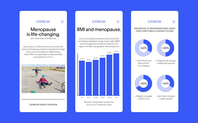
Menopause is one of the most overlooked areas of women’s health. More than two million women reach menopause every year, and over 55 million women in the US are currently experiencing symptoms, yet it remains an uncomfortable subject that is endured in private and rarely discussed with others. Over 75 percent of women who seek care don’t receive it, despite highly effective FDA-approved treatments.
“Menopause and its health effects have been understudied, misunderstood, and poorly communicated––leaving so many women in the dark,” said Dr. Jackson. “Pentagram viscerally got the problem that we are solving, understood our customer and knew how to position us within the category.”
The Strategy
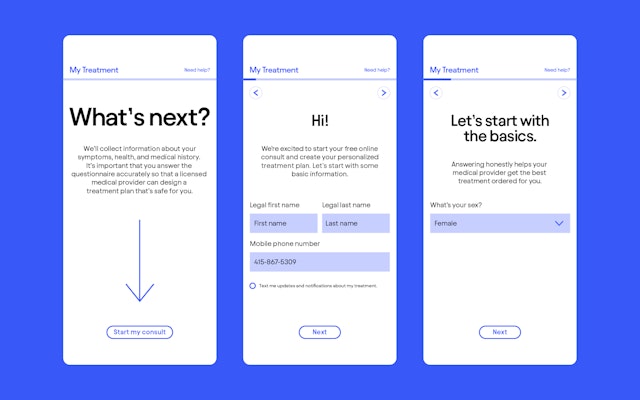
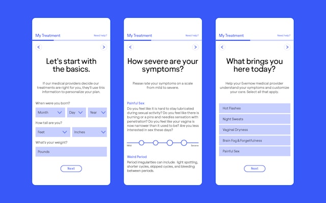
As part of its mission, Evernow wants to normalize menopause and inspire women to speak openly about their symptoms and treatment. The menopausal transition is part of a 10 to 20-year health journey that begins with perimenopause and includes constantly evolving symptoms that require versatile management. Through its site, Evernow delivers customized care with a core offering of researched hormone therapy plans, an expert clinical team, and a responsive approach.
The brand strategy positions Evernow as a smart and empathetic partner who can help navigate the ups and downs of a complicated stage of life that is unique to each woman, but shared by all. Recognizing that “you know you best,” the verbal identity and messaging gives women agency over their own experiences and validation over their symptoms. Midlife is when many women are just hitting their stride, and the branding reframes menopause as a curve in the road that should not slow them down.
The Solution
The visual identity been carefully calibrated to resonate with the wide age range of women who are affected by perimenopause and menopause. The aesthetic avoids the subdued, conservative look of healthcare marketing for older people, as well as the delicate color palette that is shorthand for direct-to-consumer brands for women.
The looping arrows suggest a winding journey that ultimately ends in something positive, optimistically pointing upward towards personal growth. The twists and turns hint at the hard-to-pin-down experience of menopause, with its constantly evolving symptoms of varying degrees. The circular geometry dynamically extends across applications to create a recognizable look for the brand, and comes to life in animations.
The logotype and other brand typography are set in the modernist sans serif Avantt, which has a geometric round “O” that complements the circular linework. The designers developed guidelines for the construction and connection of the loops, as well as infographics and a set of custom icons that echo the round forms of the logo. The positive point of view is reflected in the brand color, a bright, “electric” blue that is bold, energetic and unexpected in the category.
The linework is part of a flexible graphic toolkit that can be used to create an infinite number of brand expressions, from promotional campaigns, product packaging and fulfillment kits, to the website, app and social media channels. The identity translates to a friendly and engaging user experience on the site, where the arrows help direct users through the process. A new direction for brand photography depicts women in their everyday lives, shot in a natural and spontaneous way with vivid, saturated color.
Client
EvernowSector
- Fashion & Beauty
- Health
- Technology
Discipline
- Brand Identity
- Digital Experiences
- Brand Strategy
Office
- New York
Partner
Project team
- Daniel Koppich
- Hyejin Song
- Veronica Hoglund
Collaborators
- Eva Green, strategy