

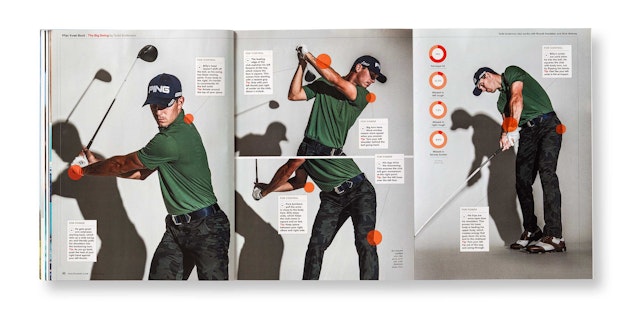
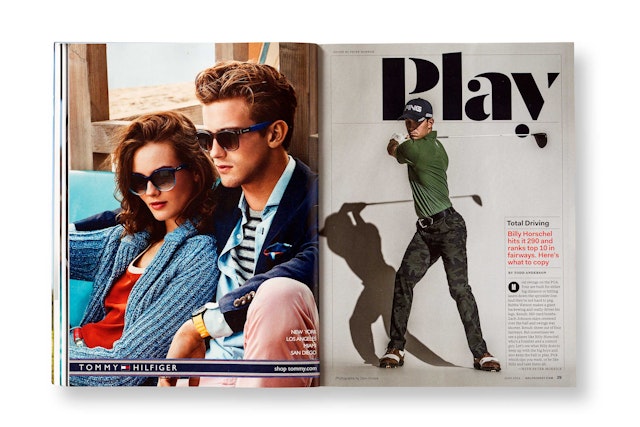
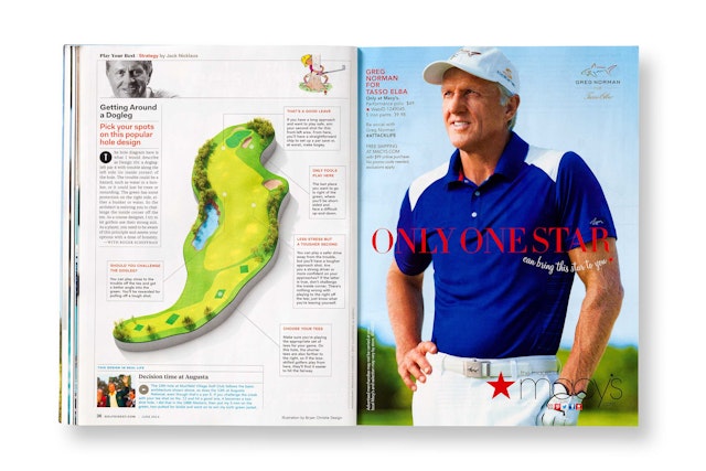
For the designers, part of the challenge was finding new methods to visually represent the subject—to break up the monotony of pictures of golf course greens against the bright blue sky, or to show golf tips like swing paths in an unexpected way.


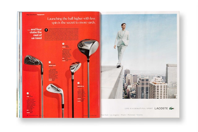


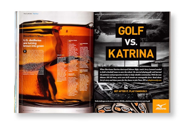
Golf is played by nearly 30 million Americans, but the sport still has the image of an old-man’s game. Golf Digest, the most widely read golf publication in the world, recently introduced a new format designed to connect with millennial golfers (ages 25-34)—the magazine’s fastest growing segment of readership—as well as the traditional core golfer (age 50-plus). Designed by Pentagram, the update refreshes the Condé Nast publication with a contemporary format that captures the excitement, energy and style of the sport.
The designers worked closely with Golf Digest creative director Ken DeLago and editor-in-chief Jerry Tarde on the redesign. The new look complements an editorial shift that includes more lifestyle content, intended to appeal to a wider audience (and the advertisers looking to reach them). The format opens up the magazine for a looser, more playful feel that conveys the game’s athleticism and virtuosity, as well as the growing “cool” of golf culture, embodied by player-fans like Justin Timberlake and Jimmy Fallon. For the designers, part of the challenge was finding new methods to visually represent the subject—to break up the monotony of pictures of golf course greens against the bright blue sky, or to show golf tips like swing paths in an unexpected way.
To update the masthead, the designers looked for a font with balls—specifically, ball terminals, which add a playful touch given the subject matter. The contemporary stencil-like font Dala Moa was selected for its distinctive ball terminals, which break free from the letterforms so balls can be hidden in plain sight in the logotype and in display text. With the blessing of Dala Moa's designer, Paul Barnes, the terminals were customized to make them perfectly round. Commercial Type, the foundry that licenses the font, worked on refining the logotype by adjusting the letter spacing as well as the spacing of the stenciling, to make sure the identity would work in a range of different sizes. The colored dot of the “i” in “Digest” was retained as a link to the magazine’s former logo.
Inside, the tone is smart, sophisticated, and irreverent, with content designed to engage both golfers and non-golfers. About a quarter of the magazine continues to be instruction––tips and techniques––joined by more articles that contain data and stats about golfers, games and gear, both for pros and amateurs. Shorter articles offer more entry points for the reader, and a flexible grid gives the dense information room to breathe.
The designers worked with the editors to restructure sections of the magazine for clearer navigation, simplifying the front of book and creating an uninterrupted well in the back. The front-of-book has been organized into two sections: “Play Your Best,” with tips for players about improving their game; and “The Golf Life,” which features everything related to golf. The new design singles out the words “Play” and “Life” on the opening pages to brand the sections within the magazine, with the headers set in the same font as the masthead.
The redesign makes increased use of infographics, marginalia, and other details to grab readers’ attention and emphasize the intelligence behind the game. Surprising images and graphics bring notes of style, wit and humor. Cartoons and illustrations cut against the dryness of the data, and pull quotes add personality. The format reintroduces photo portraits of the famous golf experts who contribute columns (Jack Nicklaus, Tom Watson, et al.). Throughout the magazine, top-notch photography puts a new perspective on golf in striking, oversized images. Photographs of objects and equipment like clubs and balls are shot up close and dramatically cropped.
In addition to the Dala Moa used for the masthead, section openers and other display type, the team put together a suite of fonts: Heroic Condensed, used mainly for cover lines and display type on features; the Fakt family (Fakt, Fakt Semi Condensed, Fakt Condensed), used mainly for small headlines in front of book; and Tiempos Text, used for body text.
Pentagram previously redesigned Tennis magazine.
